
For this project, answer the six questions below to create a Design & Marketing Strategy for your client. As further explained below, this strategy will guide your design work and all the decisions that go with it. Write it yourself, and use AI for help only if needed.
- Ideal Customer Persona — Who are we talking to, what motivates them, and what’s bothering them?
- Think about: Who is the target customer? What is their lifestyle like? What do they value? What do they want, and what problems (pain points) get in their way?
- How it guides design: Imagery, tone, and customer relatability.
- Position — What makes this option better than the competition?
- Think about: Why should they pick this brand over everyone else? What makes you different? Consider price point (value, mid-range, or premium), and what is the core promise or hook?
- How it guides design: Headline focus, value proposition, and benefits. “What we can do for you that others can’t.”
- Vibe / Personality — What vibe, style, and tone fit this brand?
- Think about: What colors, fonts, photography, and mood make this brand instantly recognizable and trustworthy?
- How it guides design: Colors, typography, art, photos, video, sound, and visual mood.
- Marketing Material & Touchpoints — What marketing material best fits this strategy, and where will they see it and engage with it?
- Think about: What specific piece of media (social graphic, web ad, flyer, email) reaches them best in that space, and how do you lay out the information so it gets noticed and acted upon?
- How it guides design: Media format and size, layout organization, and focal point sizing. Big digital billboard or small tablet or phone screen?
- Call to Actions — What do we want them to do, and why is it easy to say yes?
- Think about: What exact action should they take (CTA), and what offer lowers the friction to act?
- How it guides design: Button contrast, placement, and beneficial and motivating button text.
- Metrics and Analytics — How will we measure success?
- Think about: What specific metric or data point proves your design actually worked and achieved your goal
- How it guides design: Accountability to the client’s business goal.
Overview
As a designer, creating, understanding, and using a Design and Marketing Strategy immediately tells a hiring manager you view design through a strategic business lens, not just an aesthetic one. It tells an employer that you solve business problems and motivate customers.
It sets up the exact job interview conversation every graphic designer and visual communicator should want to have. When an interviewer sees that title on a portfolio case study and asks, “So, tell me what you know about marketing from a designer’s perspective?”, your clear, confident response can be something like:
“To me, design and marketing work together to solve business problems and motivate customers. I use this strategy to make sure every visual decision I make—from type, colors, photos, videos, and layout—is directly tied to the brand position, a target audience, a specific campaign goal, and a measurable performance goal like engagement, click-through rate, or conversion rate.”
That answer instantly sets an entry-level designer apart from other applicants. It shows they can justify their design choices with strategy and collaborate effortlessly with marketing teams on day one.
Fusing Design & Marketing is the path forward
Moving Away from a Design Brief
Moving away from “brief” makes sense in today’s marketing-driven design culture. In industry practice, a brief usually implies a static hand-off document given to a creative, whereas a Design & Marketing Strategy is a collaborative, dynamic, holistic blueprint that fuses design and marketing strategy to solve problems, motivate customers, and drive sales (conversions) for your client.
Why the Traditional Model Is Outdated
Teaching design purely through traditional branding frameworks—like simple taglines or abstract personality adjectives—no longer aligns with how modern creative roles operate.
While core visual fundamentals (composition, typography, color theory, art & photo direction) remain foundational, teaching them in isolation from business mechanics creates a severe disconnect between classroom training and professional expectations.
Historically, design education centered on visual or brand identity and emotional resonance: defining a brand’s “look and feel” based on a handful of adjectives (e.g., authentic, energetic, premium).
Today, employers also view design as a measurable driver of growth rather than a purely aesthetic expense. A visually stunning logo, ad, or graphic asset that fails to move a user through a conversion funnel is increasingly treated as a failure of design strategy and as not helpful to a client.
Visual Hierarchy – A New Approach
Design Only vs. Strategic Intent
Design hierarchy must lead the viewer’s eye (design only) while also supporting the campaign strategy of motivating the viewer and moving them through the marketing funnel and conversion pathway toward a purchase or conversion.
Design Perspective: visual hierarchy asks: “Does the layout lead the viewer’s eye, and is it pleasing to look at?”
Design & Marketing Perspective: visual hierarchy asks: “Does the visual order lead the eye, is it pleasing to look at, and does it match the decision-making process of the customer so they take action?”
Element | Design Only | Strategic Intent – Design + Marketing |
| Hook (Primary Focal Point) | Large headline or primary image. | Stops the scroll by targeting the customer’s pain point or desire immediately. |
| Supporting Visual | Secondary photo or background graphic. | Validates the promise visually (e.g., showing real skaters to prove authentic street style). |
| Body Copy | Medium-sized paragraph text. | Lowers friction by explaining the benefit quickly in 1–2 scannable sentences. |
| Offer / CTA | Button is branded with client’s colors and typeface. | Triggers action using branded high-contrast design and clear, low-friction wording (“Claim 20% Off”) at the bottom after the message. |
Designing for Price Point
While it’s only one aspect affecting the look and feel of your design work, your design will look different depending on the price of your client’s products and services. Most businesses are known for one of three categories:
- Value (affordability & deals)
- Mid-Tier (quality & everyday style)
- Premium (exclusivity & high status)
Here’s an example of how a web ad design for a sunglasses retailer might change based on their price point:
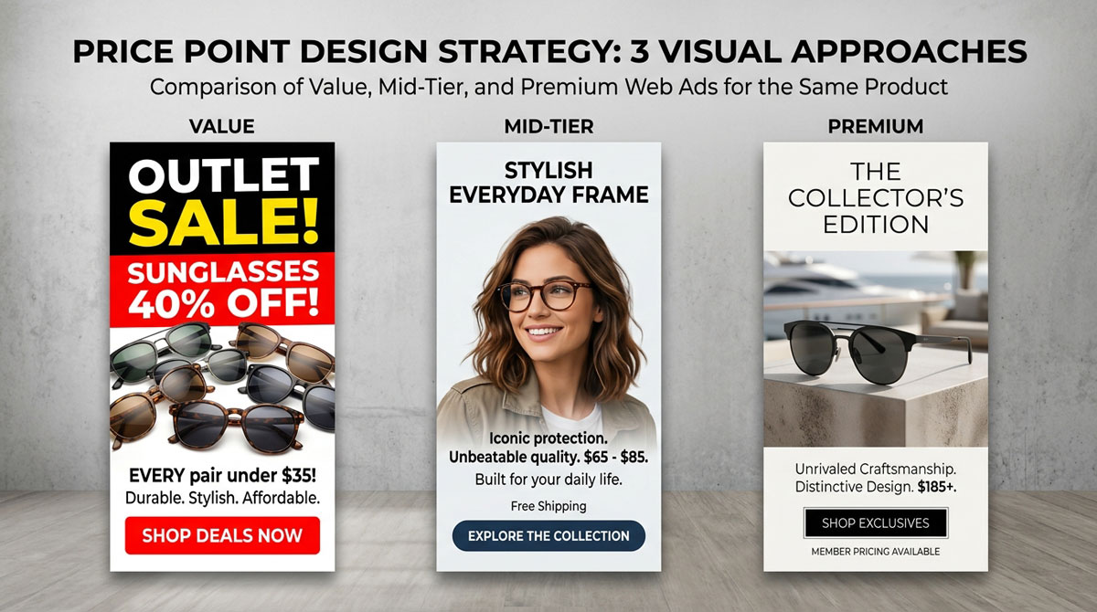
Tips and tricks to consider when designing for price point
| Price Point | Brand Personality & Vibe | What It Directs in the Visual Design | Example Brands |
| Value / Budget | Approachable, high-energy, promotional, straightforward, accessible. | • Bold, high-contrast colors (reds, bright yellows) • Large, prominent discount callouts (“20% OFF”, “BOGO”) • Clear, direct typography • Denser, information-packed layouts | Outlet Stores, Target, Old Navy, IKEA |
| Mid-Tier / Mid-Range | Balanced, reliable, stylish, quality-focused, modern. | • Clean, contemporary layouts with good breathing room • Lifestyle photography emphasizing everyday use • Balanced color palettes • Clear value proposition mixed with strong brand storytelling | Vans, Nike, Hoka, Apple, Madewell, Chipotle |
| Premium / Luxury | Minimalist, exclusive, refined, sophisticated, high-status. | • Heavy use of whitespace (negative space) • Elegant, understated serif or clean sans-serif typography • Editorial, high-fashion photography • Muted/neutral color palettes • Subtle or minimal CTAs (no screaming sale banners) | Gucci, Leica, Tesla, Aesop |