
This tutorial shows how I converted my fixed-size image ads to Google’s newer responsive AdWords format. Google feels that responsive ads are taking over fixed-size ads simply because they allow your ad to fit any display size on any device. It makes sense to me.
Fixed-size image ads
I use Google image ads to advertise my products. The ads are designed well but they only fit into a certain fixed size on a webpage. Here’s an example of a fixed-size image ad. It is 300 x 250 pixels. It’s a JPEG and doesn’t change shape, layout, or size.

Newer Responsive ads
Google saw the advantage of offering a responsive ad when tablets and phones grew in popularity.
The responsive ad concept is pretty simple. It may not give you the exact design you want, but I conceded that I would have to give up a little to benefit from the responsiveness. I want my ads to be displayed across all types of devices.
First, Google asks you to enter your ad assets. These include.
- A short headline
- A long headline
- A long description
- Your business name
- A URL link when the ad is clicked
- Three images (assets). One rectangle, one square, and one for your logo. These images have to be fairly large (1200 pixels) so they work well on high-resolution screens.
Here are the three image assets I used for an ad launching my new children’s book:

Here’s where the magic happens. Google assembles your assets to build different size ads for different devices. Here are the results:
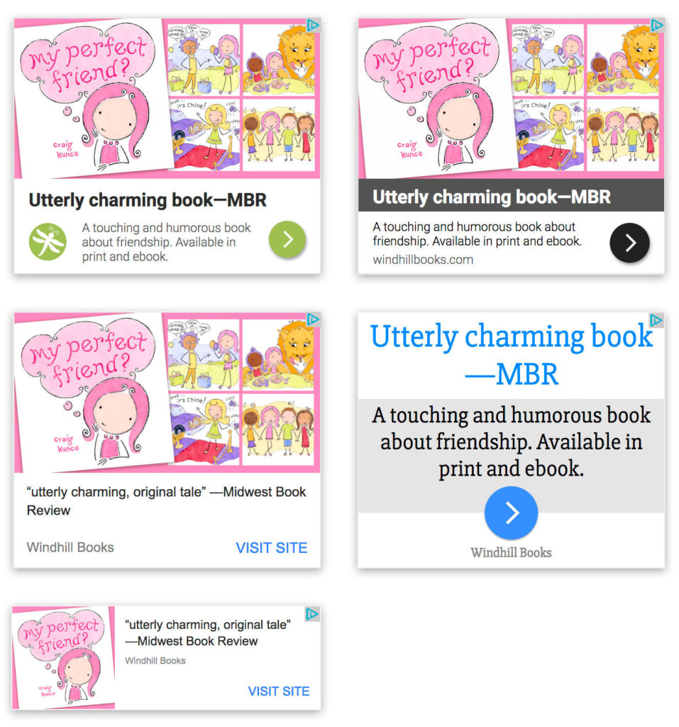
Again, some don’t look the best—they’re text-heavy. But they are all responsive, and they fit what everyone else is doing and getting used to seeing.