Rule of Thirds
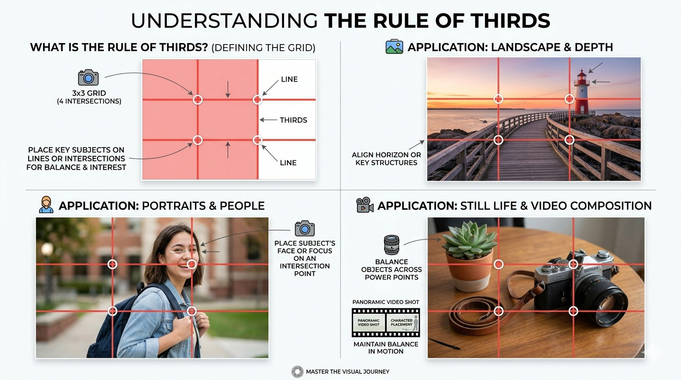
The rule of thirds divides the frame into nine equal sections and places key elements along those lines or intersections. This creates balance and visual interest. Most smartphone cameras include grid overlays to help with this.
However, professional designers also know when to break the rule. Centered compositions can feel bold and modern. Symmetry can feel clean and premium. The goal is not to follow rules blindly but to understand why they work.
Negative Space for Typography Placement
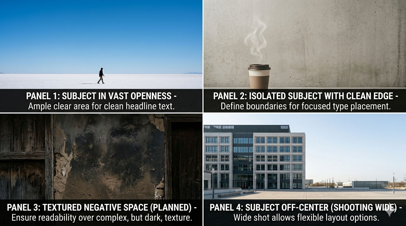
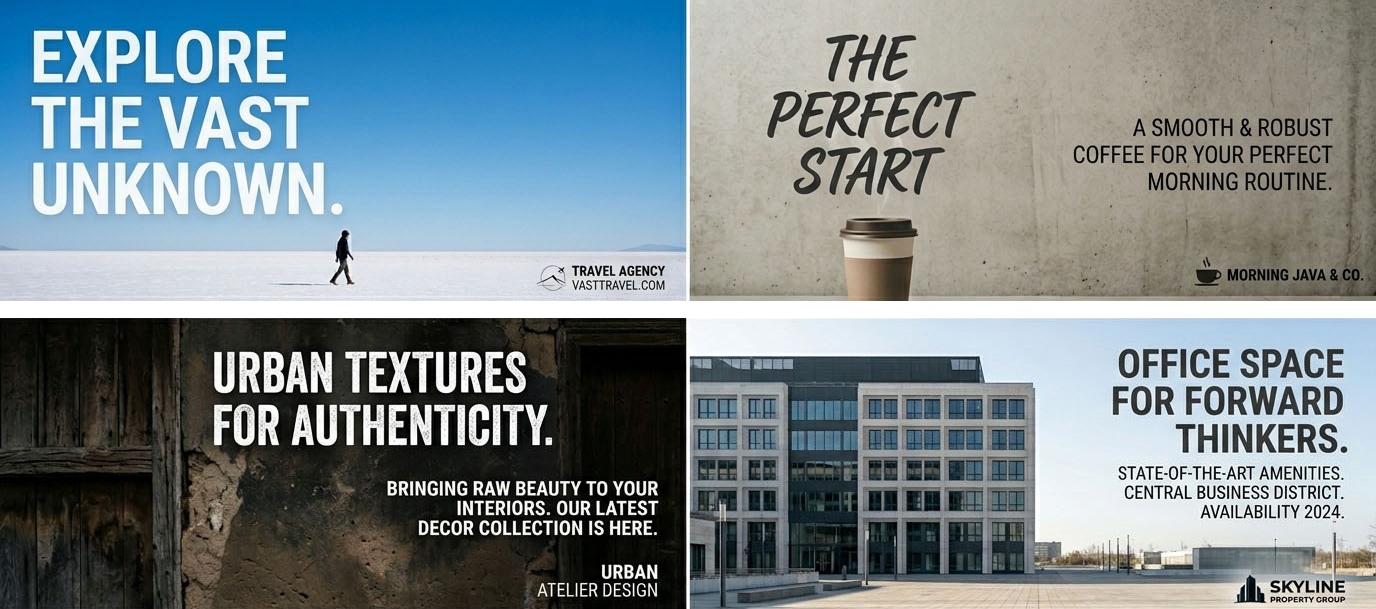
Negative space is the empty area around a subject. In marketing design, this space is valuable because it allows room for text, logos, and call-to-action buttons. If a photo is too busy, adding text later becomes difficult.
Designers think ahead while shooting. They don’t just focus on the subject; they think about layout. Shooting wider or repositioning the subject gives flexibility during layout design.
This is where photography and graphic design intersect.
Leading Lines
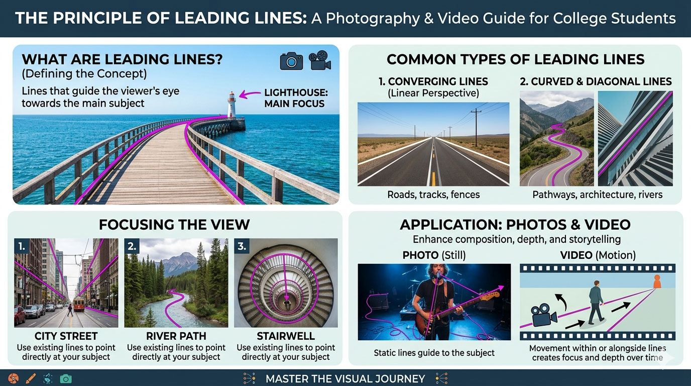
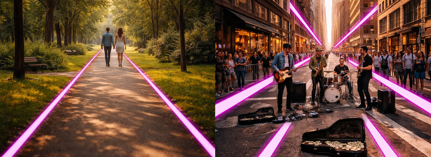
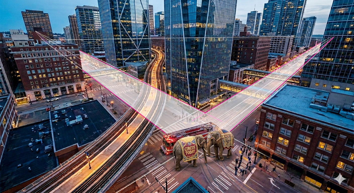
Leading lines are compositional elements in photography and video that guide the viewer’s eye through a frame toward a subject or focal point. These lines can be natural or man-made and often begin near the foreground, drawing attention deeper into the scene to create depth, perspective, and visual flow. When used intentionally, leading lines strengthen storytelling, emphasize hierarchy, and make images feel more dynamic and immersive.
Examples of Leading Lines:
- Beams of light, shadows, or even a person’s gaze pointing toward the main subject
- Roads, railway tracks, sidewalks, or bridges leading toward a subject
- Rivers, shorelines, or rows of trees guide the eye into a landscape
- Staircases, hallways, fences, or architectural columns directing focus
Shooting for Cropping
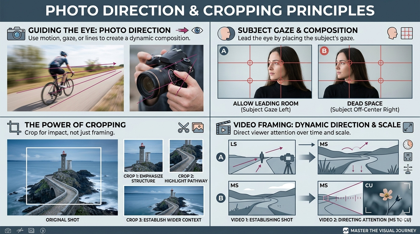
Practice shooting slightly wider than needed. This allows cropping later for different platforms. A horizontal image might later be cropped vertically for Instagram. Shooting wider preserves options.
Professional designers plan for multi-platform use.
Framing (Frame Within a Frame)
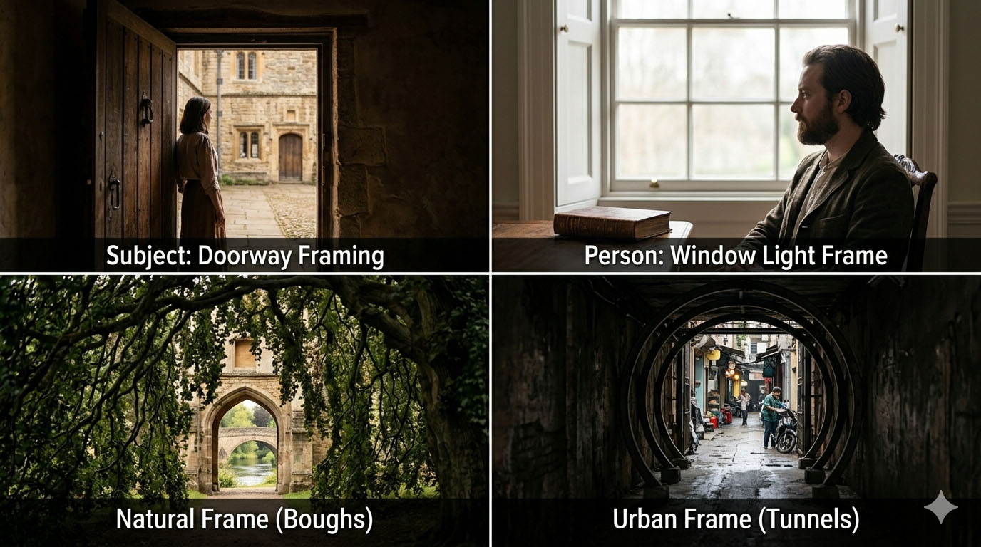
Helps set emphasis, add depth, and tell a story.
Example visuals:
- Subject framed by doorway
- Person framed by window light
- Natural frame (tree branches, archways)
- Urban frame (tunnel opening, alleyway)
Depth of Field (Shallow vs. Deep Focus)
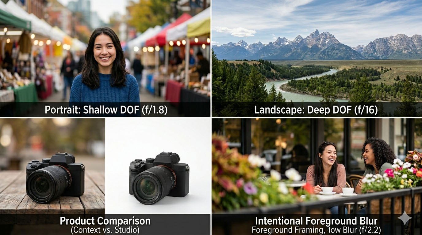
Example Visuals:
- Portrait with blurred background (shallow DOF)
- Landscape fully sharp (deep DOF)
- Product photography comparison
- Foreground blur used intentionally
Symmetry & Patterns
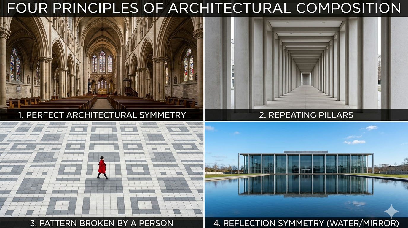
Example visuals:
- Perfect architectural symmetry
- Repeating pillars
- Pattern broken by a person
- Reflection symmetry (water/mirror)
Great for architecture, design, and product photography.
Balance (Symmetrical vs. Asymmetrical)
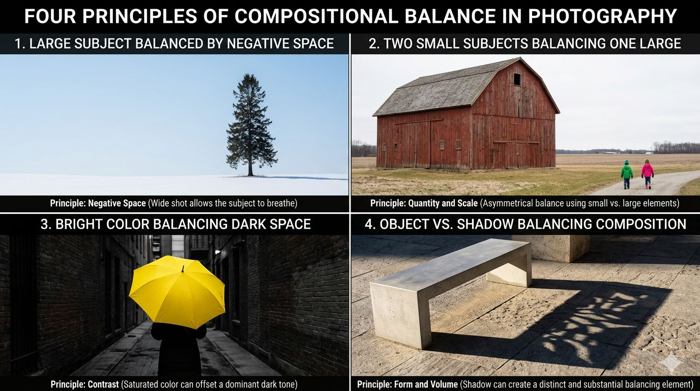
Example visuals:
- Large subject balanced by negative space
- Two small subjects balancing one large
- Bright color balancing dark space
- Object vs. shadow balancing composition
This bridges photography and graphic design.
Perspective & Camera Angle
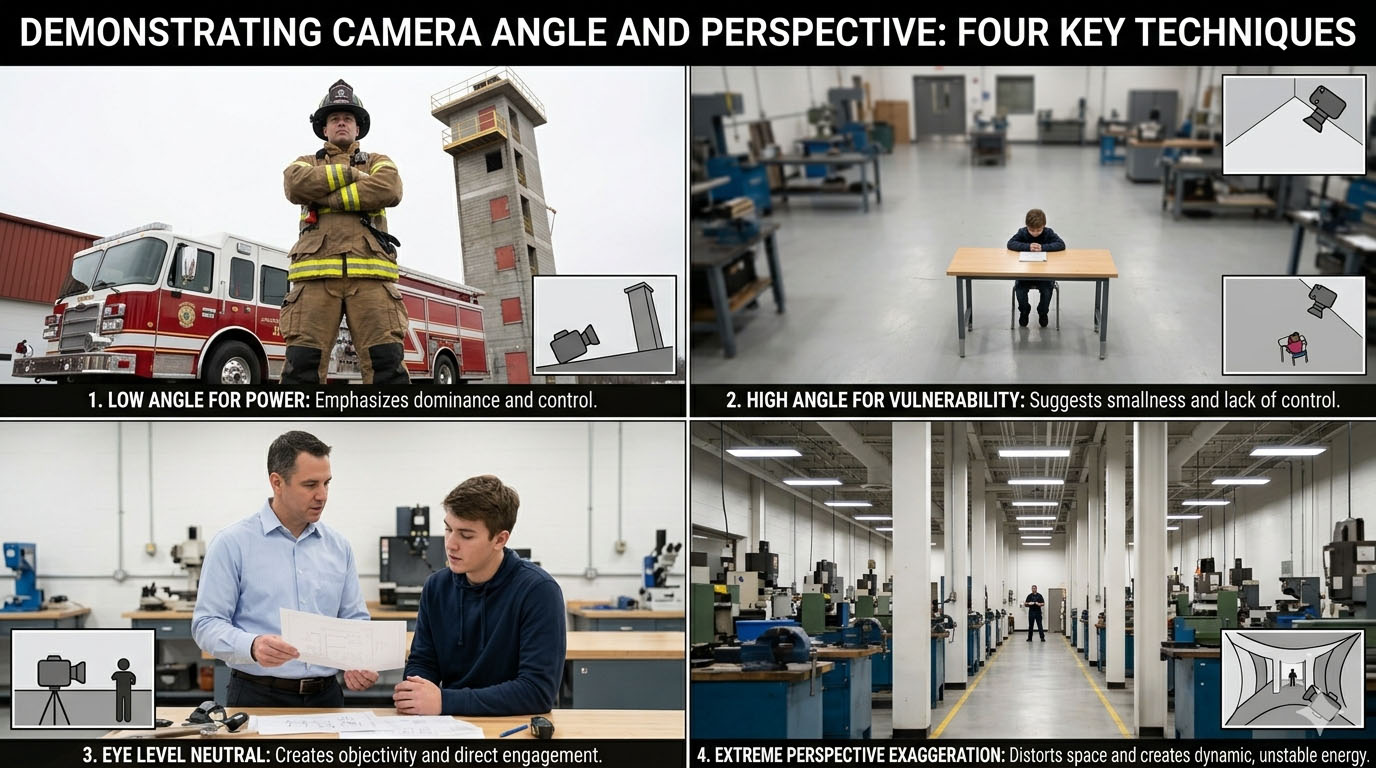
Example visuals:
- Low angle for power
- High angle for vulnerability
- Eye level neutral
- Extreme perspective exaggeration
Negative Space
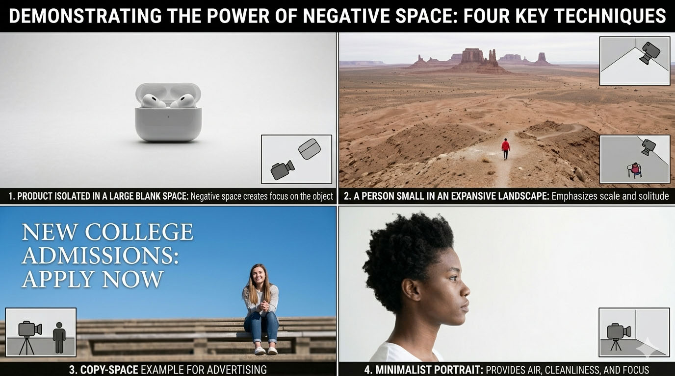
Example visuals:
- Product isolated in a large blank space
- A person small in an expansive landscape
- Copy-space example for advertising
- Minimalist portrait
Color Theory in Photography
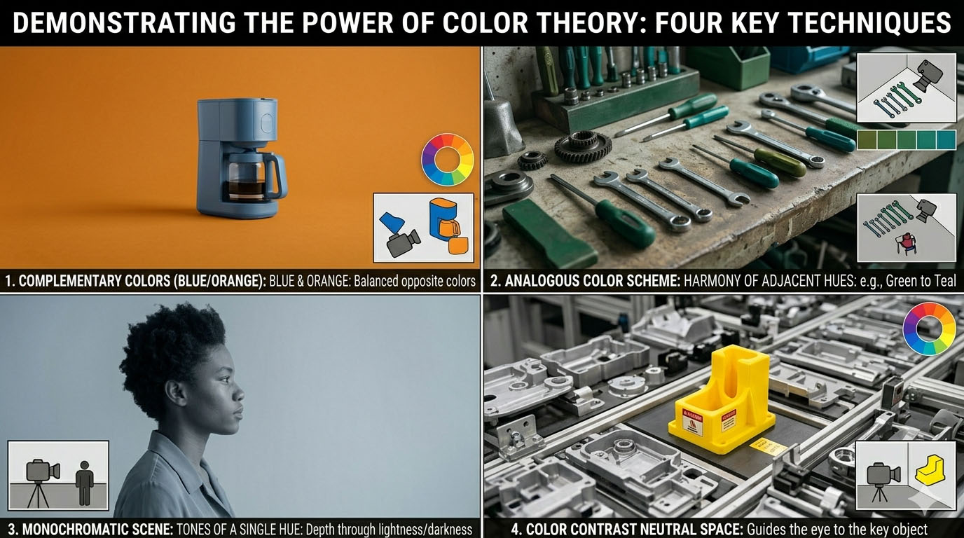
Why designers need this: It connects directly to branding.
Example visuals:
- Complementary colors (blue/orange)
- Analogous color scheme
- Monochromatic scene
- Color contrast guiding attention
Motion & Shutter Speed
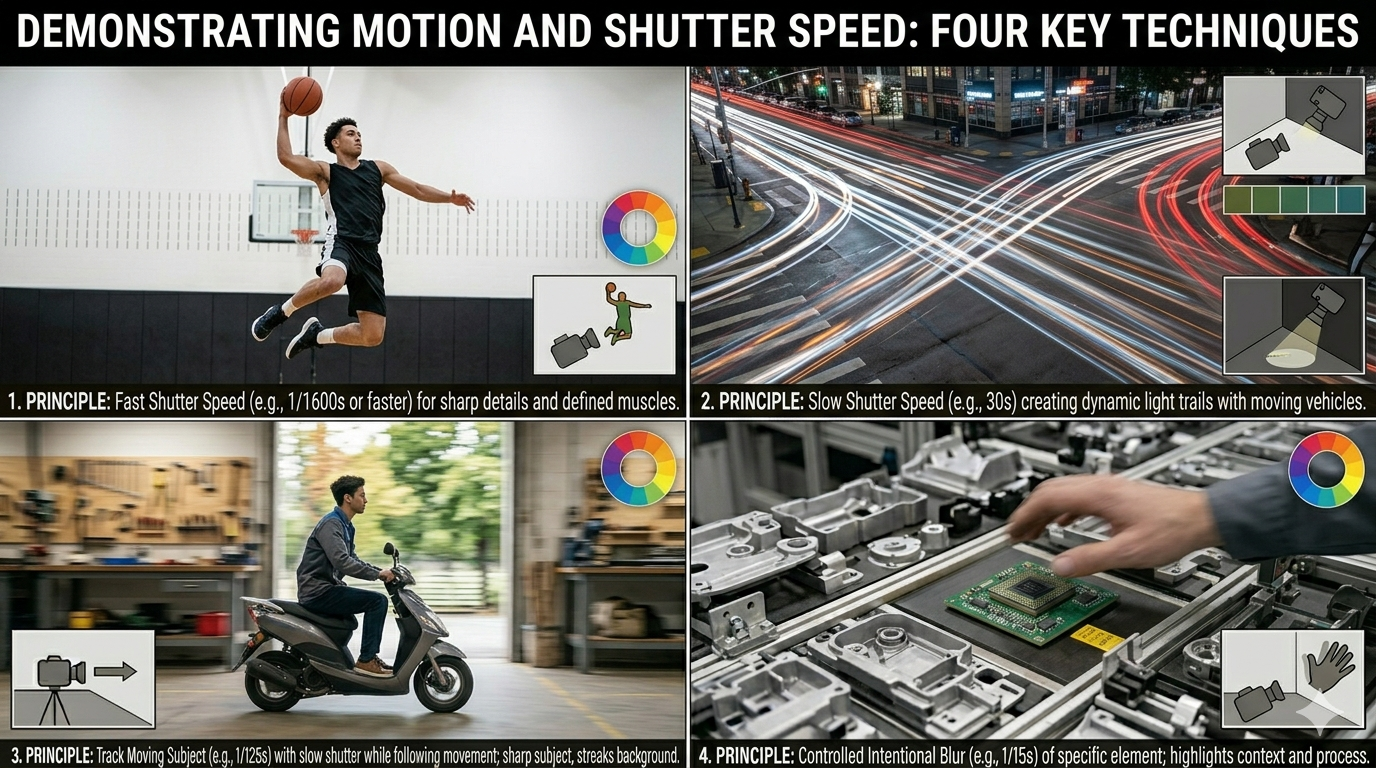
Technical and practical, it shows control of time.
Example visuals:
- Frozen sports action
- Motion blur traffic light trails
- Panning shot
- Intentional subject blur
Visual Hierarchy (Advanced but Powerful)
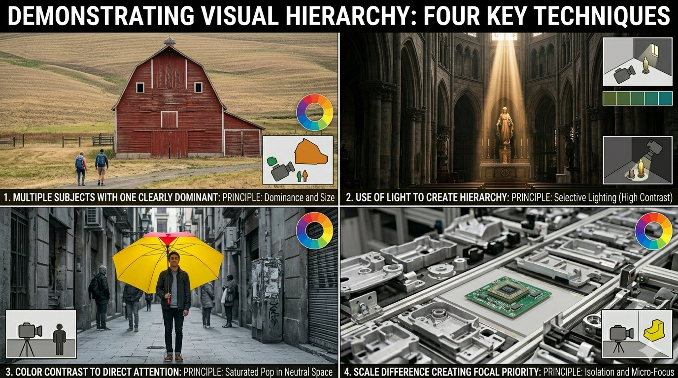
Example visuals:
- Multiple subjects with one clearly dominant
- Use of light to create hierarchy
- Color contrast to direct attention
- Scale difference creating focal priority
This bridges photography and layout design.