A good introduction to layout
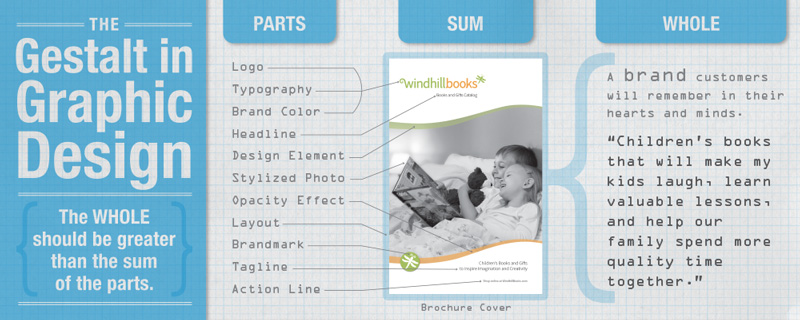
The Gestalt
Gestalt is a psychological concept and word that refers to “shape” or “form” —basically meaning that the “whole” is perceived as being more than the sum of the parts. In graphic design, this means that a logo, brochure, website, or catalog is perceived as being more than just a collection of type, art, paper, layout, etc., it is a branded visual message that carries with it (if done well) an emotional message that connects on a personal level with the intended audience. We don’t just want our viewers to read type and look at photos, we want them to feel our message in their hearts, we want to educate their minds about our product or service, and remember it as something they want or need.
So, this holds true under examination. The logo or catalog is more than its parts—all the parts come together to create a powerful and memorable brand identity that delivers a feeling and emotion in the viewer.
This of the way you feel when you get your favorite catalog in the mail. I remember this feeling as a child when the Sears Wish Book (Christmas catalog) would come each year. It was more than just a collection of toys for sale—it was the warm, childhood-driven, materialistic side of Christmas wrapped up in one big picture book. Oh, the possibilities it promised : )
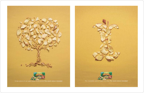
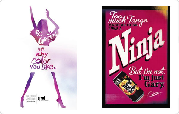
Look at how these advertisements visually deliver the whole before the parts. We, as human beings, want to organize the parts into an organized whole (the faces, jewelry, apple) before we see the parts (words, women, chips).
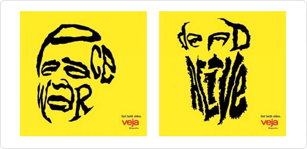
The concept also theorizes that human beings inherently want to make order out of unordered things—organize them—before we try to process them. The graphic design field applies this concept to the study of visually communicating a message to a target audience. This concept is relevant when viewers look at and interact with design work. When designing, consider how your viewer will receive your message—how will they organize the information before they process it? What “whole” will they see first? Which element will they see first? Second? Third? Is your message complex and layered—better delivered in many, smaller, organizable “chunks.” Or is it a simple, straightforward message, better delivered in a single, large, impactful graphic? There is no right or wrong. What matters is that your delivery is appropriate to deliver the message to the target audience.
Layout – Good examples
Here are several examples of good design along with descriptions of what makes them good or bad. Stay away from the bad designs and learn from the good.

How do these logos use different layouts?
Rule of Thirds
This is how visual designers begin to organize content on the “page.”
(Four magic points, and planes, to focus your viewer’s attention)
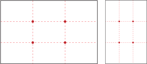
Split your page into thirds, vertically and horizontally. This is asymmetrical design at its best. Your layout will be more interesting and more professional looking. This is also the beginning of designing a page layout with a grid.
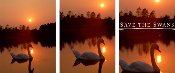
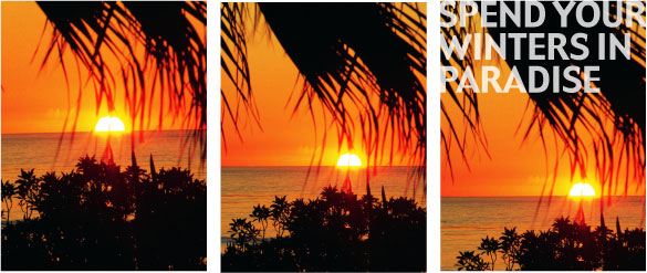
(Left) Centered sunset and horizon is less interesting and less “developed.” (Center) Design is better. (Right) Design is more creative and more “developed.”
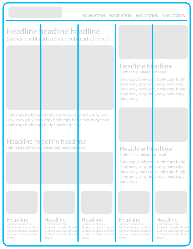
The Grid in Design
The grid is an underlying template that helps you arrange elements on your page. These elements are usually typography with art/photos.
Continuity is a term that refers to a magazine or web site that used the same grid to layout all its pages so they are consistent and look like they go together. When a website used the same grid for all of its pages it helps the viewer know where to look for information. It reduces the work viewers have to do when clicking from page-to-page because they learn to predict where certain information will be found.
Less “developed” designs rely on centered elements and overly simple layouts. These can look less creative and unprofessional.
Use an underlying grid to influence your layout choices
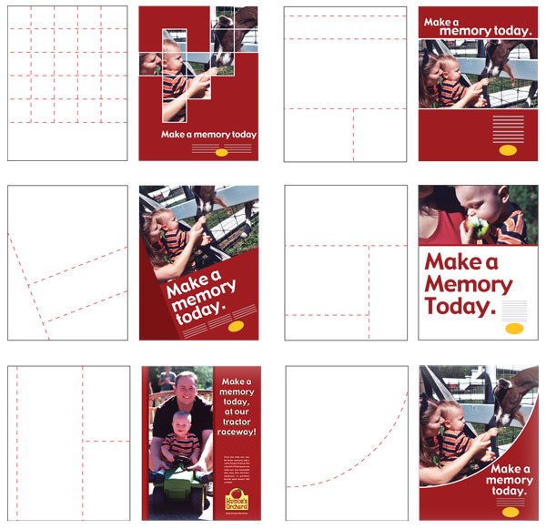
Another example
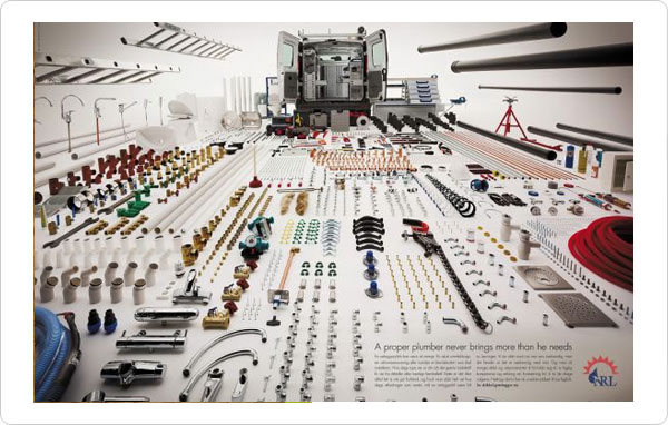
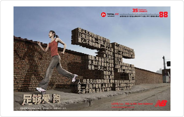
Here are examples of creative grids used to design print advertisements.
Visual Hierarchy
Leading the viewer’s eye through your design (delivering your message visually in small chunks)
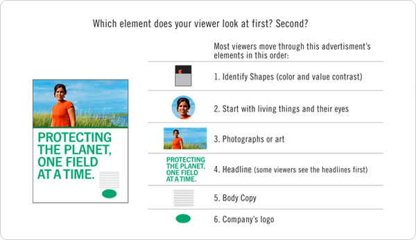
- All designers must lead their viewers through the information on the page.
- Visual Hierarchy is achieved through placement and size of the type and art.
- Our eyes usually start with the largest and most realistic element. (a photo or large illustration, especially living things with eyes)
- We then move through the page looking at elements in decreasing size.
- We also read/view top-left to bottom-right (western world)
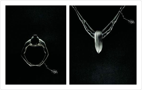
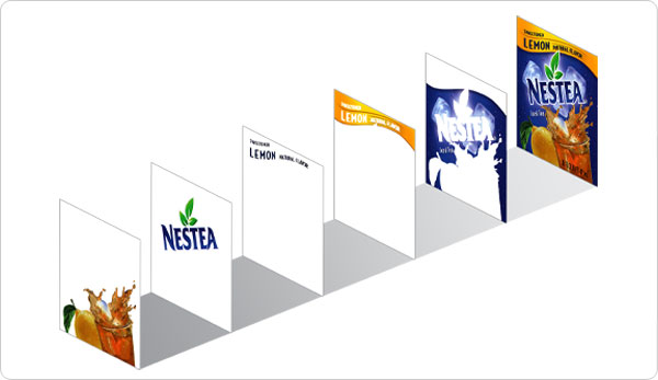
Visual Hierarchy: Depth in Design
As we look at a design, whether it is a logo, packaged product, brochure, or web site, we see certain elements first, second, third, etc. Graphic designers, as visual communicators and “message-deliverers” use this knowledge to their benefit. We can lead the viewer’s eyes through our design work by adjusting and altering the elements, making sure the viewer sees what we want them to see first, second, third, etc.
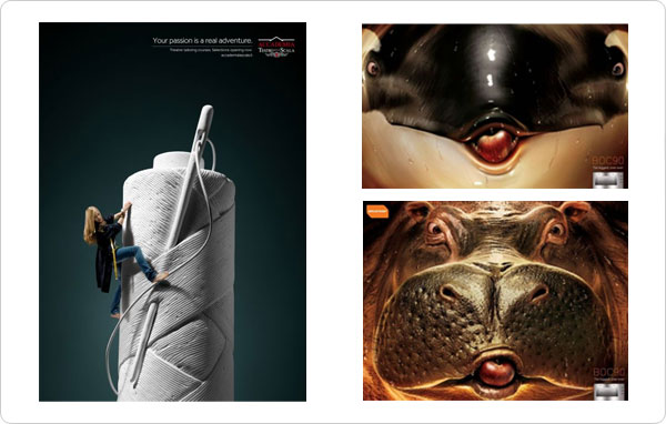
Here is an example of how designers have used depth in design to lead the viewer’s eyes.
Layout Styles
Many things can be used to influence your page/screen/packaging layout. Here are just a few:
Perspective
Mondrian
Scale (exaggerated)
Type Heavy
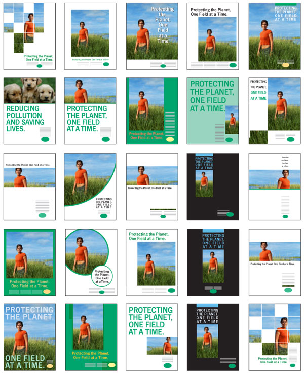
Single-Page Advertisement
Here are twenty-eight concepts for a single-page ad using the same four elements
(headline, photo, body copy, logo)