Overview
The bi-fold brochure is a creative way for businesses and organizations to showcase their products and services. It is compact, easy to carry, easy to print, and shares a lot of information.
A good brochure utilizes an even combination of brand elements, text, photos, and art to convey its message to its audience.
Grading Checklist
- Design one bi-fold brochure
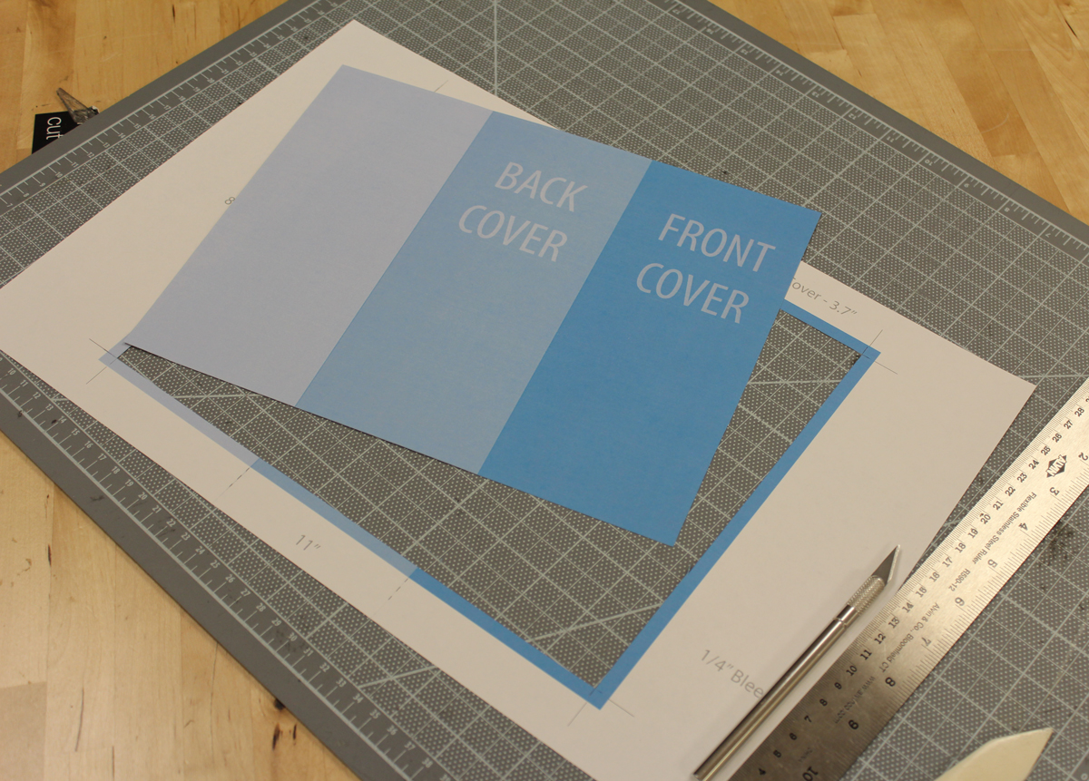
- Size: Use the template below (8.5″ x 5″, CMYK, 300
ppi ) - Software: Adobe Illustrator
- Use the client (Marie’s Floral) on the downloaded template (below) and start designing immediately
- Or choose a client from my Client List
- Or choose your own topic and client (can be made up or a real company/organization)
- Focus on 3–5 related bits of information (not too much)
- Only use 1–2 typefaces
- Choose a typeface that offers several weights so you can differentiate your look
- Create a color scheme with 3–5 colors
- Deliver your facts in small chunks (Photo with a headline and paragraph, Photo with a headline and paragraph, etc.)
- Use a contemporary design (see examples on this page)
- Use stock photos or illustrations from unsplash.com, pexels.com, or pixabay.com. Or use your own if they’re good.
- Participate in critiques
Design a bi-fold brochure for this client: Marie’s Floral
Download this project folder and start designing immediately. I have all the design elements you need: logo, photos, and marketing copy (text). This is like a real design job where you get a lot of brand assets, but you still get some creative control by choosing the typefaces, colors, style, and overall design layout.
Remember, you can still change whatever you want on the Marie’s Floral project. Use what you want and change what you want. These brand asset project folders are meant to get you started designing and get your ideas flowing—you do the rest.
Marie’s Floral
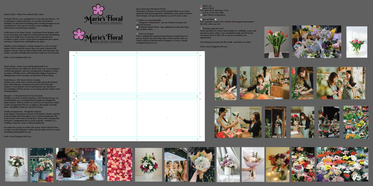
Download: Bi-Fold Brochure – Template and Brand Assets Project Folder.zip
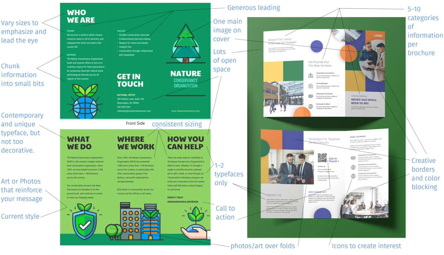
Brochure Best Practices
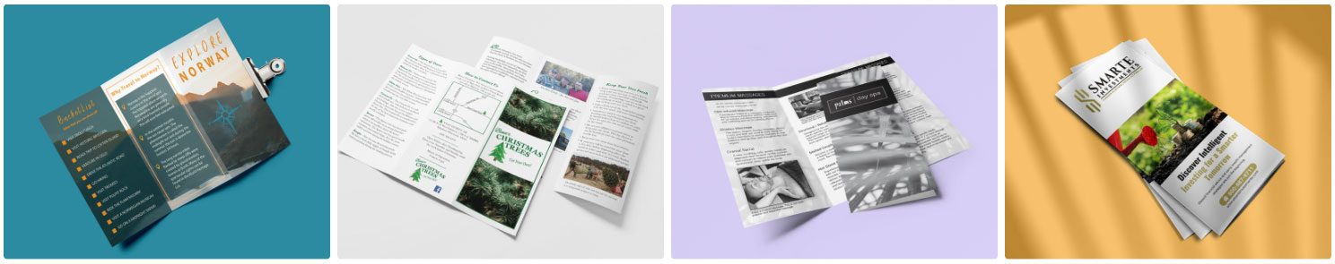
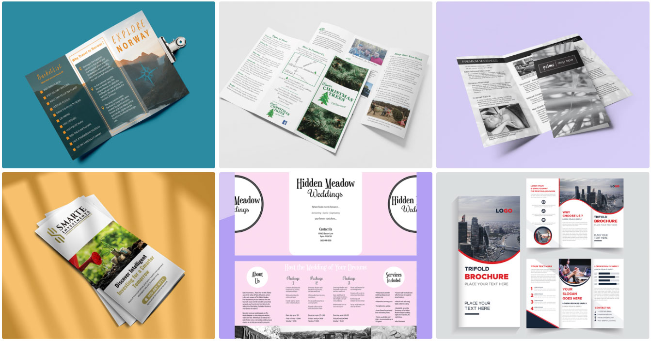
Here are several important considerations while designing your brochure. Be sure to review the helpful examples on this page, too. They will offer you new ideas and inspire you to think in new ways while designing your brochure.
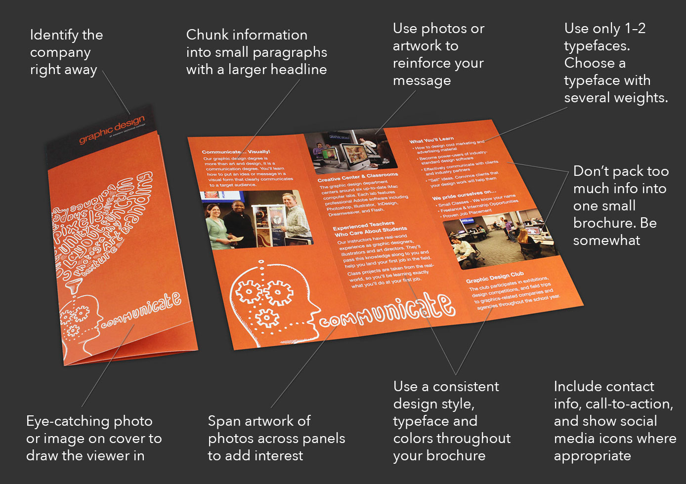
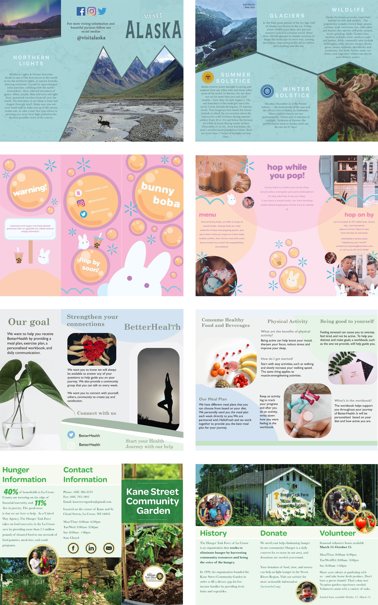
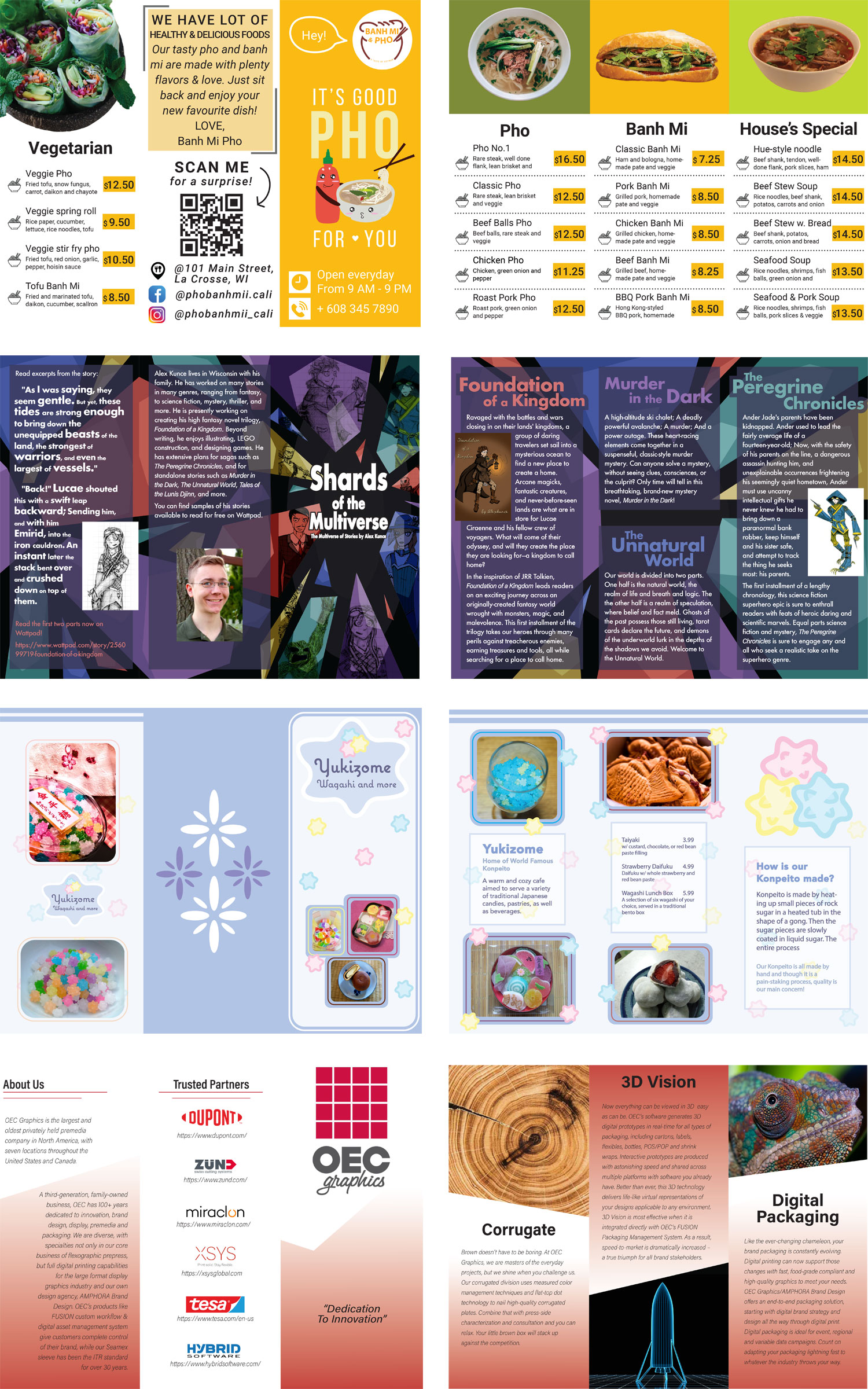
Student examples to inspire you
Industry examples to inspire you
Once done designing, print your brochure or make a digital mock up
Print your Brochure at Western’s Creative Center
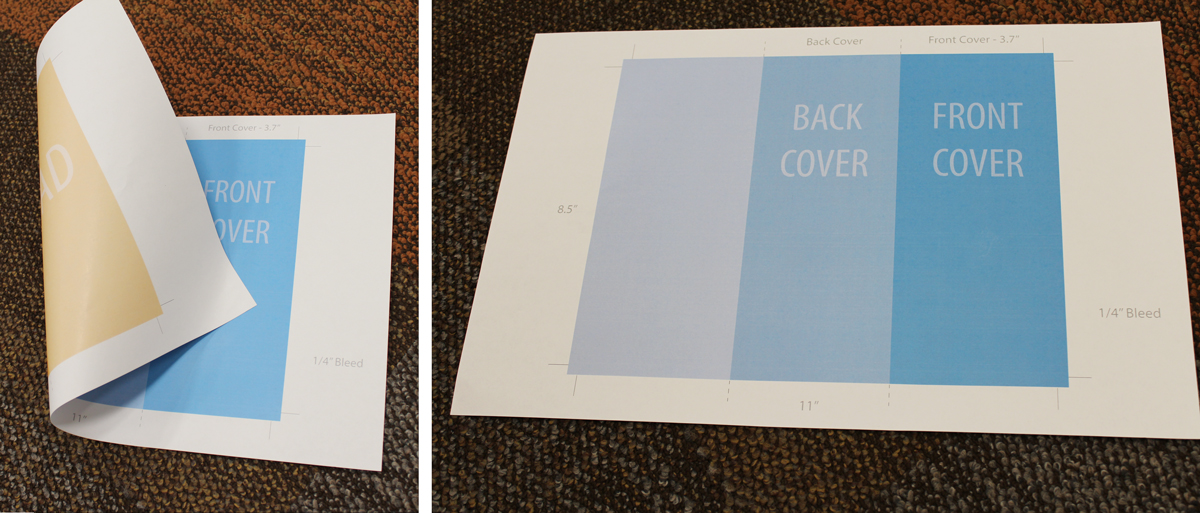
(This shows a tri-fold brochure, but the process and steps are the same.)
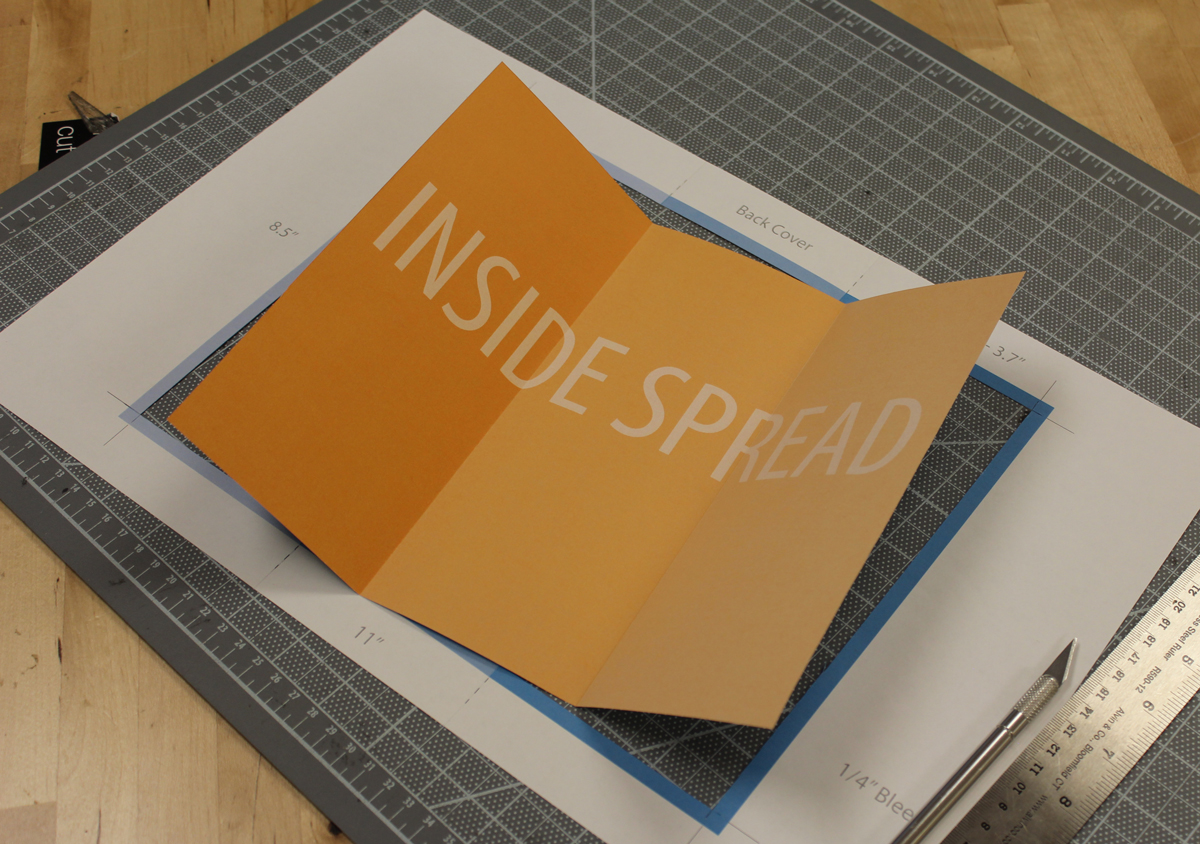
Print your brochure to 11×17″, 2-sided. I’d suggest you do this for your critiques too. That way you and your evaluators can see the real thing. You’ll see how your content works with your panels, folds, and bleeds.
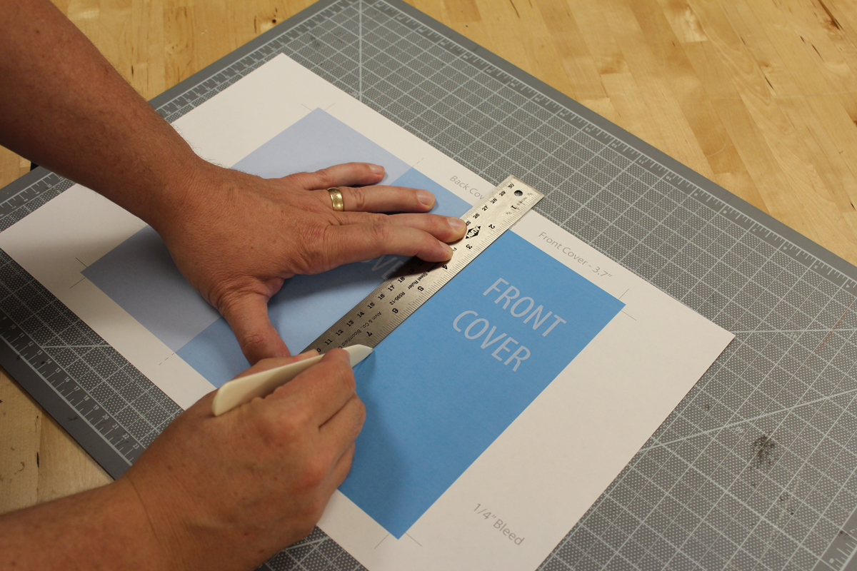
Score your folds
Score a crease into your brochure folds with a bone folder and ruler. Don’t push too hard, just enough to dent the paper and slightly bend the fibers. Always score paper on the top of the fold. This stretches the fibers and prepares them to be folded the other way with minimal ink or toner cracking.
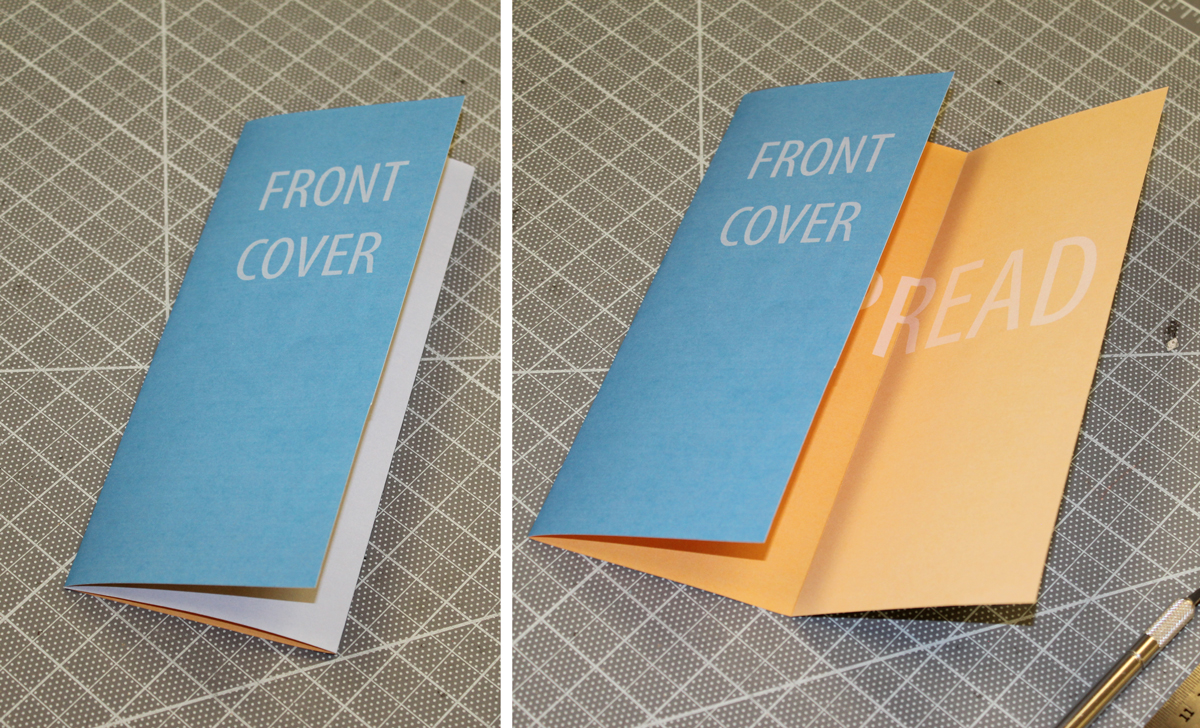
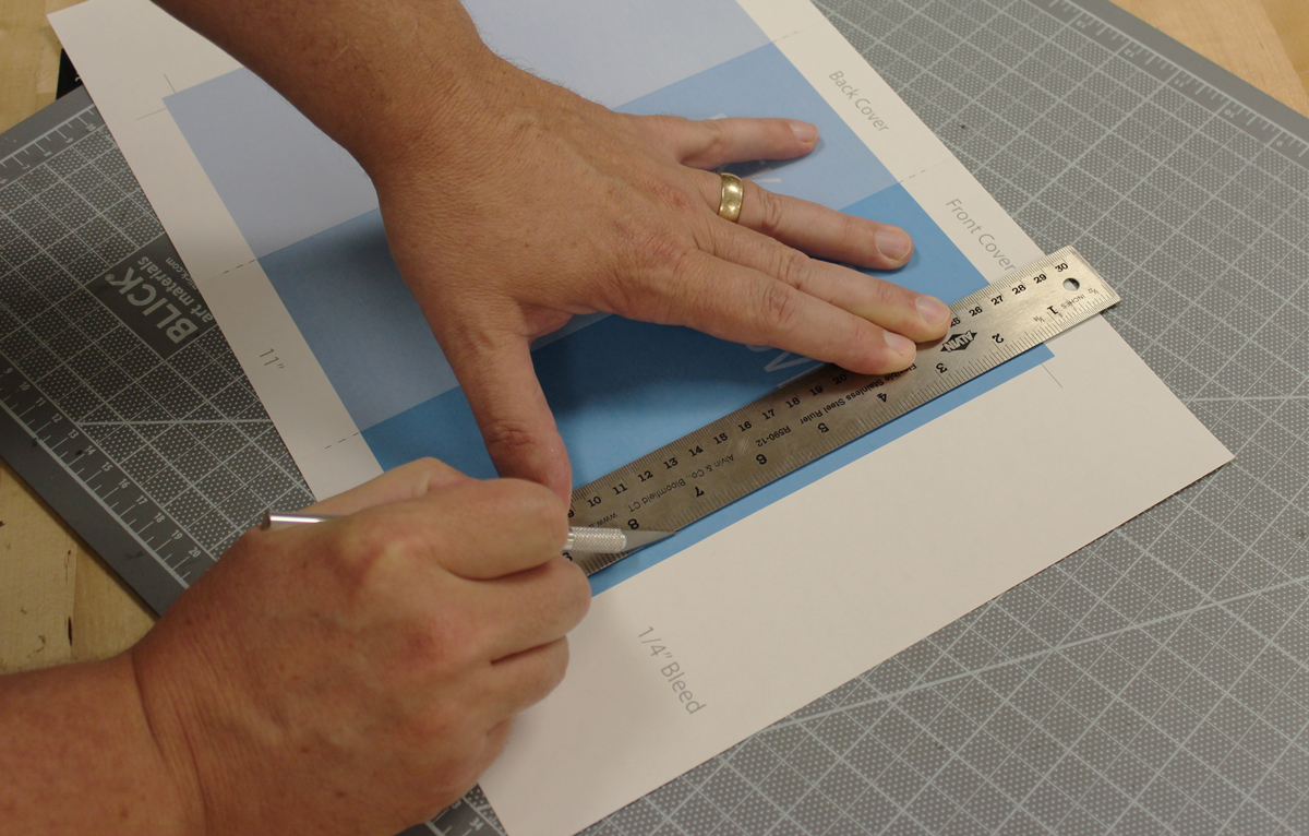
Cut it out with a scissors or Xacto knife
Fold it, and you’re done.