Behance is an excellent place to showcase your skills to potential employers. Creative professionals widely use it, and it has a job board and a social media component.
Getting to show off your work to fellow designers and have them appreciate it is an added benefit.
Like LinkedIn, Behance provides an incredibly easy and efficient way to build a valuable professional network. It offers many options for job seekers that you should take advantage of. Follow me on Behance and review my account and profile to get an idea of how I use it to showcase my work. Behance has many helpful tools to help you impress a potential employer with your amazing design work.
Grading Checklist
- For Portfolio class you only need to show me five Behance pages.
- Create your own online graduate portfolio with Behance with examples of your best work.
- Behance prefers images at least 1400 pixels wide
- Design each page following the example layouts below
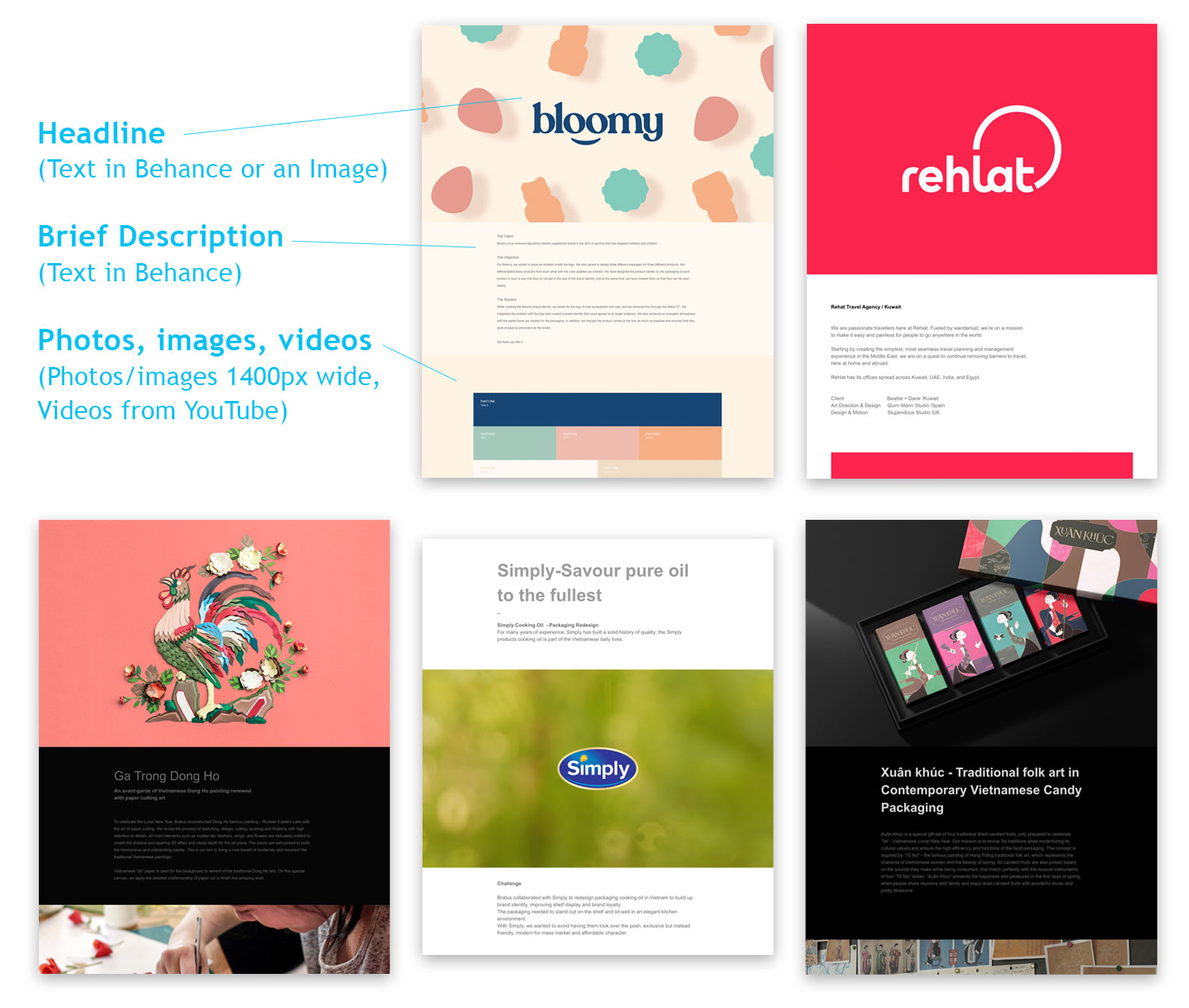
- Each page should have a title, a short description, and images
- Design each page with a somewhat similar layout, so they all go together (see below for examples)
- On 1–2 projects, show some sketches or developmental work
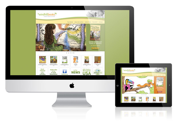
- Create mock-ups of your work to show it in the real world (https://graphicburger.com)
- Create cover images for each project
(Behance prefers cover images that are 808 x 632 pixels) I made my cover images in Photoshop and saved them for the web and devices as a PNG. - Profile picture/image size: 1080×1080 pixels
- Banner image size: 3200 x 410 pixels
- Participate in critiques
- Present your portfolio to the class
Create your Behance page layouts using your 17″ x 11″ page designs
You can save your artboards as PNGs (1400 pixels wide, 150ppi resolution) and upload them to Behance to create your page. I created the top title and paragraph myself with text inside Behance. I sampled the background from one of the images below it to match.
It looks like this:
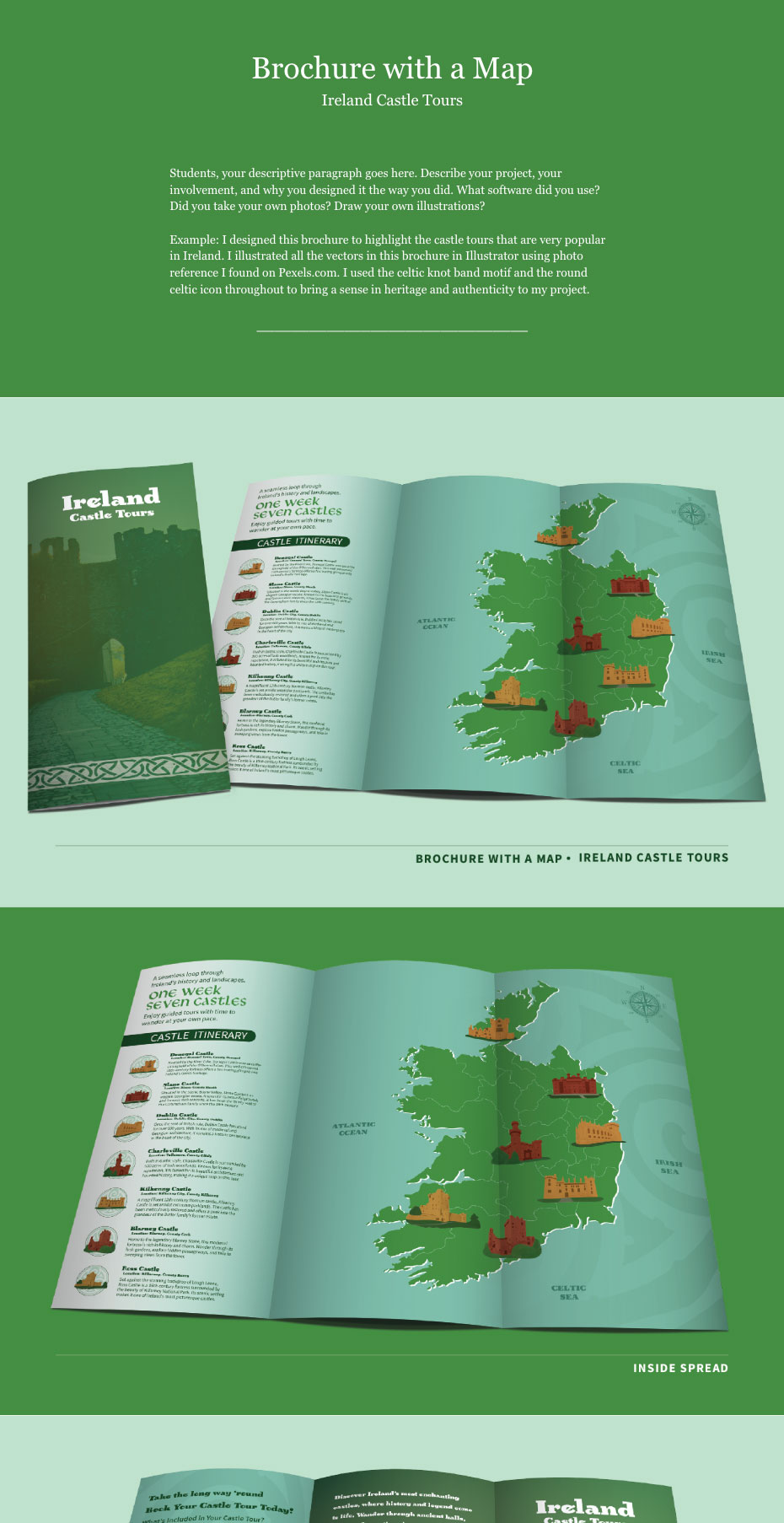
See the full Behance page here: https://www.behance.net/gallery/193641391/Basic-Behance-Portfolio-Layout
Save your designs as artboards from Illustrator
In Illustrator: File > Export > Export for Screens
(PNG, 1400 pixels wide, 150 ppi)

Then simply upload these into your Behance page and arrange them as you want.
Simple Page Layouts created in Behance (another option)
You can also design directly in Behance using your own images and designs.
It looks like this:

See the entire layout: https://www.behance.net/gallery/234923981/Brand-Identity-Signage-and-Animation
Examples of Simple Behance Page Layouts
How To Transfer your School Behance account to your Personal Behance Account
In order to continue using your Behance portfolio after you leave school, follow the steps below.
(Note: If you build your Behance page in your personal Adobe account, you don’t need to change anything.)
- Create a personal Adobe Behance account
- Follow these steps: https://help.behance.net/hc/en-us/articles/18318706310555-Guide-Adobe-ID-Management-Migrating-from-Business-Profiles-to-Personal-Profiles
Behance at-a-glance
Cover Images
My Behance homepage cover images follow a consistent design to unify all my projects. This is just one way to do it. And, looking through the many examples of portfolios on Behance, there really is no wrong way. Below, you’ll see some people have matching cover images, but most don’t. It’s up to you.


Behance Portfolio Page Layout – Industry Examples
Here are several examples of page layouts to inspire you.
https://www.behance.net/collection/193404715/Behance-Portfolio-Page-Layout

Student Behance Portfolios
Here are several student Behance portfolios from last year’s graphic design graduates:
https://www.behance.net/gallery/94564431/Graduate-Portfolios
Gif animation made in Photoshop for Behance
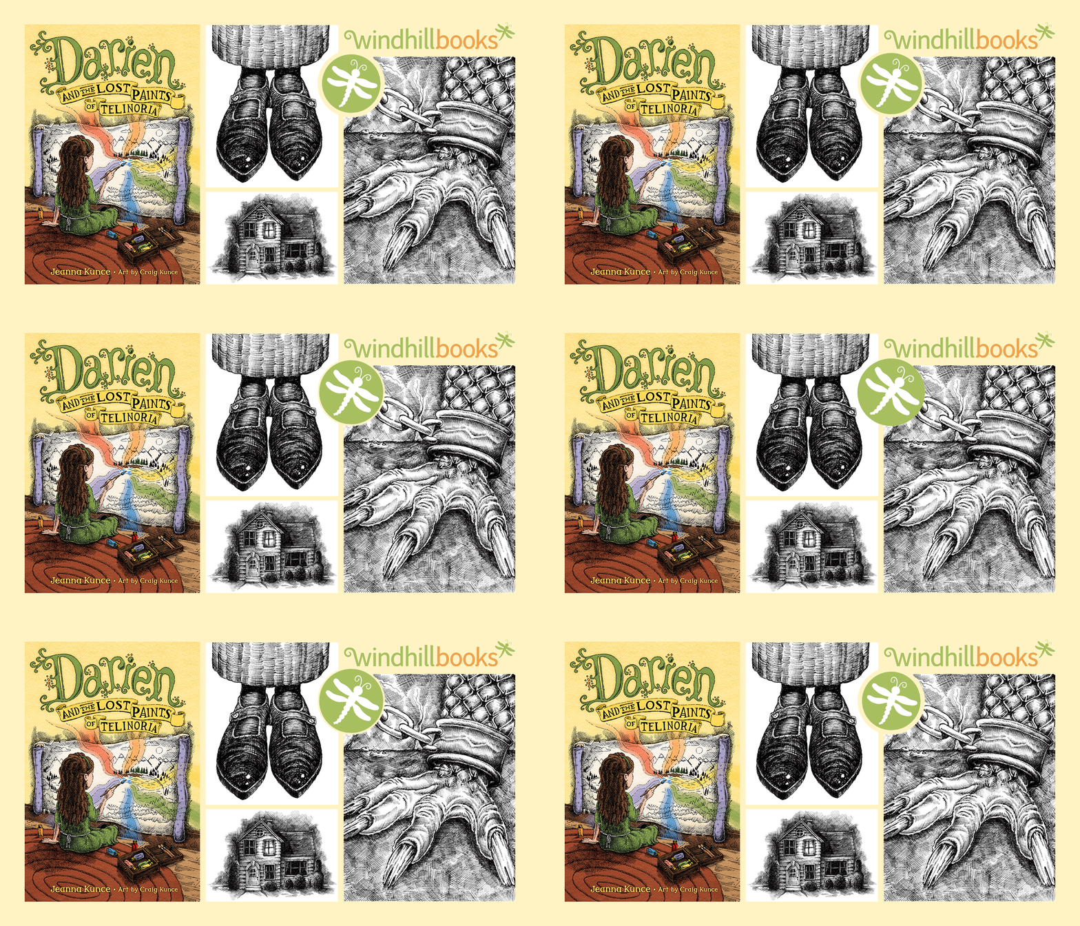
Here’s a GIF animation I made for my Behance portfolio. It’s 1400 pixels wide to fit perfectly into Behance’s full-width viewing area. My Photoshop file was 300ppi, RGB, 1400 x 800 pixels.
Here’s how it looks on my Behance page
And here’s a tutorial showing how I made it:
(6:54)
Mockups – Free
Templates and photos to mock up your websites, tablets, and phones here: (https://www.fusionplate.com, https://graphicburger.com)
A Good Behance Portfolio
Here are a few best practices to follow when creating and maintaining your online portfolio. Take the time to invest in your portfolio–It will help land you your first job!
Browse Behance and look at a few portfolios. Review them, critique them, and discover what a great online portfolio looks like.
A strong Behance portfolio has:
- 10–15 samples of your best design work
- Updated often
- Show a variety of skills and projects
- Don’t have too many projects. It shouldn’t be a dumping ground for everything you’ve ever drawn or designed.
- Quality images, or quality photos of your work on display
- Show “big picture” and “small picture” examples (show closeups and details)
- Show your process (thumbnails, developmental sketches, wireframe previews, etc.) Let them see “under the hood.”
- A thorough yet succinct description of your projects
• Inject a little personality into your writing
• Tell a bit about yourself and your career goals
• What are you passionate about and excited about? - An enticing cover page (on the homepage)
- I made my images RGB, PNG, or JPEG, high quality, 1400 pixels wide
Presenting your Work on Behance
There are many creative and impressive ways to present your work to viewers on Behance. I created a Behance collection of interesting ways other designers have presented their work. (You can view it here)
Here are a few examples of styles that are interesting and popular:
Take actual photos of your mocked-up pieces or download mockup images from the web. Graphicburger.com is a good place to start. Google more.

Add a textured background to create interest

Create a unique method to display your piece. This can also help show the size of your piece.

Try to place your marketing material in its real-life setting.
Clients may have a difficult time visualizing how your marketing material will look when in use.
