Overview
For this design
A logo is one of the most important visual elements of a business or organization’s marketing and branding efforts. It serves as the face of a company, product, or organization and helps build recognition, convey personality, and connection with the intended audience.
A successful logo is more than just an attractive graphic—it should clearly represent the brand message, reflect the organization’s values, and be memorable to the people/customers it is designed to reach.
Grading Checklist
- Create two final logo concepts for your client
(You’ll choose one for your final, and this one will also be used to help create your brand guidelines page) - Use Adobe Illustrator (vector drawing)
- Use copyright-free typography (fontsquirrel.com) or typefaces that come on your computer.
- Participate in presentations and critiques
Choose the Right Type of Logo
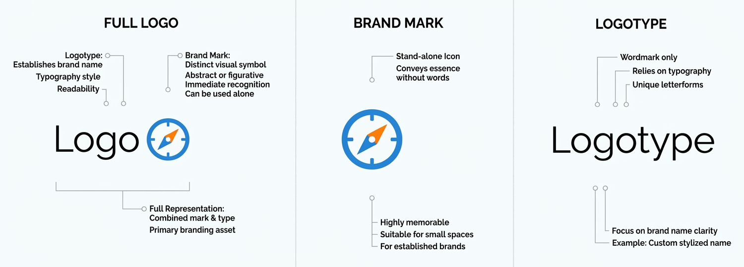
Full Logo: Logo with Icon + Words
- Combines a symbol and a brand name.
- Helps people connect the symbol with the company name.
Brand mark (Symbol Only)
- Uses only a recognizable symbol or icon.
- Works best when the symbol is simple and memorable.
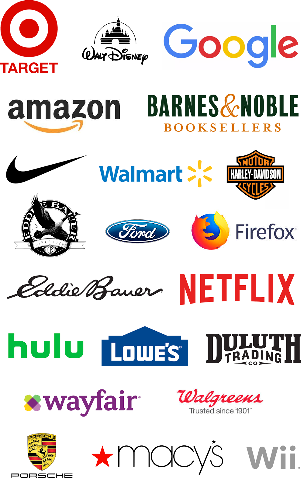
- Examples: Nike swoosh, Target bullseye.
Logotype (Wordmark)
- Uses only the company name.
- Relies on typography to create recognition.
- Examples: Walmart, Eddie Bauer.
Logo Design Best Practices
A logo is the face of a brand. Its job is to help people quickly recognize a company, product, organization, or service and understand what it represents.
Before You Design
- Learn about the brand first. What 2–3 words do you want your audience to “get” from the logo?
- Understand the target audience.
- Know the brand’s personality (fun, professional, luxurious, rugged, friendly, etc.).
- Think about what message the logo should communicate. Can you narrow this down to 2–3 words that your logo communicates?
Keep It Simple
- Use only the elements that are necessary.
- Avoid too many details, effects, or decorations.
- Simple logos are easier to recognize and remember.
Make It Relevant
- The logo should fit the brand and its audience.
- Colors, shapes, and typography should support the brand message.
- Ask yourself: “Does this logo look like it belongs to this brand?”
Make It Memorable
- Create something distinctive that people can easily recognize.
- Avoid copying trends or other companies’ logos.
- Aim for a clear visual idea that stands out.
Make It Easy to Read
- If the logo includes words, they should be readable at different sizes.
- Choose fonts that match the brand personality.
- Don’t stretch, distort, or over-decorate type.
Design for Different Sizes
- The logo should work on a business card, website, social media profile, sign, or billboard.
- Make sure details don’t disappear when the logo is reduced in size.
Make It Work in Black and White
- A strong logo should still work without color.
- Test your logo in black, white, and grayscale.
- If it only works because of color, the design may need improvement.
Use Appropriate Colors
- Colors should support the brand message.
- Limit the number of colors to 1–2.
- Consider how colors make people feel and what they communicate.
- Make sure a color isn’t already in use by a close competitor.
Test Your Design
Ask these questions:
- Does it fit the brand?
- Does it appeal to the target audience?
- Is it easy to recognize?
- Is it easy to read?
- Does it work in color and black-and-white?
- Does it still work when it’s very small?
- Would someone remember it after seeing it briefly?
Remember
A good logo is not just something that looks cool. A good logo clearly communicates the brand’s message to the right audience and helps people remember the brand.
When designing your logo, keep the focus on communication rather than artistic expression. This helps you make stronger logo decisions. It’s not a piece of art; it’s a communication device.
A logo’s job is not to tell the whole story. Its job is to identify the brand and support the brand message.
Don’t try to cram every product, service, and idea into a logo. A logo is an identifier—not an advertisement or commercial. This usually leads to cleaner, more effective logo designs.
The 7-Second Logo Test
If someone sees the logo for only a few seconds, can they:
- Recognize it easily?
- Read it easily (if it includes text)?
- Understand the brand personality?
- Remember something about it later?
- Distinguish it from competitors?
If the answer is “yes” to most of these questions, the logo is probably doing its job.
Developing a logo – Student work
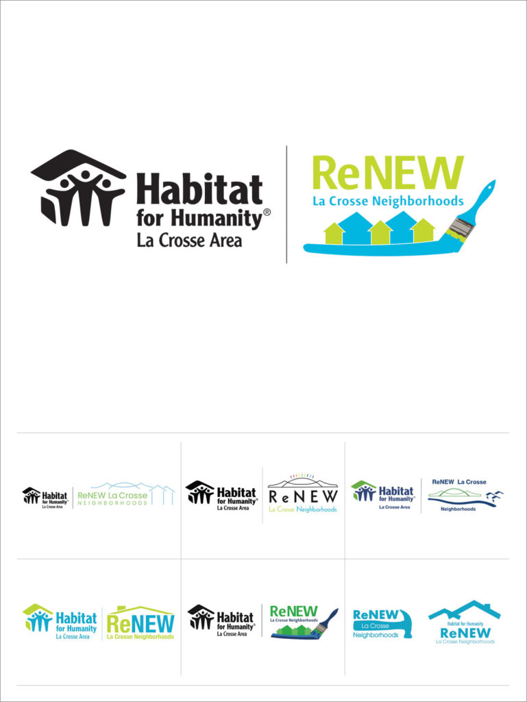
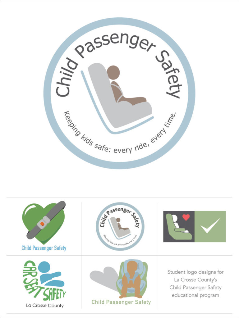
My student, Simon, allowed me to use his logo developmental work to inspire future students. He did a nice job nurturing this logo to an impressive final result. This was for a real client.
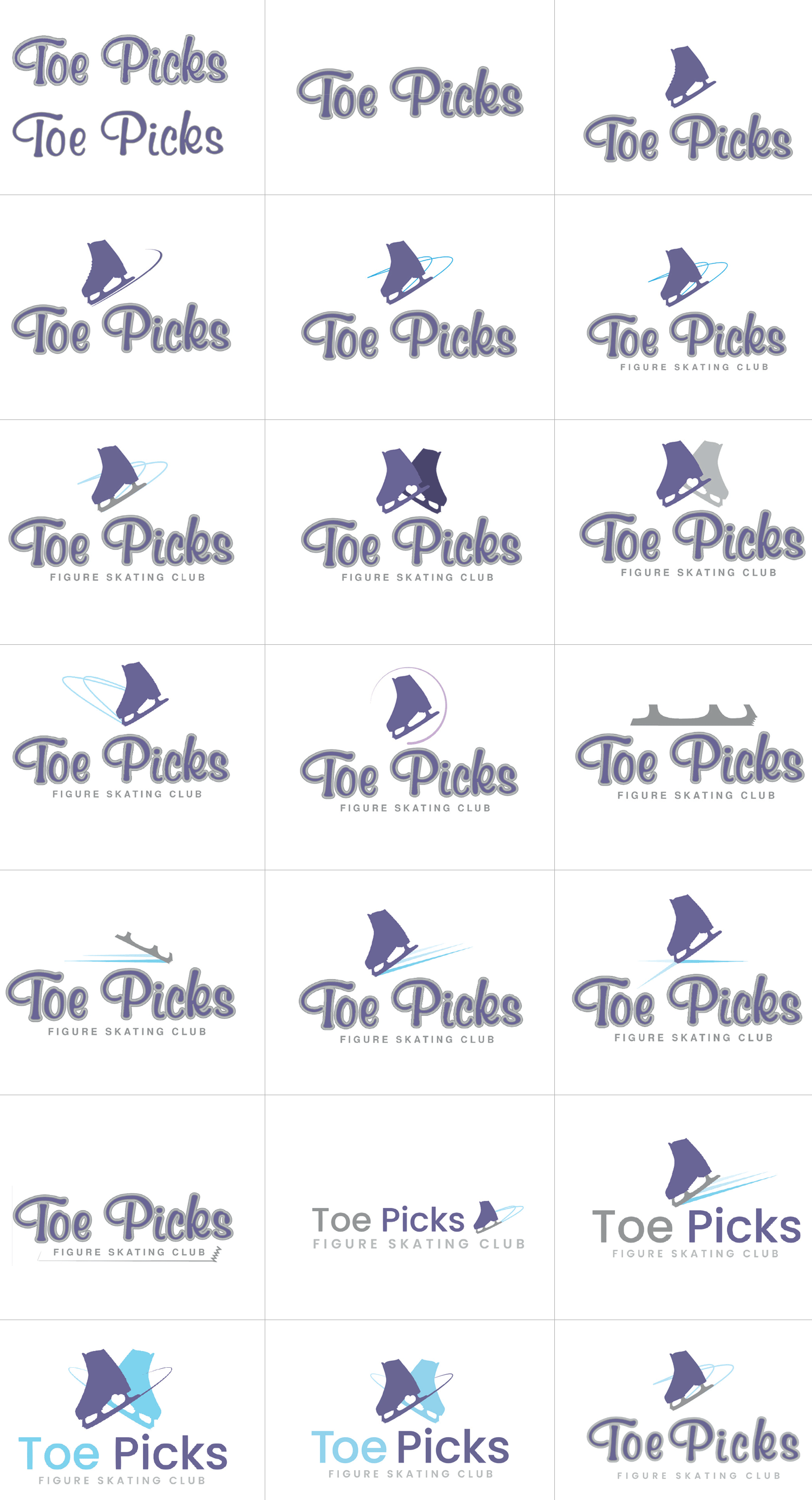
These are the final two logos he presented to the client. It’s a good idea to present at least two final ideas to a client. It’s also a good idea to show a color and black and white version.
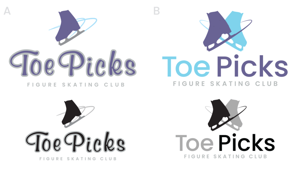
Student Logo Examples

Industry Logo Examples
These are here to help you study and be inspired by different types of logos.
In your opinion, do they pass the 7-second test?