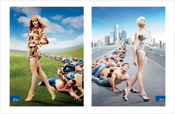
Rhythm helps move the viewer’s eye through a layout, directly or subtly. It is also called visual hierarchy because it shows the viewer what to view first, second, third, etc.
- Rhythm is usually created by repeating an element and possibly changing it slightly.
- Rhythm helps deliver the message by controlling the viewer’s eye movement.
- It can also add “life” and interaction to an otherwise inanimate page layout.
Rhythm and movement through repetition, sequential placement, and perspective (Selling Zu shoes)

Rhythm and movement through shape, repetition, and sequential placement
(Anti-drug campaign)

