Let’s begin with this helpful video that explains how images help communicate our messages
Photo and Video Direction and Cropping
I challenge you to refrain from using stock photography in its original form. Unless you have hired a photographer and personally directed the photoshoot, I would suggest carefully analyzing your photographs to see how they can be cropped to best fit your needs.
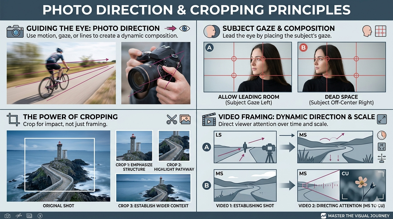
LS (Long Shot): Also known as a Wide Shot. This framing shows the entire subject from head to toe, while also giving a significant amount of the surrounding environment. It is typically used as an “establishing shot” to show where the action is taking place.
MS (Medium Shot): This is the most common shot in film and television. It typically frames a person from the waist up. It’s tight enough to show the subject’s expressions but wide enough to show their body language and some of the background.
CU (Close-Up): As seen in the bottom right of your infographic, this fills the frame with a specific part of the subject, such as a person’s face or a flower. It is used to emphasize emotion or important details.
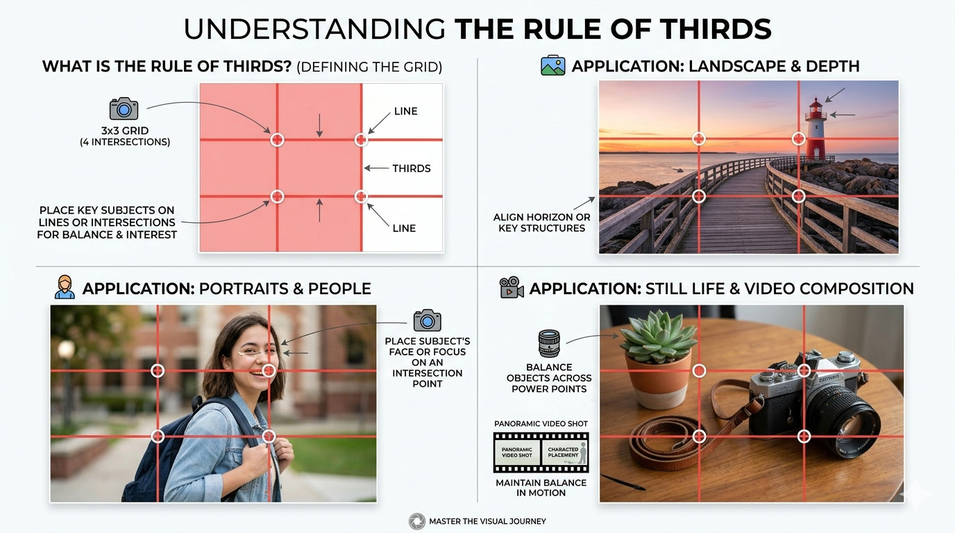
Rule of Thirds in Photography, Video, 3D Spaces, and Virtual Reality
Below are examples of a stock photograph and how it can be resized and cropped to change its impact on your layout and design. Changes include:
- Moving an element to the front by slightly cropping its edges
- De-cluttering a busy background by enlarging the photo and cropping out extra elements
- Creating a more emphasized and abstract shape to grab the reader’s eye and attention
- Moving or changing the emphasis of the primary element (or other elements)
- Adjusting the visual hierarchy of your elements
- Changing the “white space” available to place your other design elements (headline, copy, art, logos, etc.)
- Adjusting your photo to utilize the “Rule of Thirds.”
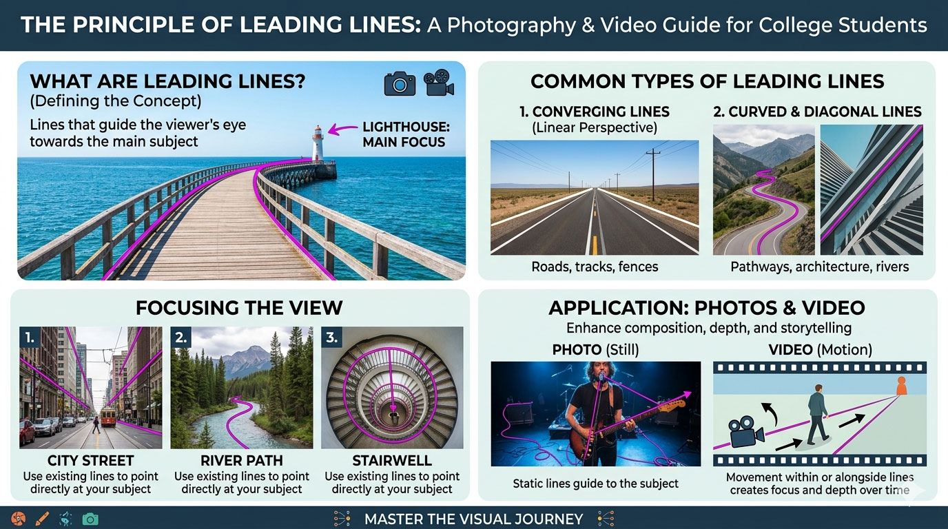
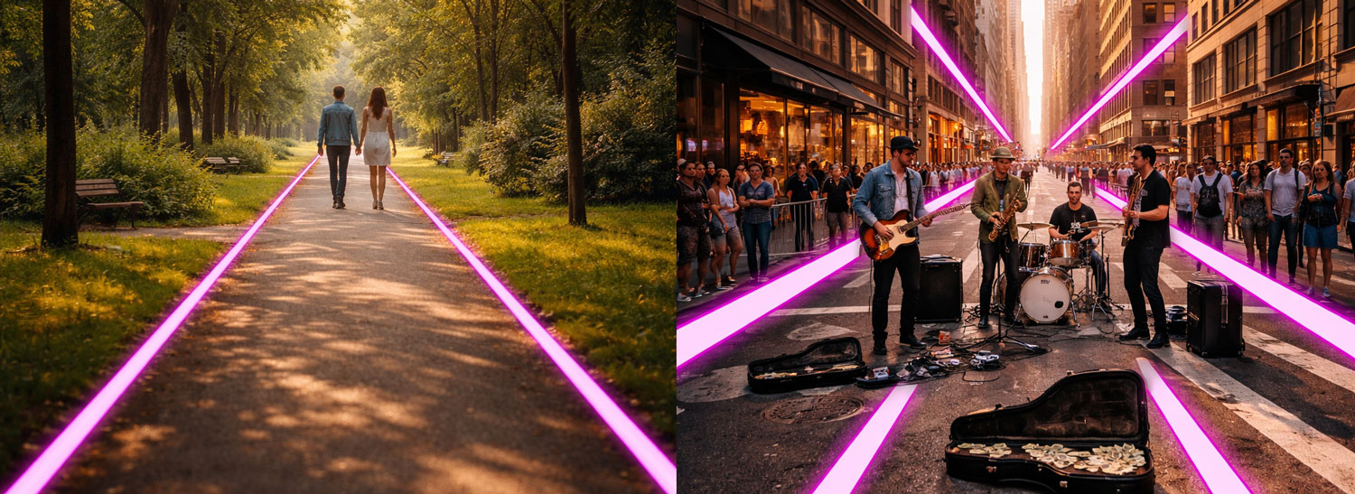
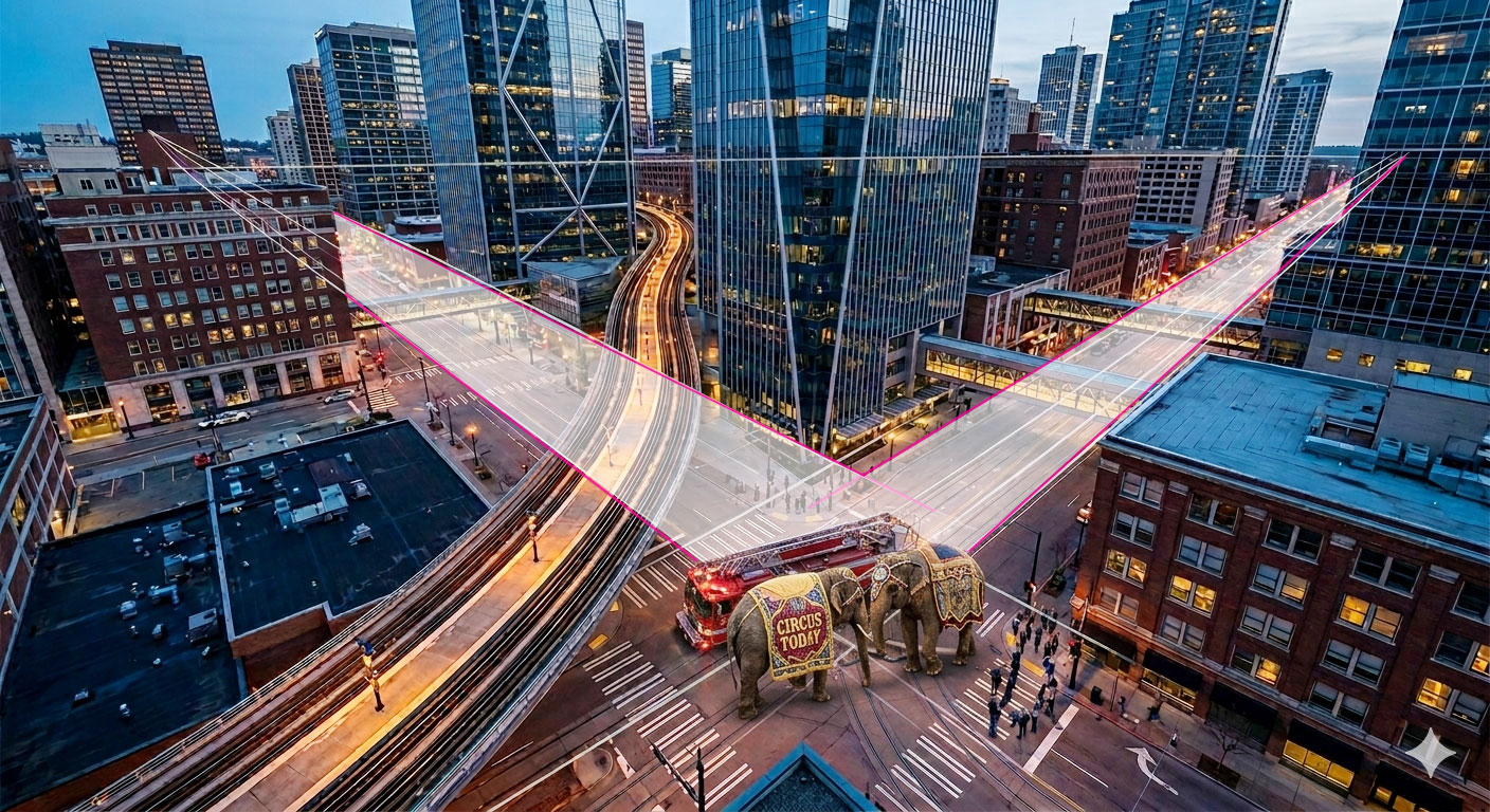
Leading Lines in Photo, Video, 3D Spaces, and Virtual Reality
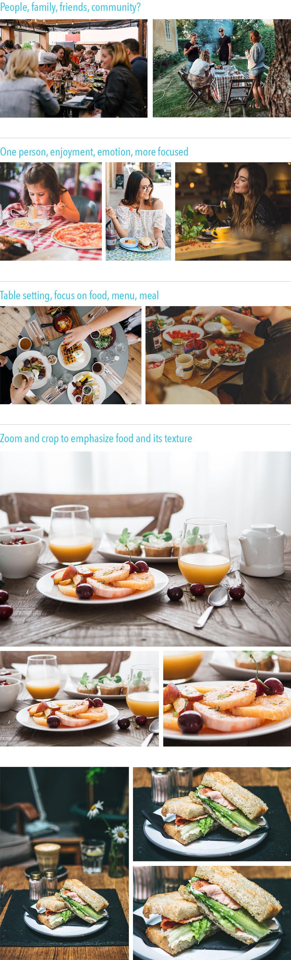
Selecting and cropping photos based on your message and audience
What are you trying to communicate? Who is your audience?
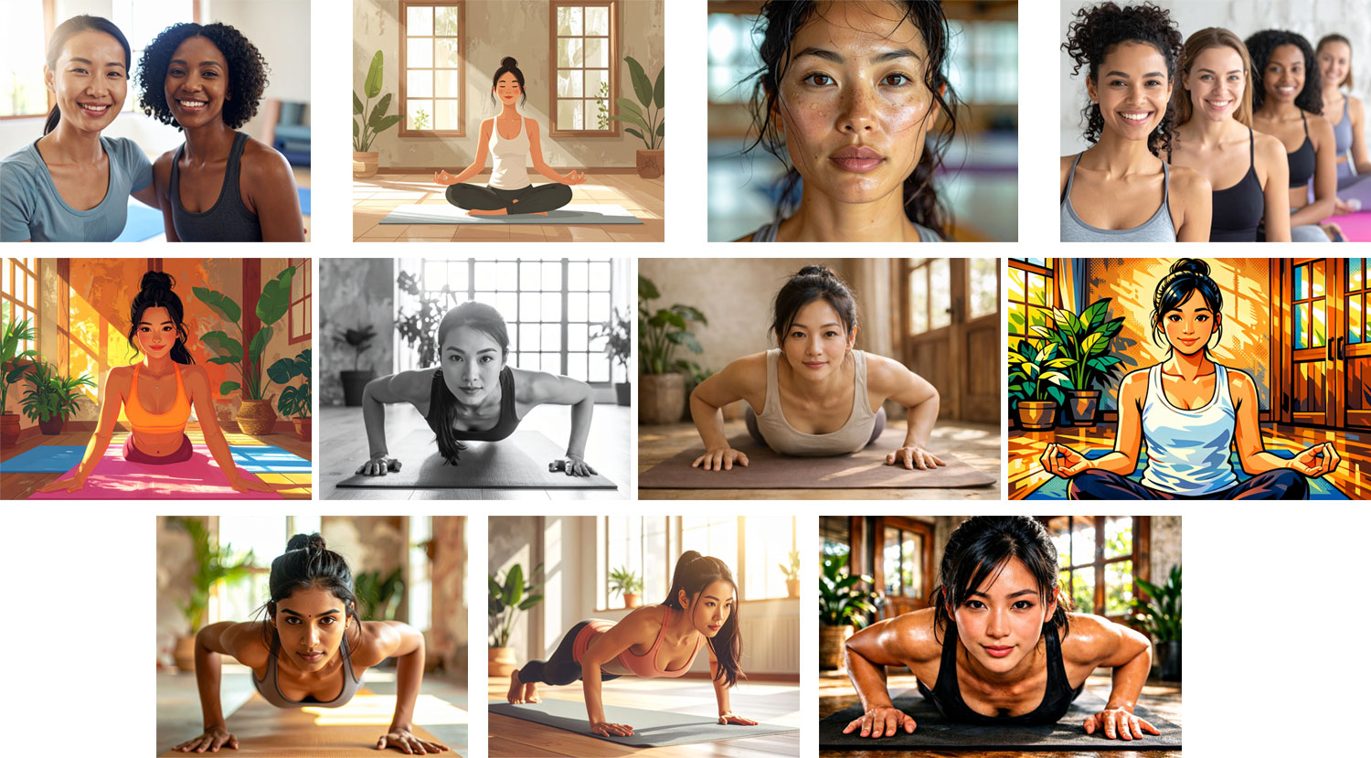
Client: Yoga Studio
These photos are all of women in a yoga studio. Looking through them, consider how each could be used effectively depending on the message being delivered and the audience being targeted.
Which photo would you choose for a studio with a brand message of:
- Intense, high-aerobic, calorie-burning yoga?
- Friendly and welcoming?
- Focused, peaceful, introspective, and calming?
- Youthful place to bring your kids?
- A place to make friends and be a part of the community?