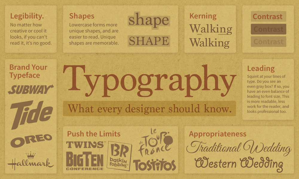
Now that you are a professional designer, never again should you use type set
Typography Basics
Helpful videos about typography
I’d suggest you watch and understand the first two videos first. Then watch the rest as you become more curious about type and want to enhance and refine your design skills with typography. Learning to design with type is an ongoing process of growth and practice. It takes time to fully develop a strong sense of designing with type.
Pairing Typefaces (& Type History)
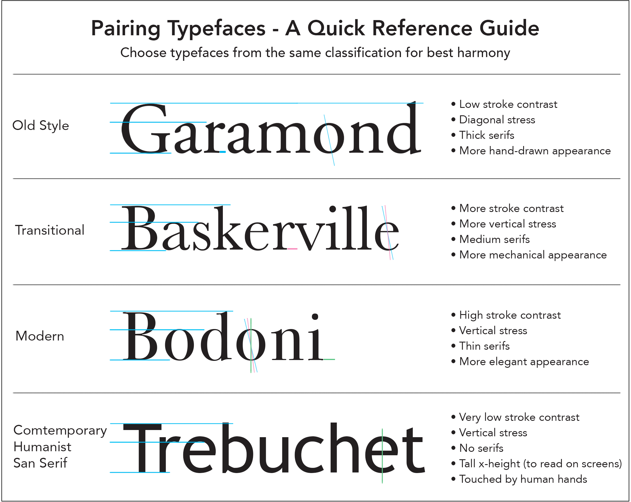
This video offers a more in-depth look at picking typefaces for your next design project.
More Helpful Typography Knowledge
Kerning
I’ve highlighted kerning here because it’s so important to graphic design. Always study the kerning in your headlines and large display type on all your designs.
Kerning is the space between letters. It can and should be adjusted in your design work. Here is an example of a few words set on the computer (in Adobe Illustrator)
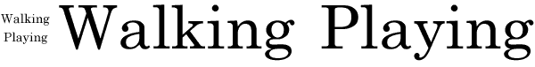
The smaller sample looks fine. But when we look carefully at the larger sample, notice how much space is between some of the letters? You might notice the large space between the W and the a in Walking. This should be tightened by adjusting the kerning (the space between letters) to make it look more professional. If you look closer, where does the kerning need more work? Notice the extra space between the a and
When we enlarge type for headlines, display posters, billboards, or signs, we must adjust the letterforms, kerning, and leading so they look good and remain legible.
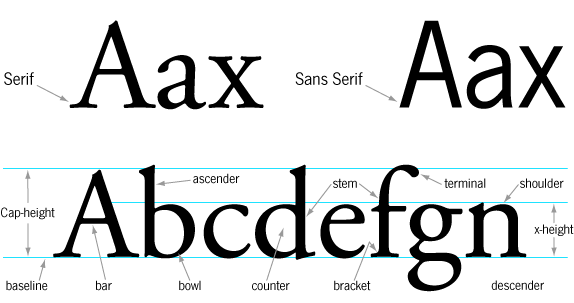
Anatomy of Type
This video dives into the anatomy of type and also offers some tips and tricks.
Font Squirrel’s HOT list
One of the best ways to see what designers are using is to see what they are downloading. Font Squirrel has a tab on their website titled “HOT.” It lists the most popular typefaces people are downloading. I’ve watched it for several years now, and it seems to give an accurate snapshot of the world we live in.
Also, check out their great font identifier tab.
Fonts in Use
Another great resource is the website fontsinuse.com. It allows users to upload images showing typefaces used in real projects. It’s a great way to see how a typeface looks in a real-world marketing design.