Create your own Brand Guidelines
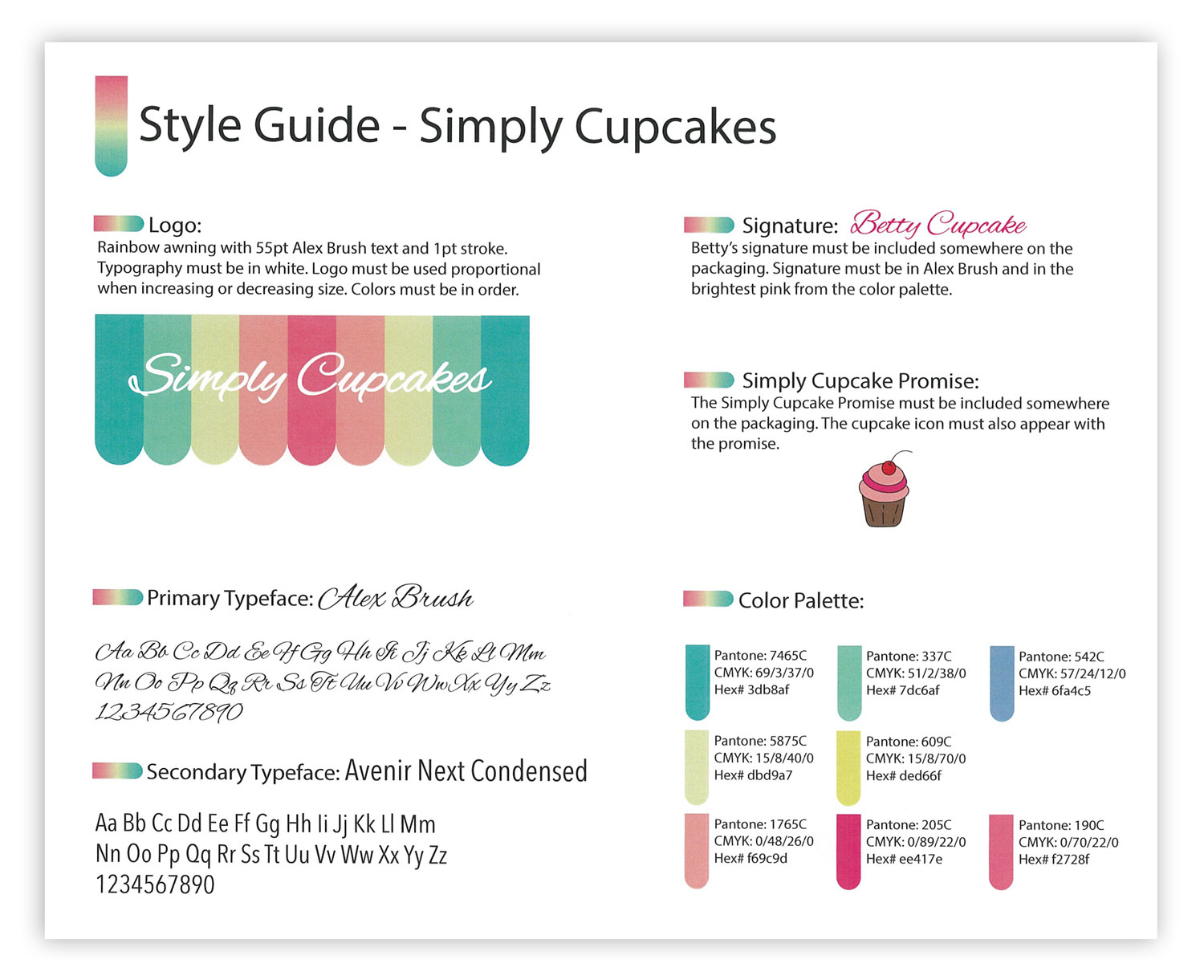
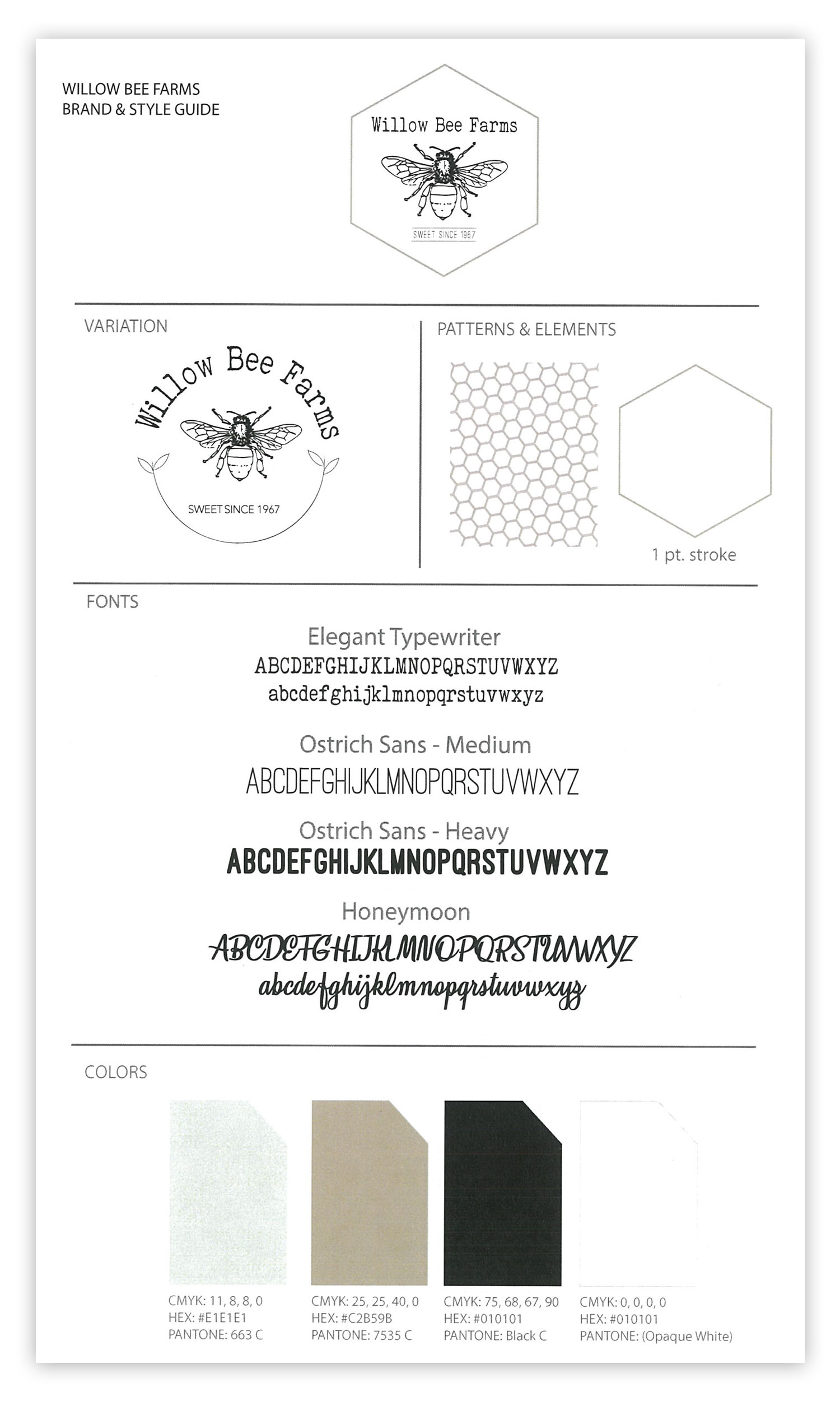
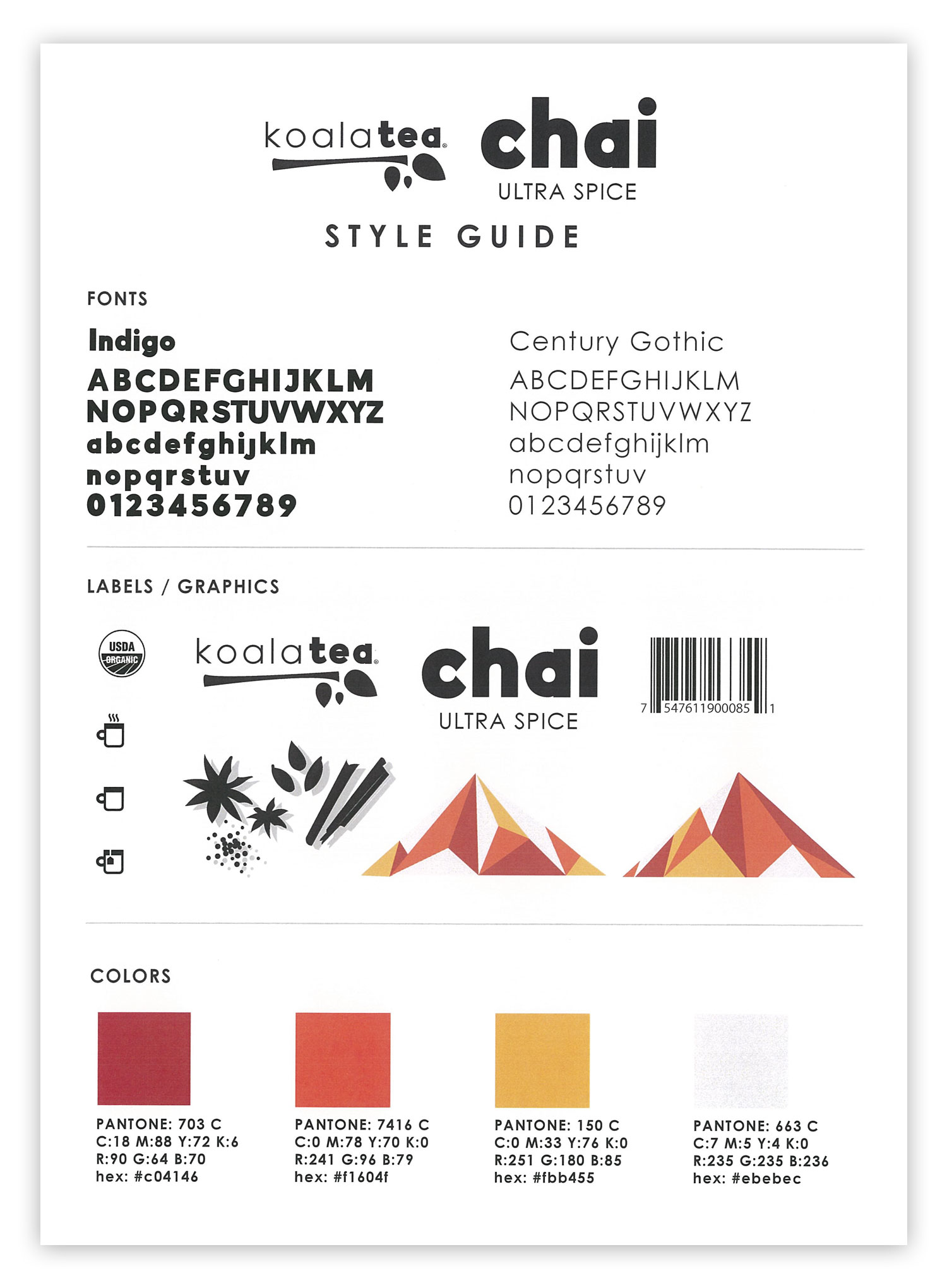
As you prepare to create your marketing pieces, you should have a style and feel in mind, a logo, a few typefaces, colors, photos/videos/illustrations, and design elements you plan to use. You should document those elements on a brand guidelines sheet. Use the examples below to inspire you to create your own.
Overview
At some point in your career, you’ll be asked to create a brand guidelines book for a client. This is the essence and foundation of any organization’s brand message.
Brand guidelines usually outline in great detail what the organization stands for and the message it wants to communicate to its target audience. It also details what the visual brand must look like. Each guide specifies which logos, typefaces, colors, design elements, and photography styles must be used. It is important to read and fully understand the brand guidelines before you begin designing for a client.
Why create brand guidelines?
The main reason is consistency. You want everyone’s designs to look and feel the same and to communicate the same message. It simplifies and clarifies the message your audience receives. Remember: Make it easy for your reader to hear your message—create order from chaos.
BRAND GUIDELINES = CONSISTENT MESSAGE AND LOOK = BRAND RECOGNITION = BRAND LOYALTY= COMMUNICATION
What to include
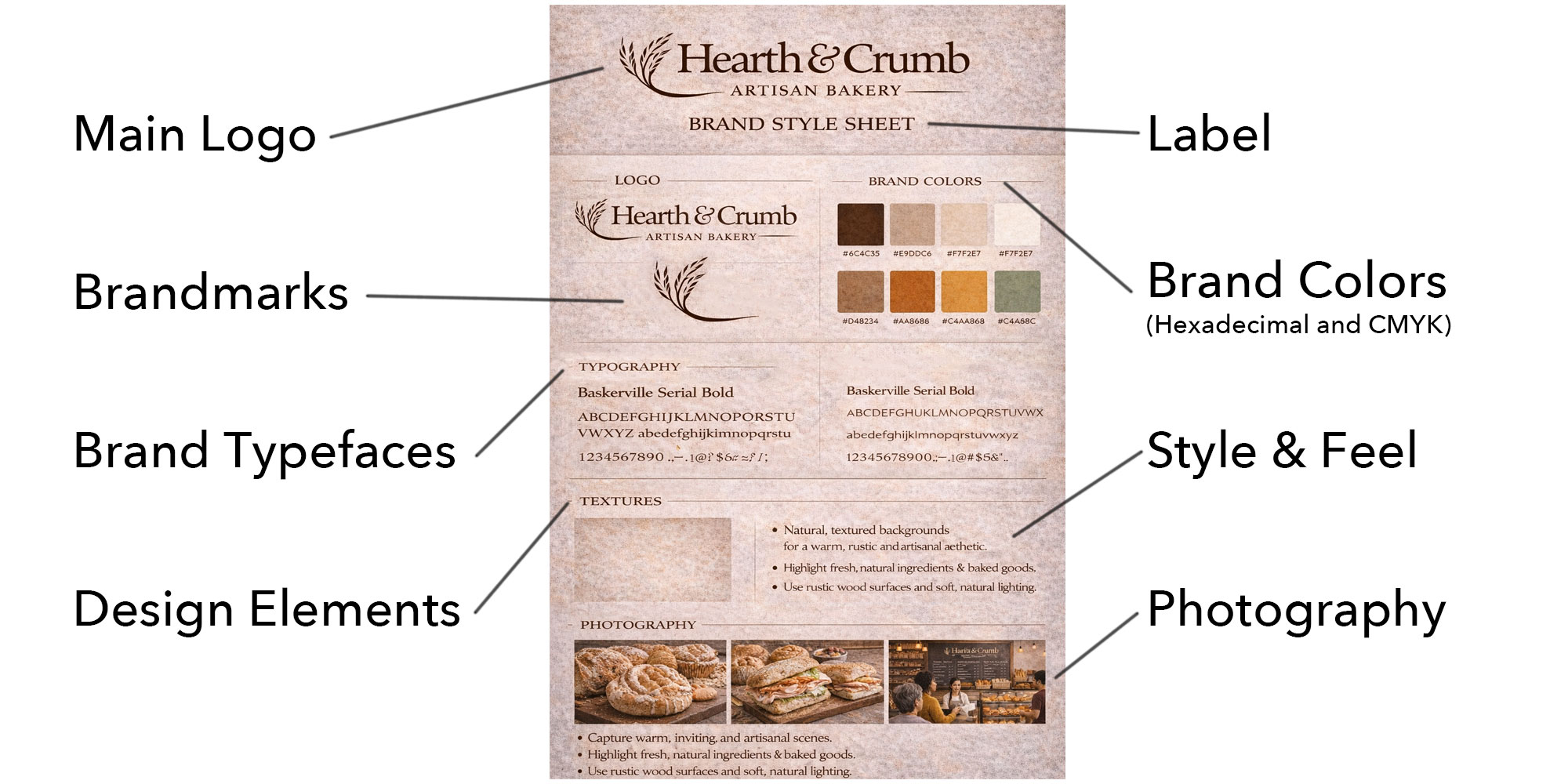
Brand guidelines template to use
You may design your own brand guidelines page or use this Adobe Illustrator template. Adjust it as needed to fit your needs.

brand-guidelines-template.ai.zipDownload
A brief explanation of each category on the template
Logo
This is the primary logo your client uses. Show it in full color and black and white if possible.
Brandmark
If you have a brandmark, include it here.
Colors
This section is extremely helpful when other designers are designing for your brand. It lists the web hexadecimal color and the CMYK color values. You should include the 3–5 main colors you use.
Typography
This area shows the exact typeface your brand uses. I find it helpful to show the alphabet, numbers, and the weights that come with the typeface, too.
Art/Photo Direction
If your brand uses a unique illustration style or a customized photo filter, show several examples of it here. This helps set the tone for how other designers will use new photos with your brand.
Repeatable Design Elements
If your brand uses a specific border style, texture, corner treatment, wave design, dotted line, gradient, etc., this is where you’ll show them. These elements help hold a brand identity together and make all your marketing pieces look cohesive. Consistency is key.
Student Examples