Quick links to a variety of helpful and educational marketing and design case studies. These will help you better understand the “why” behind your designs and how they are used in the real world.
- Rise & Shine Bakery
- Solstice Yoga
- Table & Twine (Meal Kit Delivery Service)
- Street Greens & Grains (Food Truck)
- Re-THREADED (Upcycled Clothing Store)
Rise & Shine Bakery
The Story: A local artisan baker, Sarah, is opening “Rise & Shine Bakery.” She makes incredible sourdough, but nobody knows she exists yet. We are going to follow her journey from a dusty, boarded-up storefront to the busiest spot on the block.
Phase 1: Pre-Opening (Building the Buzz)
- The Marketing Principle: Brand Identity & Awareness. Before you sell a loaf of bread, you have to sell a “feeling.” At the top of the Marketing Funnel, we are just trying to get people to notice we exist.
- Design Deliverables: * Logo and color palette.
- “Coming Soon” window vinyls/signage.
- Social media “teaser” templates.
- The “Why” (Design + Marketing Fusion): The design isn’t just a logo; it’s a personality. If the bakery is high-end and expensive, the design needs to feel minimal and elegant. If it’s a cozy neighborhood spot, the design needs to feel warm and approachable. Connection: If your design doesn’t match the “vibe” Sarah wants, the “Awareness” phase will attract the wrong customers, and the marketing will fail before it starts.
Phase 2: Launch / Soft Opening (Testing the Waters)
- The Marketing Principle: Target Audience & User Experience (UX). Now we are inviting a small group (friends, family, local influencers). We are looking for Customer Feedback to see if our message is landing.
- Design Deliverables: * Printed menus (limited selection).
- “Exclusive Invite” digital cards or postcards.
- In-store price tags and flavor labels.
- The “Why” (Design + Marketing Fusion): Design here is about Clarity. If a customer is confused by the menu layout, they won’t buy. If the price tags are hard to read, the “Customer Need” for a seamless experience isn’t met. Connection: Good design in this phase reduces “friction.” If the marketing goal is to get people to try a new pastry, the design should make that pastry the easiest thing to find on the menu.
Phase 3: The Grand Opening (The Big Push)
- The Marketing Principle: Conversion & Call-to-Action (CTA). The goal is no longer just “knowing” we exist—it’s “getting through the door today.” We are creating urgency.
- Design Deliverables: * Grand Opening banners and A-frame sidewalk signs.
- Direct mail flyers with a “Buy One, Get One” coupon.
- Promotional Instagram ads.
- The “Why” (Design + Marketing Fusion): This is where Hierarchy meets Conversion. The design must shout the Value Proposition (Free Coffee!) and the CTA (Visit Saturday at 9 AM!). Connection: This isn’t the time for subtle, artsy layouts. If the CTA is buried in a beautiful illustration, the bakery stays empty. The design’s job is to direct the human eye to the “Action.”
Phase 4: Daily & Ongoing (Staying Relevant)
- The Marketing Principle: Retention & Community Engagement. The honeymoon phase is over. Now we need “Regulars.” We are building Brand Equity and loyalty.
- Design Deliverables: * Loyalty punch cards.
- Seasonal posters (e.g., “Pumpkin Spice Muffins are back!”).
- Email newsletter headers.
- The “Why” (Design + Marketing Fusion): Design helps build a Habit. The loyalty card is a physical reminder of the brand in the customer’s wallet. The seasonal posters keep the brand feeling “fresh” and give the customer a reason to return. Connection: Design becomes a storytelling tool here. You aren’t just designing a poster; you’re reminding the neighbor why this bakery is part of their morning routine.
Summary Table for Designers
| Phase | Marketing Goal/Funnel | Design’s Job | Key Concept |
| Pre-Opening | Awareness | Create a “Vibe” | The Funnel (Top) |
| Soft Opening | Feedback | Create Clarity | User Experience (UX) |
| Grand Opening | Conversion | Drive Action | Call-to-Action (CTA) |
| Ongoing | Retention | Build Loyalty | Community Engagement |
How this helps designers:
Marketing provides the “Brief” and design provides the “Solution.” Designers aren’t just making a flyer; they are solving Sarah’s problem of “not enough people in the shop on a Tuesday morning.”
Solstice Yoga
The Story: Maya is a dedicated yogi opening “Solstice Yoga.” She has a beautiful space with hardwood floors, but currently, it’s just an empty room. She needs to transform that empty room into a community sanctuary where people feel safe, challenged, and inspired.
Phase 1: Pre-Opening (The “Who & What” Phase)
Core Marketing Principle: Brand Identity & Awareness (Product). Maya isn’t just selling “exercise”; she’s selling a lifestyle. At the top of the Marketing Funnel, we need to establish the “vibe” so the right people feel like they belong there.
- Logo and Color Palette: The visual “Mantra.”
- How it fits: If the colors are neon orange, people expect high-intensity power yoga. If they are sage green and soft tan, they expect restoration. The design communicates the intensity level before a student ever rolls out a mat.
- “Opening Soon” Window Graphics: Visualizing the “Place.”
- How it fits: It stops neighbors from seeing a “closed shop” and starts them seeing a “future destination.” It builds curiosity and anticipation in the local community.
- Social Media “Teaser” Templates: Digital Breadcrumbs.
- How it fits: By using calming imagery and minimal text, these designs build a digital atmosphere. They invite people to follow the journey, moving them from “Unaware” to “Interested.”
- Brand Style Guide: The Blueprint for Trust.
- How it fits: For a wellness brand, consistency equals safety. If the brand looks messy or disjointed, a student won’t trust the studio with their physical health. The guide ensures every touchpoint feels “Solstice.”
- Mission Statement Postcard: Defining the “Product.”
- How it fits: This explains why Solstice exists (e.g., “Yoga for Every Body”). Design-wise, the typography must be approachable and legible, signaling that the studio is inclusive, not elitist.
Phase 2: Launch / Soft Opening (The “How & Where” Phase)
Core Marketing Principle: Target Audience & User Experience (Place & Price). We are inviting “Founding Members” to test the flow of the studio. We want to make sure the “User Journey” from the front door to the yoga mat is seamless.
- Class Schedule (Digital & Printed): The User “Map.”
- How it fits: This is pure Information Architecture. A designer must organize types of yoga, instructors, and times so it’s scannable in seconds. If the schedule is confusing, the customer won’t book a class.
- “Founding Member” Digital Invites: Marketing through Exclusivity.
- How it fits: By designing something that looks like an “exclusive offer,” you trigger a psychological “Price” benefit. People feel they are getting a deal because they were “first.”
- Studio Wayfinding Signage: Improving the UX (User Experience).
- How it fits: New students are often nervous. Clear signs for “Shoes Here,” “Change Rooms,” and “Studio A” reduce customer anxiety. Good design makes the “Place” feel welcoming.
- New Student Intake Forms: Data Collection.
- How it fits: This is a “friction” point. If the form looks like a tax document, it’s a bad start. A well-designed, clean form makes the onboarding process feel like part of the self-care experience.
- Staff T-shirts/Uniforms: Identifying “The Experts.”
- How it fits: In a room full of people in yoga gear, the instructors need to be easily identifiable. Design here provides clarity and authority, making it easy for a student to know who to go to for help.
Phase 3: The Grand Opening (The “Action” Phase)
Core Marketing Principle: Promotion (The 4th P). It’s time to fill the room. We need a clear Call-to-Action (CTA) and a sense of “Limited Time” excitement to drive Conversion.
- A-Frame Sidewalk Sign: The “Hook.”
- How it fits: This catches the “hyper-local” audience. The design needs to be bold and high-contrast so a person driving or walking by can read “FIRST CLASS FREE” at a glance.
- “First Class Free” Digital Vouchers: The “Lead Magnet.”
- How it fits: This is a classic “Promotion” tactic to lower the “Price” barrier. The design’s primary job is to highlight the CTA—it should tell them exactly where to click to claim their spot.
- Paid Social Media Ads (Video/Static): Targeting the “Interest.”
- How it fits: These ads use targeted marketing to reach people interested in “fitness” or “wellness.” The design must use “stoppers”—visuals so beautiful they make a user pause their scroll.
- Local “Partnership” Posters: Community Marketing.
- How it fits: Maya hangs these in local juice bars or gyms. The design needs to bridge two brands—fitting into the juice bar’s aesthetic while still clearly being “Solstice.”
- Grand Opening Event Program: Managing the “Hype.”
- How it fits: If Maya has a 9 AM meditation and an 11 AM “Mimosas & Mats” event, the program keeps people there longer. Dwell time in marketing leads to higher sales and better community ties.
Phase 4: Daily & Ongoing (The “Why Come Back?” Phase)
Core Marketing Principle: Retention & Brand Equity. We’ve got them in the door; now we need them to make yoga a habit. We are building Social Proof and long-term loyalty.
- Refer-a-Friend Cards: Word-of-Mouth Marketing.
- How it fits: People trust friends more than ads. By designing a “Give $10, Get $10” card, you’re turning your students into Brand Ambassadors. The design should be small enough to fit in a wallet.
- Monthly Workshop Posters: Keeping the “Product” Fresh.
- How it fits: Regular classes can become routine. Specialized workshops (e.g., “Handstand 101”) provide “Newness,” which is a key driver in keeping customers engaged and spending.
- Email Newsletter Templates: The “Nurture” Sequence.
- How it fits: This is about Retention. A weekly “Yoga Tip” or “Teacher Spotlight” keeps Solstice in the student’s mind. The design should feel like a “gift” in their inbox, not a “sales pitch.”
- Social Media “Member Spotlight” Graphics: Social Proof.
- How it fits: When you feature a real student, you are showing (not telling) that your studio is for real people. Design-wise, these should look “editorial” and high-quality to make the member feel like a star.
- Retail Packaging (Tags/Bags): Revenue Diversification.
- How it fits: If Maya sells mats or essential oils, the branded packaging carries the “Solstice Feeling” into the student’s home. It extends the brand experience far beyond the 60-minute class.
“Marketing Mindset” Pro-Tip:
- In Phase 1, we are selling a Dream.
- In Phase 2, we are selling a Process.
- In Phase 3, we are selling an Action.
- In Phase 4, we are selling a Relationship.
Table & Twine (Meal Kit Delivery Service)
The Story: “Table & Twine” aims to compete with the big guys (HelloFresh, Blue Apron) by focusing on “Zero Waste” and “Farm-to-Table” ingredients in their meal kit delivery services. They don’t have a storefront—their “store” is an app and a cardboard box. The designer’s job is to make a digital experience feel as warm and trustworthy as a local farmers’ market.
Phase 1: Pre-Opening (The “Who & What” Phase)
Core Marketing Principle: Brand Identity & Market Positioning. Because the customer can’t “smell” the food or “see” the shop, the design must do all the heavy lifting to build trust. This is the top of the Marketing Funnel.
- Logo and Brand System: The “Seal of Quality.”
- How it fits: Since this is a “Product” people will eat, the design must look clean, professional, and appetizing. A logo that feels too “techy” might make the food feel processed; a logo that feels too “grungy” might make the food feel unsafe.
- “Coming Soon” Landing Page: Lead Generation.
- How it fits: This is a digital “placeholder.” Its job is to collect emails (leads) before the launch. The design must be high-impact with a simple CTA (“Get 50% off your first box”) to turn “curious visitors” into “future customers.”
- Photography Style Guide: Visual Language.
- How it fits: In food marketing, “you eat with your eyes.” A designer must define how the food is shot. Bright, natural lighting communicates “freshness,” which is the brand’s Core Value Proposition.
- Influencer “Sneak Peek” Media Kit: Social Proof.
- How it fits: Maya (the founder) sends digital kits to food bloggers. The design must look “premium” so that influencers feel excited to share it with their followers, building Awareness through trusted voices.
- Investor Pitch Deck: Securing “Capital.”
- How it fits: Online businesses need a lot of upfront cash for logistics. The design must communicate a scalable business model, using charts and infographics to show how “Table & Twine” will dominate the market.
Phase 2: Launch / Soft Opening (The “How & Where” Phase)
Core Marketing Principle: User Experience (UX) & The “Place.” In this business, the website/app is the “Place.” If the “Place” is hard to navigate, people leave without buying.
- Mobile App / Website Interface: The “Digital Storefront.”
- How it fits: This is the heart of the User Journey. The design must make “browsing meals” and “checking out” effortless. If a student struggles to find the “Vegetarian” filter, that’s a design failure that leads to a lost sale.
- Recipe Card Templates: The “Product” Experience.
- How it fits: This is the only physical thing the customer keeps. The design must be functional and clear (UX in print!). If the instructions are hard to read while cooking, the customer won’t enjoy the “Product” and won’t re-order.
- “Beta Tester” Milestone Emails: Relationship Building.
- How it fits: We are “marketing” to our first users to make them feel like partners. The design should feel personal and “behind-the-scenes,” encouraging honest feedback to improve the service.
- Subscription Tier Graphics: Communicating “Price.”
- How it fits: Most meal kits have complex pricing (2 people vs. 4 people, 3 meals vs. 5). The design must simplify complex data so the customer can make a quick decision without “analysis paralysis.”
- Interactive Onboarding Quiz: Target Audience Profiling.
- How it fits: “Do you like spicy food?” “Are you keto?” Design makes this data-mining feel like a fun game. This allows the marketing team to segment the audience and send them personalized offers later.
Phase 3: Full Market Launch (The “Action” Phase)
Core Marketing Principle: Promotion & Conversion (The 4th P). Now we are spending money to get people to click. We need high-energy designs that move people from “Thinking about it” to “Buying it.”
- Paid Social Media Video Ads: The “Hook.”
- How it fits: These ads have seconds to work. The design (motion graphics/typography) must highlight the Value Proposition (Save 3 hours a week!) and a massive CTA button to drive immediate Conversion.
- Referral “Free Box” Graphics: Customer Acquisition Cost (CAC).
- How it fits: It’s cheaper to have a customer “sell” for you. By designing “Shareable” graphics for the app, you turn users into a sales force. This is a Promotion tactic that leverages “Social Proof.”
- The “Unboxing” Experience (Packaging): Brand Equity.
- How it fits: For an online brand, the moment the box hits the porch is the “Grand Opening.” The design of the box, the branded tape, and the insulated liners must scream “high quality.” It’s marketing at the doorstep.
- Retargeting Banner Ads: Staying “Top of Mind.”
- How it fits: If a user looked at a meal but didn’t buy, these ads “follow” them. The design should remind them of the specific “Product” they liked, acting as a visual nudge back into the funnel.
- Direct Mailer with QR Code: Bridging Physical to Digital.
- How it fits: Even “Online” brands use physical mail. A designer creates a postcard that lands in a mailbox; the QR code is the “Bridge” that brings the customer back to the digital “Place.”
Phase 4: Daily & Ongoing (The “Why Come Back?” Phase)
Core Marketing Principle: Retention & Lifetime Value (LTV). It costs 5x more to get a new customer than to keep an old one. Design must keep the experience “fresh” every single week.
- Seasonal Menu Catalogs: “Newness” Marketing.
- How it fits: To prevent “Subscription Fatigue,” the design must highlight Seasonal Products (e.g., “The Winter Comfort Collection”). It gives the customer a reason to keep their subscription active.
- Loyalty Milestone “Surprises”: Gamification.
- How it fits: A sticker or a small “free gift” card in their 10th box. The design makes the customer feel “seen” and appreciated, which builds Brand Loyalty and lowers “churn” (people quitting).
- “Win-Back” Email Campaign: Retention.
- How it fits: When someone cancels, you market to get them back. The design should be empathetic and enticing (e.g., “We miss you—here’s $20 to come back”), focusing on the “Benefits” they are missing out on.
- User-Generated Content (UGC) Templates: Community Engagement.
- How it fits: “Table & Twine” creates a branded “Instagram Frame” for people to show off their cooked meals. This is Community Marketing—it lets the customers create the content for the brand.
- Add-on Marketplace Graphics: Upselling (Revenue Growth).
- How it fits: “Want to add wine or cookies to your box?” The design must make these Add-ons look irresistible and easy to “click and add,” increasing the average order value.
Final Marketing Comparison for your Students
| Business Type | The “Place” (3rd P) | Design Focus | Marketing Vibe |
| Bakery | Physical Shop | Sensory/Smell/Tactile | Warm & Local |
| Yoga Studio | Physical/Digital | Experience/Safety/Trust | Peaceful & Community |
| Meal Kit | App/Website/Box | Convenience/UX/Clarity | Modern & Efficient |
A Closing Thought for your Students:
In all three stories, the designer isn’t just “making things look good.” They are solving a business problem.
- In Phase 1, the problem is Anonymity.
- In Phase 2, the problem is Confusion.
- In Phase 3, the problem is Indecision.
- In Phase 4, the problem is Boredom.
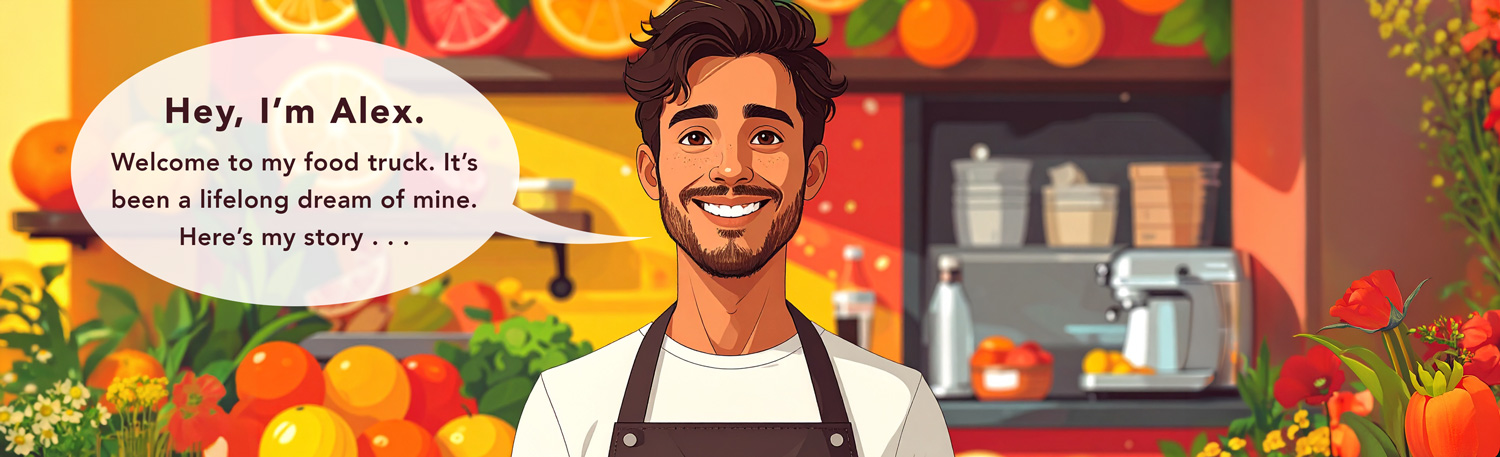
Street Greens & Grains (Food Truck)
The Story: Alex is opening a tacos and salads food truck. He has the truck, the recipes, and the permits. But a food truck is a moving target. If the design doesn’t “scream” what the product is from a block away, people will just walk past it. We need to turn a metal box into a local icon.
Phase 1: Pre-Opening (The “Hype” Phase)
Core Marketing Principle: Brand Identity & Positioning. We are defining the Unique Selling Proposition (USP). Why should someone buy a taco from Alex instead of the taco bell down the street? This is the Top of the Funnel (Awareness).
- The Truck Wrap (Visual Identity): The “Mobile Billboard.”
- How it fits: This is the most important design. It’s the “Product” and the “Place” combined. The design must be legible at 30 mph. If it’s too cluttered, people won’t know it’s a food truck; they’ll think it’s a delivery van.
- “Coming to a Corner Near You” Social Teasers: Building Awareness.
- How it fits: These designs focus on Anticipation. By showing close-ups of fresh ingredients (the “Product”), you’re setting a high-quality expectation before the truck ever parks.
- “Vote for our First Stop” Social Graphics: Market Research & Engagement.
- How it fits: Marketing is a two-way street. By asking the community where they want the truck to go, you are segmenting your audience and ensuring your “Place” (Phase 2) is actually where the customers are.
- Brand Style Guide: The Foundation of Trust.
- How it fits: Food trucks can sometimes feel “sketchy” to new customers. A professional, consistent brand identity signals cleanliness and reliability, which are the biggest hurdles in food truck marketing.
- Pitch Deck for Local Breweries: Stakeholder Promotion.
- How it fits: Food trucks often park at breweries (a “Partnership” strategy). The design here needs to convince a brewery owner that Alex’s truck will add value to their taproom and attract more customers.
Phase 2: Launch / Soft Opening (The “Route” Phase)
Core Marketing Principle: Target Audience & Agile Marketing. We are testing our “Place.” A food truck needs to prove it can be found. We are moving from “Awareness” to “Consideration.”
- Weekly Route Map (Digital): Solving the “Place” Problem.
- How it fits: If customers don’t know where you are, you don’t exist. This design needs to be highly shareable (think Instagram Stories) and easy to read on a small phone screen.
- Magnetic Menu Boards: Agility in Pricing/Product.
- How it fits: Food trucks often run out of items or change prices based on market cost. The design must be modular. If a designer makes a permanent sign that can’t be updated, they’ve failed the business’s “Agile” marketing needs.
- QR Code Stickers for “Check-In”: Customer Data Collection.
- How it fits: Alex needs to know who is eating. A well-designed sticker on the truck window invites people to join a mailing list in exchange for a free drink, turning a one-time diner into a “Lead.”
- “I Found the Truck!” Social Media Frame: User-Generated Content (UGC).
- How it fits: This is Social Proof. When a customer takes a photo with a cool, branded frame or background on the truck, they are doing the “Promotion” for Alex for free.
- Staff T-shirts/Hats: Professionalism in the “Place.”
- How it fits: In a small truck, the staff are the “Brand Ambassadors.” Cohesive apparel makes the operation look like a legitimate business rather than a hobby, reinforcing the “Product” quality.
Phase 3: The Grand Opening (The “Drop” Phase)
Core Marketing Principle: Promotion & Physical Interruption. We need to stop foot traffic. We are looking for Conversion—getting people to stand in line now.
- Feather Flags / A-Frame Signs: Physical “Hooks.”
- How it fits: On a busy street, you have 3 seconds to catch an eye. The design must have High Contrast and a “Hero Image” of a taco that makes people hungry instantly.
- “Text for Today’s Special” Signage: Direct Marketing CTA.
- How it fits: This creates a Direct Relationship. The design’s job is to make the “Call to Action” (CTA) the most prominent thing on the truck, so people sign up for alerts while they wait in line.
- Grand Opening “BOGO” Vouchers: Price-based Promotion.
- How it fits: This is a “Loss Leader” strategy. You lose money on the second taco to gain a long-term customer. The design must make the Value (FREE) the star of the layout.
- Co-Branded Posters for Partner Locations: Community Promotion.
- How it fits: Alex hangs these in the breweries or gyms where he parks. The design must respect the “Partner’s” space while still being distinctly “Street Greens,” showing a fusion of two brands.
- Press Kit / “Foodie” Invite: Influencer Marketing.
- How it fits: Alex invites local food influencers for a free meal. The design of the digital invite needs to look “Instagrammable” so the influencers feel that the truck is “cool” enough to feature on their feed.
Phase 4: Daily & Ongoing (The “Fanatic” Phase)
Core Marketing Principle: Retention & Brand Equity. We want “Super-fans.” We want people who will drive 20 minutes across town just because they saw the truck is parked in a specific spot.
- “Secret Menu” Social Content: Exclusivity & Loyalty.
- How it fits: Marketing to your “Inner Circle.” By designing “Secret Menu” posts that only followers see, you build a sense of belonging. It rewards people for staying engaged with the brand.
- Catering & Events One-Sheet: Revenue Diversification.
- How it fits: Food trucks make huge money on private events. This design moves the marketing from B2C (Business to Consumer) to B2B (Business to Business). It needs to look professional, organized, and “Price” transparent.
- Taco-of-the-Month Posters: “Newness” Marketing.
- How it fits: Even the best taco gets boring if you eat it every day. Design creates Excitement around a “Limited Time Offer” (LTO), which is a classic marketing tactic to drive repeat visits.
- Branded Packaging (Stickers/Liners): The “Walking Billboard.”
- How it fits: When someone walks back to their office with a “Street Greens” tray, everyone in the elevator sees it. The design turns the packaging into a silent salesman.
- Community “Wall of Fame” or Map: Building Brand Equity.
- How it fits: A map on the truck where people can put a sticker showing where they are from. This design creates a physical connection between the brand and the neighborhood, turning “customers” into “community.”
Final Comparison for Students: “The Big Four”
| Business | Primary “Why” for Design | The Marketing Secret |
| Bakery | Sensory Attraction | Selling a “Comfort” feeling. |
| Yoga Studio | Trust & Calm | Selling a “Transformation.” |
| Meal Kit | Convenience & Clarity | Selling “Time” and “Ease.” |
| Food Truck | Visibility & Movement | Selling “Discovery” and “Urgency.” |
The Roast and Ritual (Coffee Shop)
The Story: Leo is an expert coffee bean roaster. He knows the difference between a bean from Ethiopia and one from Brazil. But to the average person walking by, it’s just coffee. The designer’s job is to translate Leo’s “coffee nerd” expertise into a brand that feels welcoming rather than intimidating.
Phase 1: Pre-Opening (The “Who & What” Phase)
Core Marketing Principle: Brand Identity & Positioning (Product). We are establishing the “vibe” to attract a specific tribe. At the top of the Marketing Funnel, we are building a world people want to join.
- Logo and Visual Identity System: The “Vibe Check.”
- How it fits: If the logo is sleek and black, it’s a high-end “serious” shop. If it’s hand-drawn and colorful, it’s a neighborhood “cozy” spot. The design positions the product in the mind of the consumer before they even take a sip.
- “Coming Soon” Window Vinyls: Targetting the “Place.”
- How it fits: Local coffee shops rely on “foot-traffic awareness.” The design turns a dusty window into a teaser campaign, signaling to locals that their morning routine is about to get an upgrade.
- Social Media “Teaser” Mood Boards: Visual Storytelling.
- How it fits: By posting textures (burlap sacks, steam, wood grain), the design creates an atmospheric expectation. It’s not selling coffee yet; it’s selling the anticipation of the shop.
- Brand Style Guide: Ensuring Consistency.
- How it fits: Coffee shops have many small touchpoints (napkins, stickers, signs). A style guide ensures that the brand doesn’t feel “cheap” by looking different every time the customer sees it. Consistency builds trust.
- Pitch Deck for Local Roasters/Wholesalers: B2B Marketing.
- How it fits: Leo needs to partner with milk suppliers and bakers. A well-designed pitch deck shows that his business is professional and worth partnering with, helping him secure better “Product” ingredients.
Phase 2: Launch / Soft Opening (The “How & Where” Phase)
Core Marketing Principle: User Experience (UX) & Information Architecture. We are testing the “Ritual.” If the line is confusing or the menu is a mess, the customer won’t come back.
- Main Menu Board: The “Decision Engine.”
- How it fits: This is Hierarchy at work. The design must guide the eye from the high-margin drinks (Lattes) to the quick wins (Drip). If the menu is cluttered, the line slows down, and the “Place” feels stressful.
- “Founding Neighbor” Invitations: Creating “Insiders.”
- How it fits: Marketing often uses “Social Belonging” to build a base. The design should feel like a VIP pass, making the local community feel like they “own” a piece of the shop’s success.
- In-Store Wayfinding (Wifi/Restroom/Trash): Improving the UX.
- How it fits: A coffee shop is often a second office. Clear, branded signs for the “necessities” make the customer feel comfortable and “at home.” Good design reduces social anxiety in new spaces.
- Customer Feedback Cards: Market Research.
- How it fits: We need to know if the “Price” is right or the “Product” is too bitter. A clean, easy-to-fill-out card makes the customer feel like their opinion is a valuable part of the brand’s growth.
- Staff Aprons and Pins: Humanizing the Brand.
- How it fits: The Barista is the face of the “Ritual.” Branded apparel creates a sense of Authority and Expertise, making the customer feel they are in the hands of a professional.
Phase 3: The Grand Opening (The “Action” Phase)
Core Marketing Principle: Promotion & Call-to-Action (CTA). We need to break people’s existing habits (like going to Starbucks) and get them to try “The Roast & Ritual” instead.
- Sidewalk A-Frame Sign: The “Stop” Signal.
- How it fits: This is a Physical CTA. The design needs a massive “Hook” (e.g., “Best Oat Milk Latte in Town”) to interrupt someone’s walk and change their destination.
- Direct Mail/Door Hangers with Coupons: Local Conversion.
- How it fits: This hits the 4th P (Promotion). The design must emphasize the Benefit (Free Pastry with Coffee) and make the “Action” (Visit us at 123 Main St) impossible to miss.
- Paid Social Media “Carousel” Ads: Targeted Reach.
- How it fits: These ads target people within a 1-mile radius. The design uses Visual Proof (gorgeous latte art) to tempt the user and a “Get Directions” button to drive the sale.
- Opening Day Event Schedule: Managing the “Hype.”
- How it fits: If Leo has a “Latte Art Throwdown” at 2 PM, the design of the schedule keeps people in the shop longer. Increased dwell time leads to more “add-on” sales (like muffins or beans).
- Media Kit for Local Bloggers: Earned Media.
- How it fits: We want the local “Foodie” influencers to talk about us. A designer creates a digital kit with high-res photos and “Brand Facts,” making it easy for the media to give Leo free “Promotion.”
Phase 4: Daily & Ongoing (The “Why Come Back?” Phase)
Core Marketing Principle: Retention & Brand Equity. We want to be their “Third Place” (Home, Work, Ritual). We are moving them to the bottom of the Marketing Funnel (Loyalty).
- Physical Loyalty (Punch) Cards: The “Dopamine” Design.
- How it fits: It’s a Retention Tool. The design gives the customer a “Quest” (Buy 9, get 1 free). Every time they open their wallet and see that card, they are reminded of the brand.
- Seasonal Feature Posters: Fighting “Boredom.”
- How it fits: Marketing requires “Newness.” A designer creates a template for “Monthly Specials” (e.g., Lavender Honey Latte). This gives regulars a reason to explore the menu and spend more money.
- Email Newsletter Templates: Maintaining “Mindshare.”
- How it fits: Leo sends a weekly note about new bean origins. The design must feel like a “Letter from a Friend,” reinforcing the community aspect and keeping the shop “Top of Mind.”
- Branded Cup Sleeves/Takeaway Bags: The “Mobile Billboard.”
- How it fits: When a customer walks to the office with a branded cup, they are passively marketing for Leo. The design should be “Instagrammable” so people want to be seen with it.
- Community “Bulletin Board” Layout: Engagement.
- How it fits: By designing a space for community flyers or local art, the shop becomes a Community Hub. This builds “Brand Equity”—people don’t just shop there; they feel they belong there.
Re-THREADED (Upcycled Clothing Store)
The Story: The founder, Sam, finds cool old clothes and sews them into new, modern pieces. Sam has the talent, but the business needs to look like a high-end fashion house, not a messy garage sale. The designer’s job is to make “old” feel “new” and “exclusive.”
Phase 1: Pre-Opening (The “Who & What” Phase)
Core Marketing Principle: Brand Positioning & Identity (The 1st P: Product). In the upcycling world, the “Product” is actually Curation. We are at the Awareness stage of the funnel.
- Visual Identity & Logo System: The “Designer Label.”
- How it fits: To justify higher prices for upcycled gear, the brand must look “editorial.” The logo acts as a seal of quality. If the design is too “crafty,” customers expect low prices; if it’s “minimalist/streetwear,” they expect a premium.
- “Coming Soon” Teaser Video (Social): Building Anticipation.
- How it fits: This targets the “Awareness” phase. The design (motion graphics, filters) should feel like a fashion film. It’s meant to stop the scroll and make people ask, “What is this brand?”
- Brand Manifesto/Zine (Digital or Print): Communicating the Why.
- How it fits: Marketing to Gen Z requires Values. This design explains the “Eco-friendly” mission. It turns a shop into a movement, giving the customer a “Reason to Care.”
- Landing Page with Email Capture: Lead Generation.
- How it fits: Since items are one-of-a-kind, Sam needs a list of people to “drop” them to. The design’s only goal is the CTA: “Sign up for early access.”
- “Found” Imagery Mood Board: Setting the Aesthetic Standard.
- How it fits: This helps the marketing team stay consistent. If the brand is “90s Grunge,” the design shouldn’t use “70s Disco” fonts. Consistency equals Brand Equity.
Phase 2: Launch / Soft Opening (The “How & Where” Phase)
Core Marketing Principle: User Experience (UX) & Scarcity (The 3rd P: Place). We are testing how people shop for one-of-a-kind items. We are moving from “Awareness” to “Consideration.”
- Hybrid E-commerce Interface: The “Digital Place.”
- How it fits: The design must handle High Scarcity. When an item sells, it’s gone forever. The UI must clearly show “SOLD” to create “FOMO” (Fear Of Missing Out) for the next visitor.
- “The First Drop” Exclusive Invites: Marketing via Exclusivity.
- How it fits: By designing an invite for the “Soft Launch,” Sam rewards early supporters. The design should feel like a “backstage pass,” building a deeper Customer Relationship.
- In-Store Storytelling Tags: Providing Value Information.
- How it fits: These aren’t just price tags. They explain where the garment came from and how it was upcycled. Design turns a boring tag into a conversation piece that justifies the “Price.”
- Sustainable Packaging Design: The Brand Promise.
- How it fits: If an upcycled brand uses plastic mailers, the marketing fails. The design of compostable bags and recycled tissue paper reinforces the “Eco-friendly” USP (Unique Selling Proposition).
- Digital “Lookbook”: Visualizing the UX.
- How it fits: Customers often don’t know how to style “vintage” pieces. The design of a lookbook shows them how to wear the “Product,” making it easier for them to say “Yes” to a purchase.
Phase 3: The Grand Opening (The “Action” Phase)
Core Marketing Principle: Promotion & Conversion (The 4th P). It’s time to drive traffic to both the physical shop and the website. We need a loud Call-to-Action (CTA)
- Wheatpaste Street Posters: Local Physical Interruption.
- How it fits: For a streetwear-adjacent brand, street posters feel “authentic.” The design must be high-contrast and bold, directing people to the “Grand Opening” date and location.
- “Golden Ticket” Social Graphics: Gamification of Promotion.
- How it fits: A contest: “First 10 people at the shop get a Golden Ticket for 50% off.” The design must look “valuable”—using gold textures or bold typography—to drive immediate physical action.
- Targeted “Drop” Social Ads: Paid Conversion.
- How it fits: These ads target people who like “Sustainable Fashion.” The design focuses on the CTA (“Shop the Drop”) and uses “urgent” design elements like countdown timers.
- Storefront Vinyls & Window Display: The “Hook.”
- How it fits: This is the “A” in AIDA (Attention). The design needs to be so visually striking that people stop their cars or their walk to look. It’s the physical version of a “thumb-stopper” ad.
- Opening Day “Event Map” (Digital): Managing the Customer Journey.
- How it fits: If there’s a DJ, a “repair bar,” and a “DIY station,” the map keeps the crowd moving. A well-designed event ensures Positive Social Proof on Instagram.
Phase 4: Daily & Ongoing (The “Why Come Back?” Phase)
Core Marketing Principle: Retention & Community Engagement. Since every item is unique, Sam needs to keep people checking back daily. We are building Lifetime Value (LTV).
- Weekly “Drop” Newsletter Template: Maintaining Mindshare.
- How it fits: This is the most consistent marketing tool. The design needs to be modular so Sam can swap in new photos every week, keeping the brand “top of mind” for the customer.
- “Repair & Care” Guide (Post-Purchase):Customer Retention.
- How it fits: Marketing doesn’t end at the sale. By designing a beautiful guide on “How to wash upcycled silk,” the brand shows it cares about the customer’s investment, building long-term loyalty.
- User-Generated Content (UGC) Templates:Social Proof.
- How it fits: Design a “Share your fit” Instagram story template. When customers use it, they are marketing the brand to their own followers for free. This is “Earned Media.”
- “Re-Threaded” Loyalty App/Card: Increasing LTV.
- How it fits: A digital card where you earn “Earth Points” for every purchase. The design makes the “loyalty” feel like a game, encouraging the customer to choose RE-Threaded over a competitor.
- Collaboration “Zines” with Local Artists:Community Engagement.
- How it fits: By designing a collaborative zine or flyer for a local art show, Sam embeds the brand into the local culture. This isn’t selling clothes; it’s selling “cool,” which is the ultimate marketing for fashion.
“Marketing Mindset” Pro-Tip:
- In Phase 1, the design builds the Legend.
- In Phase 2, the design builds the Path.
- In Phase 3, the design builds the Crowd
- In Phase 4, the design builds the Family
The AIDA Model
Let’s introduce the AIDA Model. It’s a classic marketing “road map” for design:
- A – Attention: Did the design make me stop? (Phase 1 & 3)
- I – Interest: Did the design make me want to learn more? (Phase 1 & 2)
- D – Desire: Did the design make me want the product? (Phase 2 & 4)
- A – Action: Did the design tell me exactly what to do next? (Phase 3)