Typography in Graphic Design

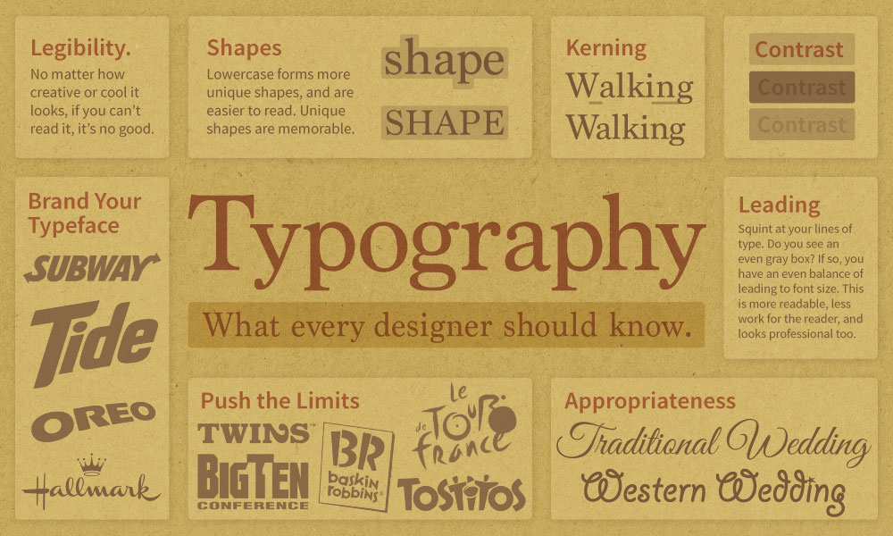
Now that you are a professional designer, never again should you use typeset by a computer (approx. 12 pt. or larger) without considering the letterform and its kerning and leading. You know better now. Let’s begin with a few typography basics in an infographic

Typography Basics

Very helpful videos about typography

Kerning

Let’s begin with kerning. Kerning is the space between letters. It can and should be adjusted in your design work. Here is an example of a few words that have been set on the computer (in Adobe Illustrator).

The smaller sample looks fine. But when we look carefully at the larger sample, notice how much space is between some of the letters? You might notice the large space between the W and a in Walking. This should be tightened up by adjusting the kerning (space between letters) to make it look more professional. If you look closer, where does the kerning need more work? Notice the extra space between the a and l in Walking, and between the a and y in Playing. Begin to train your eyes to see these small, but important areas to fix. Being able to see and fix these details is what makes a graphic designer a professional visual communicator.

When we enlarge type to make headlines, display posters, billboards, signs, etc., we must adjust the letterforms, kerning and leading so that they look good, and are legible.

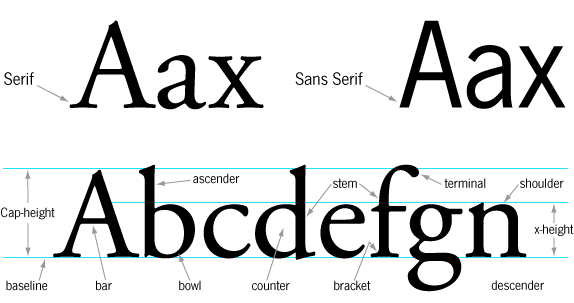
Anatomy of Type

More Typography Basics

Here are some examples illustrating the basics of typography that every designer should know. Study these often, they will make your work look much more professional and developed.

Proof that we read words as shapes

I cdnuolt blveiee taht I cluod aulaclty uesdnatnrd waht I was rdanieg: the phaonmneel pweor of the hmuan mnid. Aoccdrnig to a rseearch taem at Cmabrigde Uinervtisy, it deosn’t mttaer in waht oredr the ltteers in a wrod are, the olny iprmoatnt tihng is taht the frist and lsat ltteer be in the rghit pclae. The rset can be a taotl mses and you can sitll raed it wouthit a porbelm. Tihs is bcuseae the huamn mnid deos not raed ervey lteter by istlef, but the wrod as a wlohe. Such a cdonition is arppoiatrely cllaed Typoglycemia

Legibility – Pushing the Limits

The goal of any designer is to try to create something that interests the viewer and gets them to think about the message being delivered. Here are some examples of how far designers can alter the letter form and still maintain a legible message. Many customers like a challenge, so don’t be afraid to make them think and have to work a little to get their message.

Appropriateness

One of the primary concerns designers face is whether or not their design work will “fit” into the guidelines that most viewers think a logo, or ad, or web site should look like for a particular company or industry. For example, if you are designing a logo for a bank your viewers (target market) should think, “yeah, that is what a bank logo should look like.” They should feel that your design work is appropriate and fits their general idea of what a bank should look like.

Now, this isn’t to say that you can’t challenge their deeply held beliefs about what a bank should look like. But you may fail if it looks too different from what they expect.

Which typeface do you feel is the most appropriate for each word? Which color? the trick here is that it really depends on what your message is, and who your target market is. Wouldn’t all of these work if we were talking to the right target market?

Advanced Typography – Nesting and Letter Axis

Here are examples of type design that uses the forms of various letters to help the layout and arrangement of the words. There is no right or wrong form to follow, just remind yourself that legibility is key and that you have a message to deliver to a target audience.

Typography Trends

While the best typeface is the one that fits your design style and best delivers your message to your audience, we do see trends emerge as time passes. Sometimes we don’t notice a design or typography trend until it passes. But we can be aware of what is happening all around us. Many designers, including myself, watch other designers and popular culture and see what’s trendy and current.

Font Squirrel’s HOT list

One of the best ways to see what designers are using is to see what they are downloading. Font Squirrel has a tab on their website titled “HOT.” It lists the most popular typefaces people are downloading. I’ve watched it for several years now and it seems to give an accurate snapshot of the world we live in.

Also, check out their great font identifier tab.

fontsquirrel.com

Fonts in Use

Another great resource is the website fontsinuse.com. It allows users to upload images that show typefaces being used on real projects. It’s a great way to see how a typeface looks on a design used in a real marketing situation.

fontsinuse.com