A good video to get you started with design fundamentals
(An interesting look at how design principles are used in interior design)
Unity
Unity in graphic design means that things look like they go together. Here are some examples that show how to achieve unity in different ways.
Chunking Information
- Things that are close together, look like they go together and are unified. Do you find 4 chunks of information?
- Chunking helps to emphasize areas too
- Look how these samples group information together, into smaller chunks. The viewer can visually organize them, then read through the different chunks of information.
- All the type is white. It matches the white foam and helps to unify the design.

- These three bottle designs use a similar layout.
- They use three chunks to deliver the message. Top chunk is the brand identity. Middle chunk features the product description/photo. The third chunk is the legal area.
- Simple
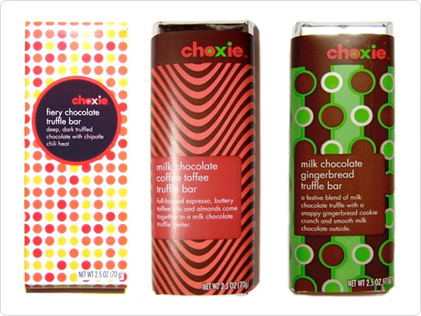
Unity through repetition
- Unified by repeating a design motif/pattern throughout the layout
- This repeated pattern unifies each individual wrapper
- It also unifies the product line with continuity. Each candy bar uses a different repeated geometric pattern on this company’s candy bars. So they look like they go together and are part of the same brand.
Unity through continuation
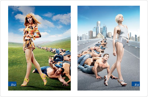
- Elements are placed or chosen so the viewer’s eye moves from one element to the next and “continues” through the design or layout.
- Continuation through sequential repetition of similar elements (the men and perspective). Notice how the men fall, and end, at here feet—since they are selling shoes.
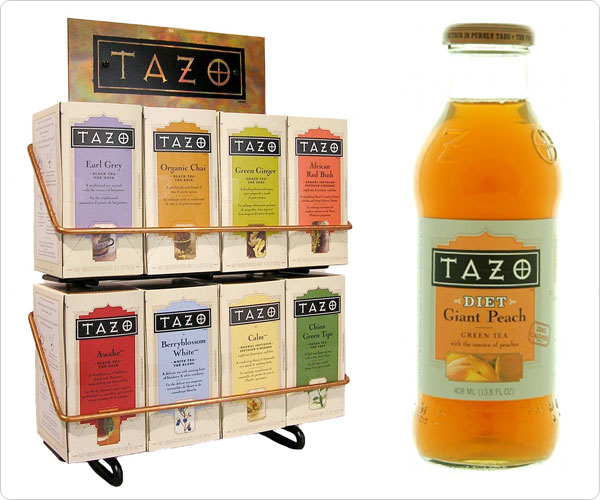
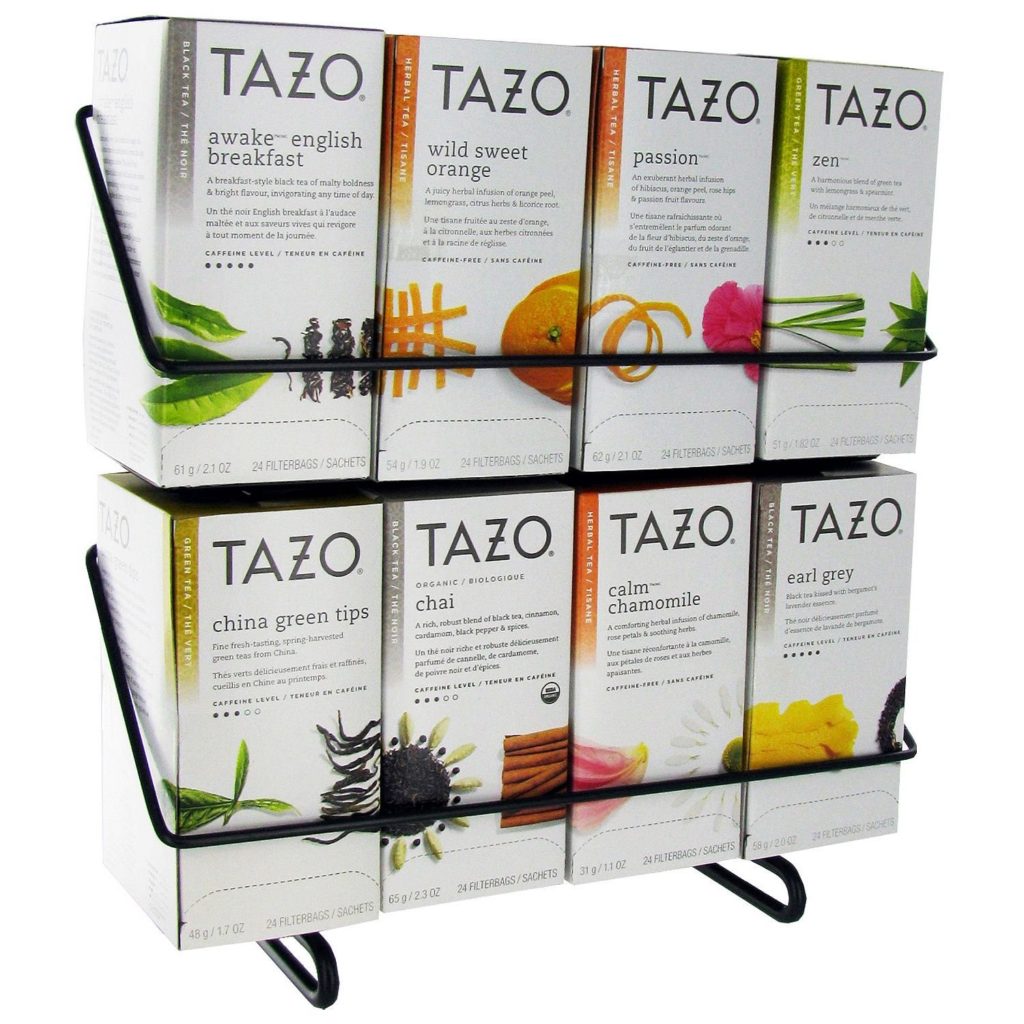
Unity through continuity
- Continuity means less work for the viewer!
- Continuity helps unify packaging, pages in a magazine, textbooks, or a multiple-page web site by putting design elements in the same place on each page.
- Imagine how frustrating it would be if the page number was in a different place on every page of a magazine. Or if a logo changed placement on every web page. The reader would have to work harder than needed to get the information.
- Continuity also helps reinforce brand identity by keeping the brand look consistent. This helps build visual brand loyalty. Look how Tazo tea uses consistency and continuity in their packaging.