Balance in design refers to the visual weight of each element, and how each element’s visual weight is distributed in the layout.
Symmetrical Balance
- Things are centered vertically and/or horizontally. Many cans and bottles use this approach—but they don’t have to.

Asymmetrical balance
- Elements are not perfectly centered
- They utilize white space and the visual weight of other elements to balance the layout.
- This can take more time, thought and skill, but it usually looks more developed and professional


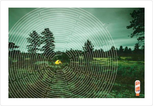
Radial Balance
- Notice that the tent falls on the page using the rule of thirds.
- This ad also emphasizes the tent and bottle with color and isolation

