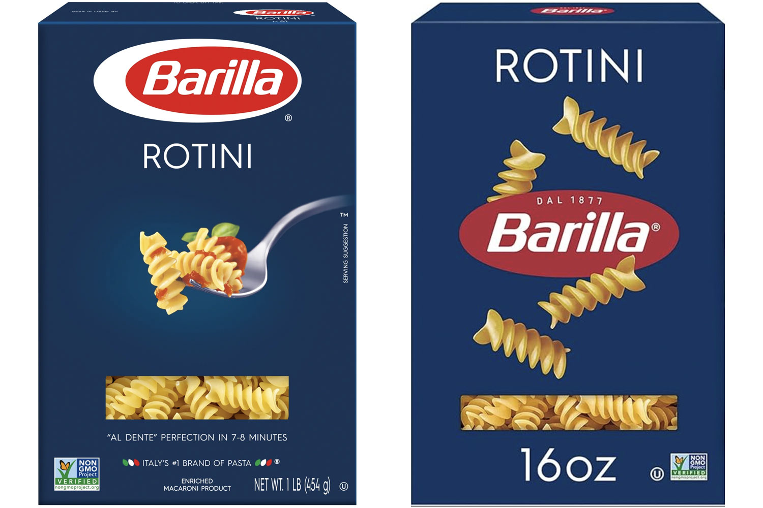
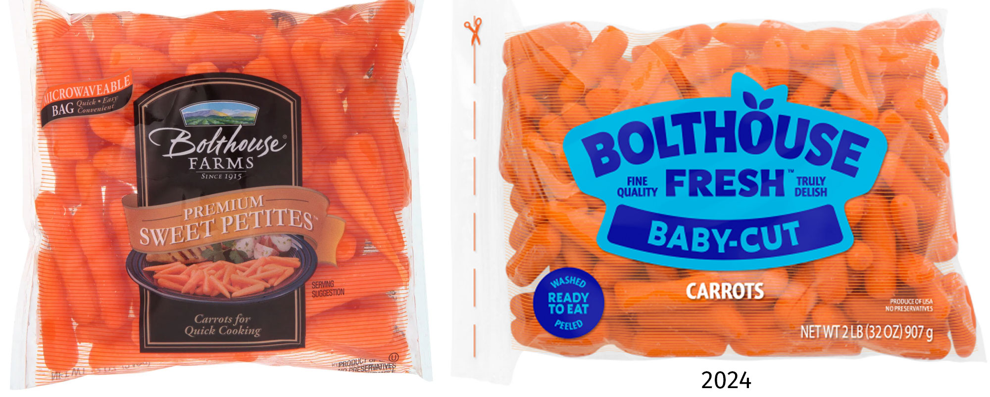
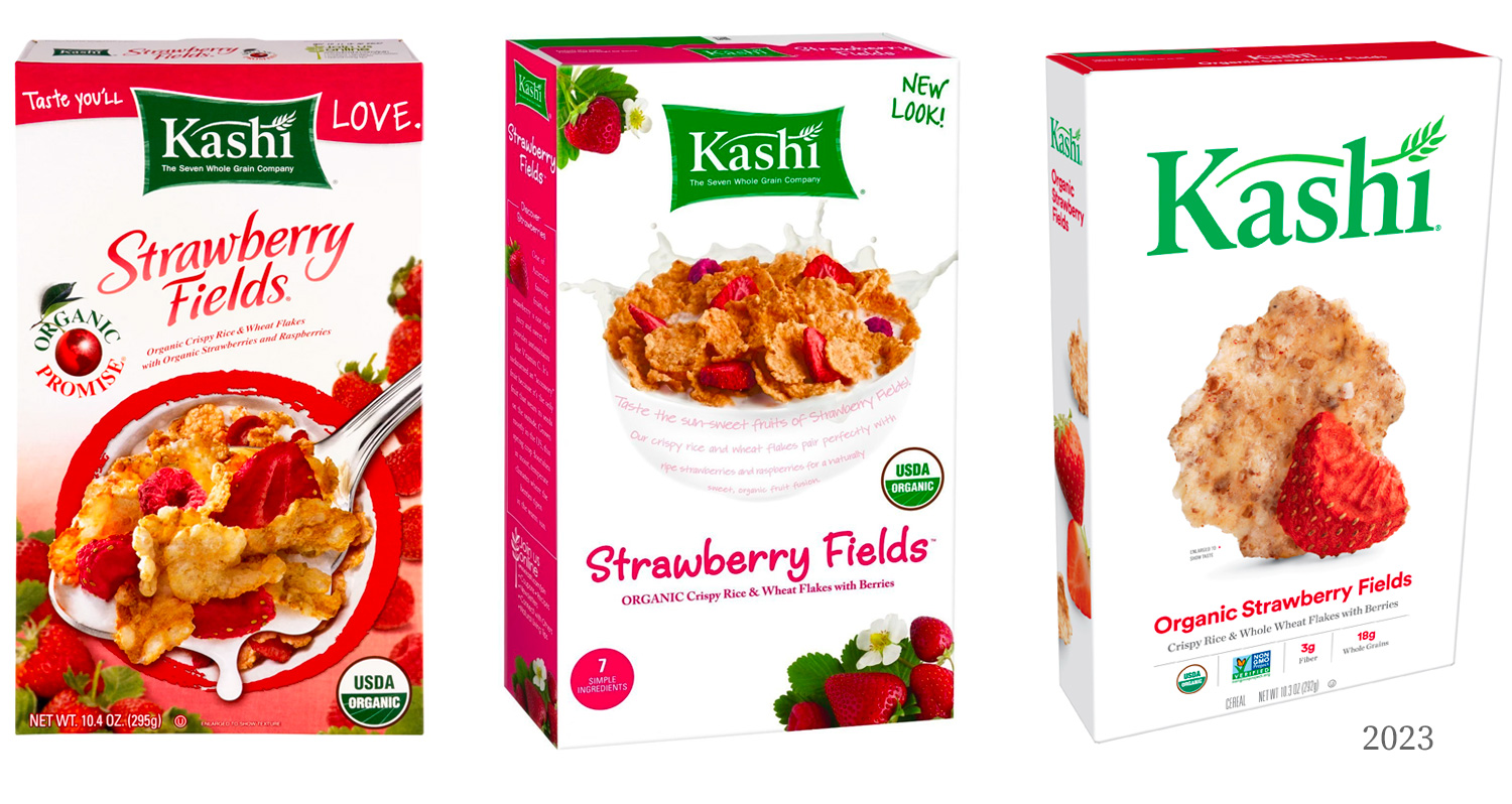
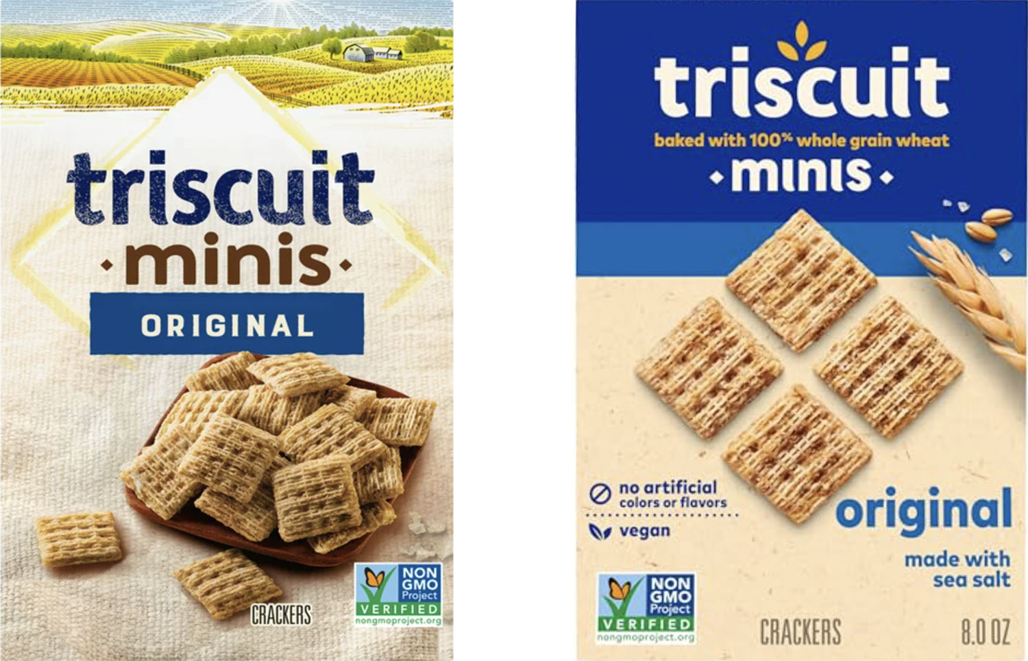
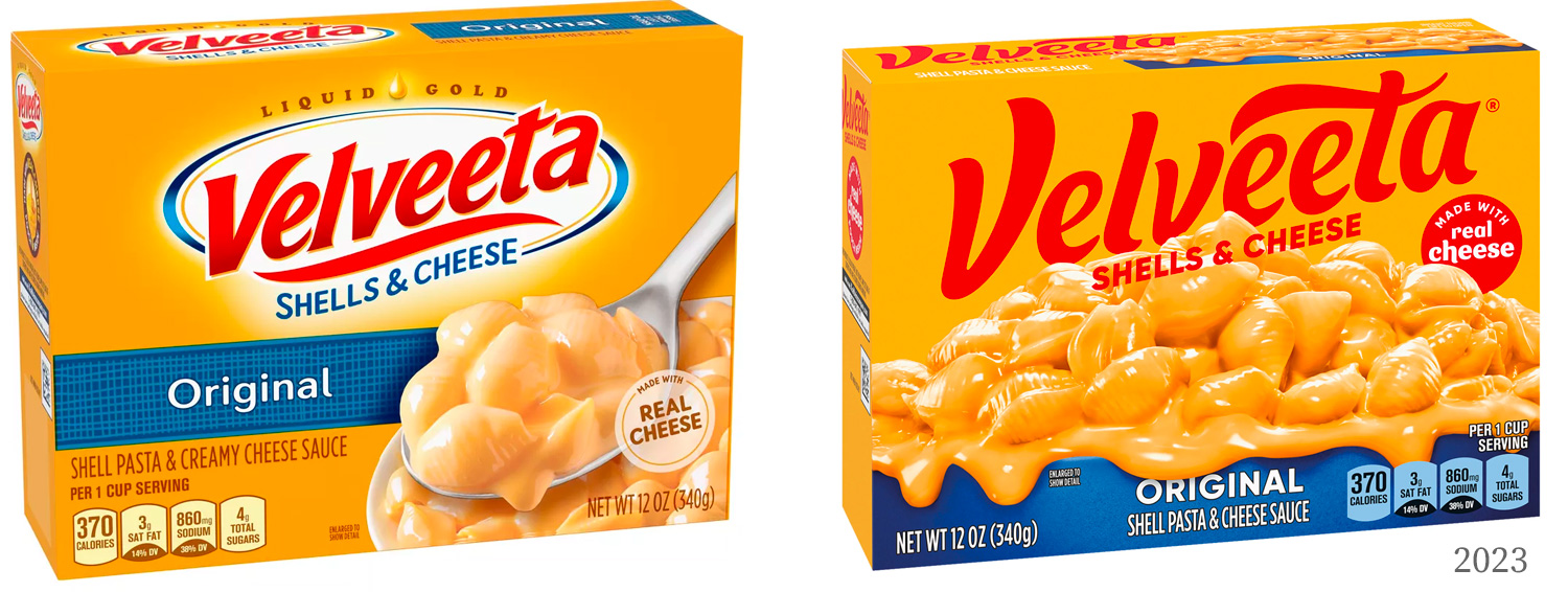
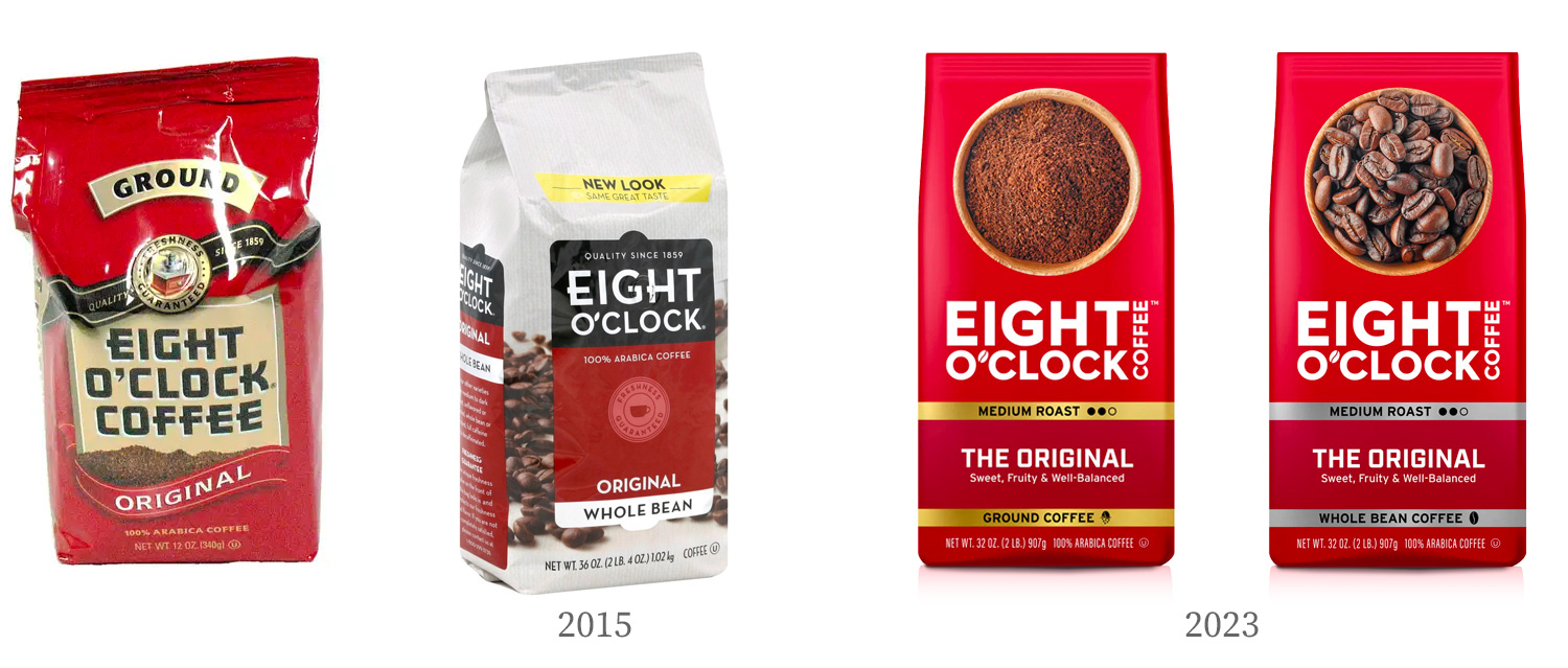
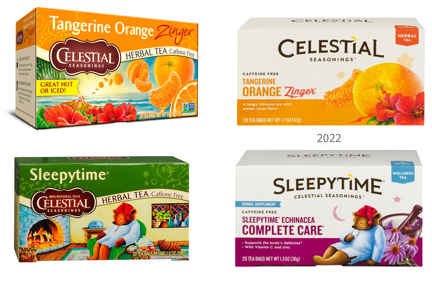
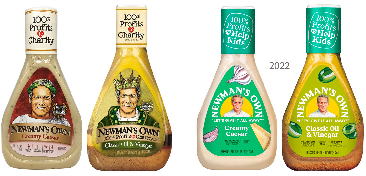
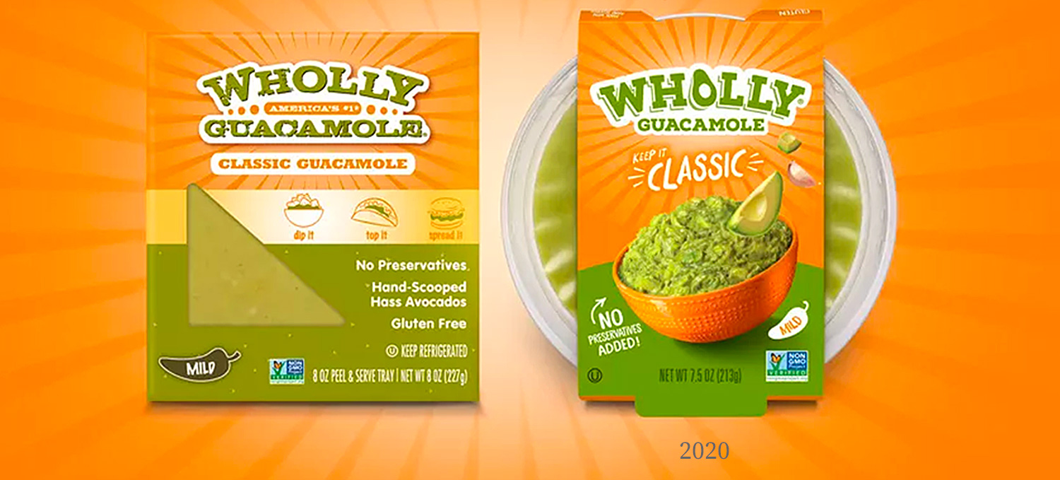
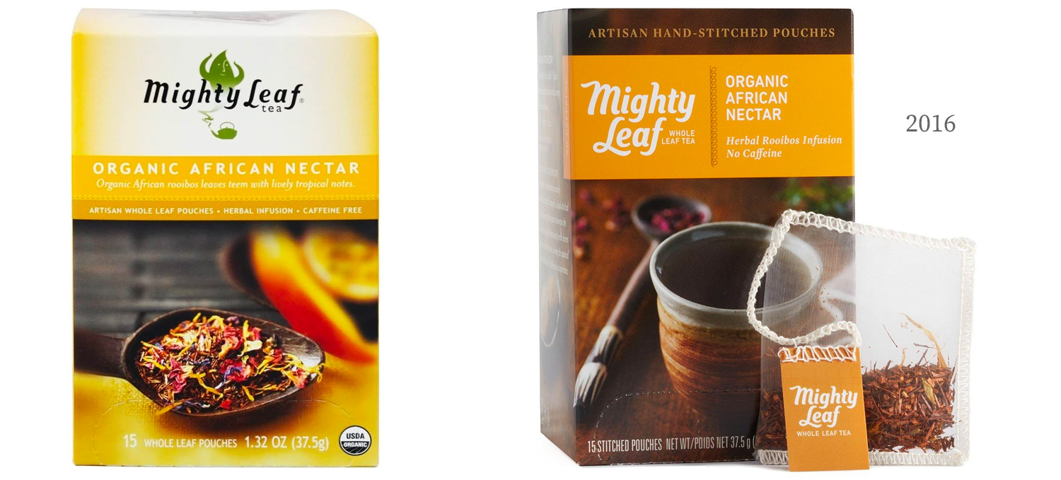
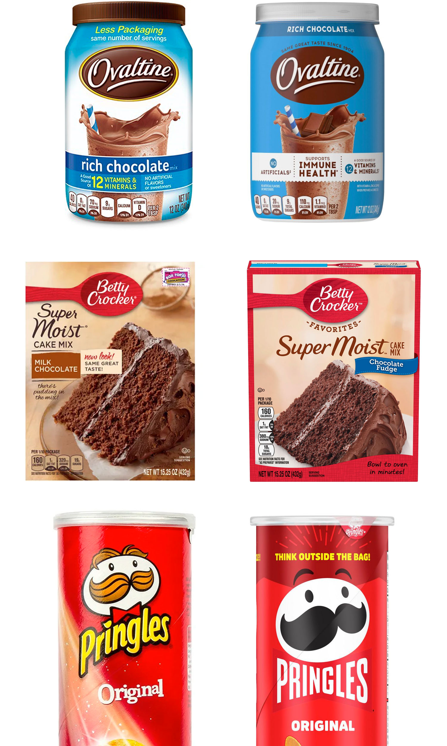
2018– Present
In the late 2010s and early 2020s, I noticed several brands moving to a simplified and minimalistic layout and logo design. The trend includes:
- Minimalistic style and layouts. Less is more.
- Limited gradients and blends
- Less depth, dimension, and fewer drop shadows
- Centered layouts (symmetrical)
- Few outlines
- Overlapping graphics and images
- Larger blocks of solid colors
Why are designs being simplified?
I read a lot about this from many sources and keep this list of what the industry is saying. Time will tell which reasons for simplifying designs resonate most with consumers. Consumers have the ultimate say in what works and what doesn’t—so we’ll see.
Many factors drive most changes and trends, so remember that these are just a few currently being discussed, and there are certainly more to come.
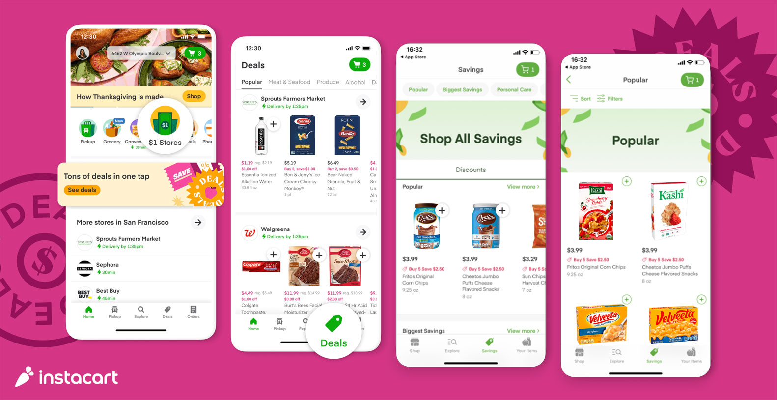
- Necessity is usually the mother of invention. My wife gave me this one. She felt the new packaging designs were easier to see in all the apps consumers use on their smaller phone screens. I did an Instacart screen mockup (below) to show this. I think she has a point.
- Health-conscious consumers want natural foods with honest ingredients that they can pronounce and understand. A clean, simplified design that emphasizes the main ingredients seems to help communicate this to consumers. Fewer drop shadows, gradients, images, outlines, and a later overall design style also help communicate this.
- Companies change their packaging and marketing design as they update and/or change their vision/mission statements to embrace more visible stewardship (giving back to the community, focusing on sustainability, embracing important social causes, increasing worker conditions, etc.).
- A simpler design tends to make consumers think of a company as being honest, sustainable, authentic, and truthful. No extra hidden secrets, no fine print. They then may think the ingredients are honest and the company is being truthful about the quality of the product or service.
- Clean, simplified, and organized design work makes order from chaos like it always has. This apparently protects consumers from feeling overwhelmed by a “busy” design. There is less information to sift through to find what they want to know. Less stress, less anxiety, and more clarity can help consumers make quick decisions and feel more confident in their choices. Some might argue that the isolation of COVID led to an increase in mental health issues that led to consumers wanting simplified, less overwhelming design work. This might be partially true, but this trend started before 2020. Maybe the effects of social media, going back to the 2000s, also played a part in this trend.
- Sometimes designs just need to change. Just like you didn’t want to listen to your parents’ music and wanted your “own music,” different generations want and like different things. One company tries a new design, and consumers respond well to it, and then more companies embrace it. If enough companies embrace it, it can become a trend.
- A clean design can mirror the green or eco-conscience trends of the modern consumer.
Remember the basics of design
- Good design makes order from chaos.
- Good design should be simplified and clear. As designers, our goal is to strip away all that isn’t necessary in a design so we can clearly deliver the message to the audience.
- Typography still has to be legible.
- The brand still has to be identifiable (typefaces, colors, art, styles, layout, etc.)
- Photos, illustrations, and videos still have to reinforce the headline/text and message.
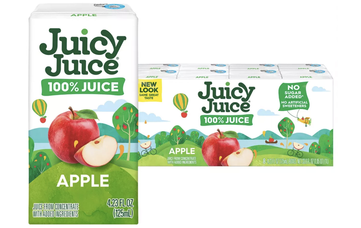
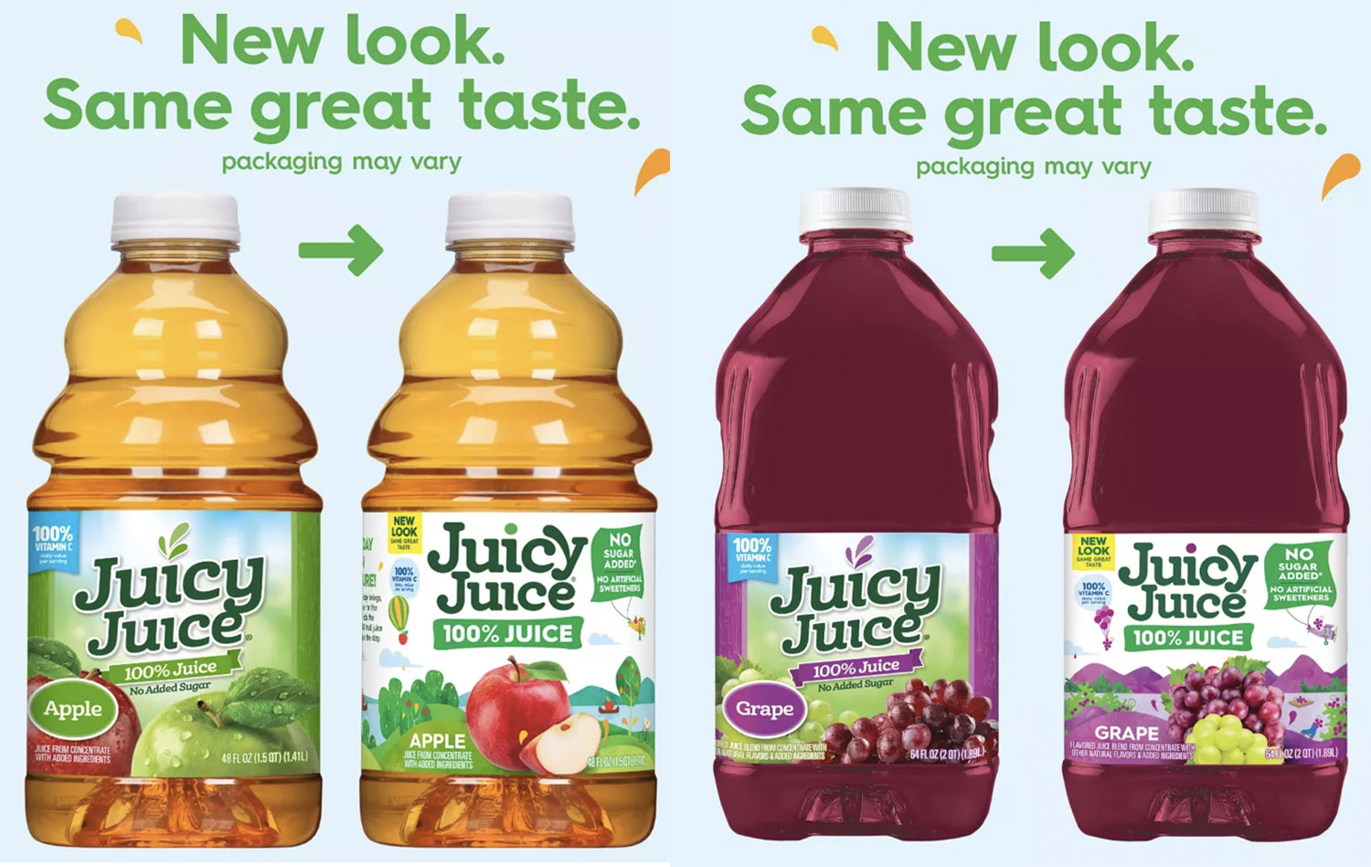
Juicy Juice, part of the Harvest Hill Beverage Company, is unveiling a brand new look created in partnership with agency Little Big Brands. The work capitalizes on their category leadership while bringing a new playful element on pack that appeals to parents and kids alike.
“Juicy Juice is a go-to for a lot of families, whether at home or on-the-go, promising 100% juice,” said Ben Glotzer, senior creative director, Little Big Brands. “We really wanted to help modernize and evolve the brand, but also create something that really resonates with kids. Bringing a fun fruity world to life on pack is visually appealing and also gives the brand an incredible toolbox for digital and advertising exploration.”
The success of the design is anchored in the ability to create differentiated wholesome and better-for-you cues with a contemporary look. The brand mark is a respectful evolution that brings more play and juiciness to the brand. From a functional perspective, communication was focused on clearly helping consumers understand the key claims and reasons to believe, and color was strategically used to identity flavors easily. Fruit photography was nestled center pack to create appetite appeal and aid in shopability as well. The design allows the brand to flex across multiple pack structures and sizes as well as sublines.
Emotionally, this new imaginative Juicy Juice world brings fruit to life in unexpected ways. It creates a natural environment with unique “Easter eggs” specific to each flavor, resulting in a fruit-filled, playful landscape. A strawberry parachuting, an apple canoeing, a raspberry in a rocket ship. All part of a day in the life of Juicy Juice. Claims are solidly anchored in these elements as well, like the ‘No Sugar/No Artificial Sweetener’ tag being flown in a banner behind the airplane. The result is a fruity dreamland with all-family appeal.
Full Article: https://www.packagingstrategies.com/articles/104448-juicy-juice-embraces-more-vibrant-look-in-brand-redesign
