Nothing is more important than color when it comes to designing marketing material for your client
3 Things to consider with color
There are three main areas a graphic designer should consider when choosing colors for a brand identity:
- Does the color appropriately communicate the client’s brand/message to the target audience?
- Is the color free to use? Does any competitor already “own” the brand color?
- What emotional, psychological, and symbolic meanings are associated with your color choice in the culture you are designing for?
A helpful video introducing color
Color Consistency is a Challenge
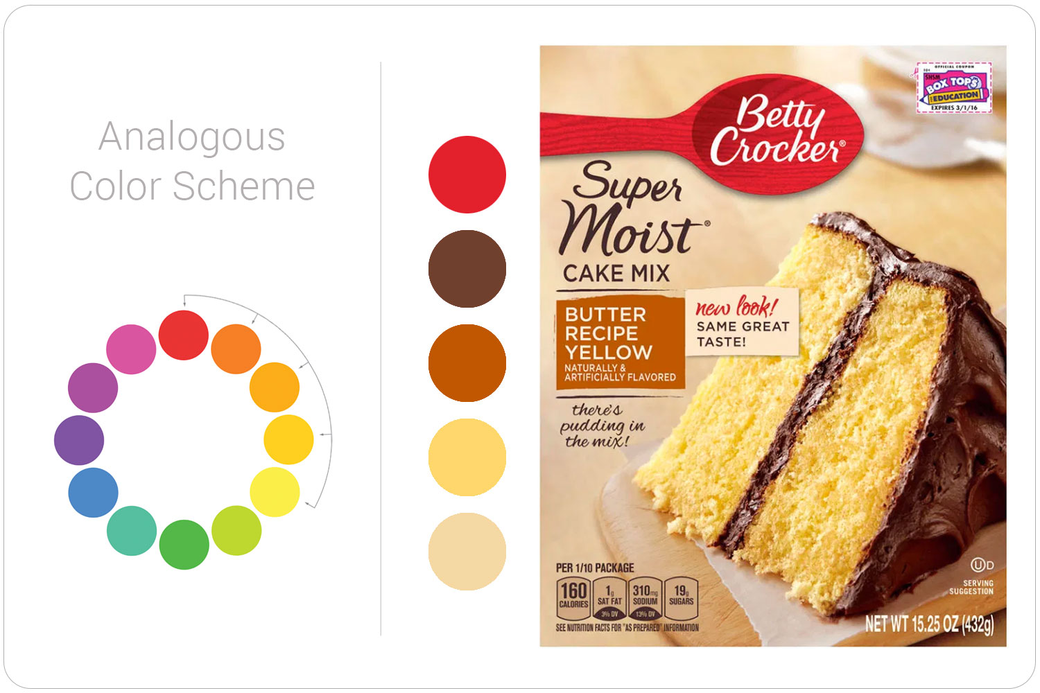
Your color choice must remain consistent when reproduced across many products and media. That’s why it’s best not to choose an unusual main brand color. I’d stay away from neons, pastels, and metallics. They are very hard to reproduce in many printing processes.
As a designer and art director, I’ve had to ensure that a brand’s color looks consistent across many marketing materials. It’s never easy, and it’s never perfect.
Think of the challenge Pepsi’s designers have when trying to maintain consistency over all these products sold and printed all over the world.

Color Comes From the Sun
The energy that the Sun creates radiates outward onto Earth. All this energy is made up of many different sizes of waves. All of these waves, or forms of radiation, make up what we call the electromagnetic spectrum. The electromagnetic spectrum is the range of wavelengths.
Human eyes can see a small portion of the waves in the electromagnetic spectrum. This small portion is referred to as visible light. This is where our colors come from.
Color is simply the way receptor cells in our eyes detect certain wavelengths of light from the Sun.
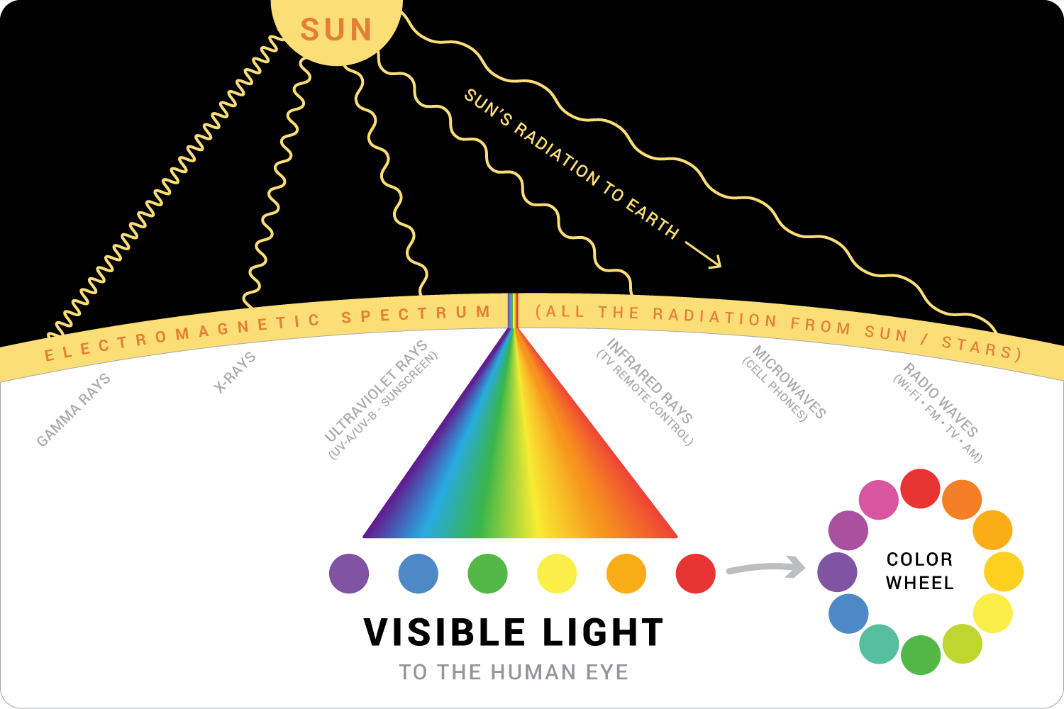
Color Wheel
Warm colors are the reds, oranges, and yellows. These colors tend to move forward and pop off the page.
Cool colors do the opposite. The blues, greens, and violets tend to recede and move to the background.
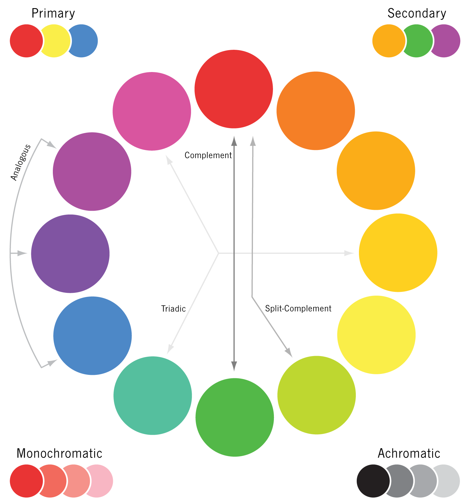
Using the Color Wheel to Design
Complementary Colors and After-Image
Complementary colors are two colors directly across the 12-step color wheel from each other. Our favorite Christmas colors, red and green, are perfect examples of complementary colors. Your favorite sports team might use blue and orange
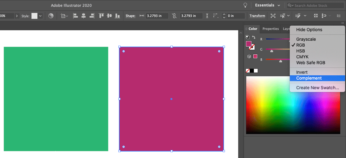
Did you know that your eyes can show the complement of any color?
Do you ever need a harmonious color to go with one of the main colors in a design? Your eyes can do it for you. Simply stare at the color you are starting with, then move your eyes slightly to the side on a white background (paper or screen), and the complementary color will appear. It only lasts for a short time, so you might have to do it a few times.
If you prefer, Adobe Illustrator offers the same function. The tool is in the Color palette > Complement.
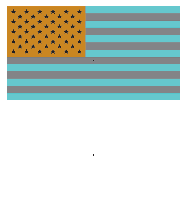
Try this tried-and-true complement activity. Stare at the black dot on top for about 15 seconds, then at the black dot at the bottom. See the Flag? Pretty cool.
Color Gamut in Graphic Design
The number of colors we can accurately see/print/display varies when we compare the human eye, a printed magazine, or a computer screen. These color groupings for a given medium are called gamuts.
Designers need to be aware of color gamut differences when creating marketing materials.
If you are designing for a printed brochure and accidentally set up your colors in RGB (used for computer/tv/device screens), you may choose a color that doesn’t look good when printed on paper (CMYK).
If you’re in a software application like Illustrator, Photoshop, or InDesign, youwill see an error message saying the color is “Out of Gamut.”
Like this:
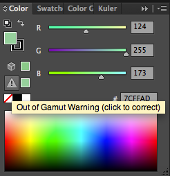
To fix this issue, you have to switch to a CMYK color mode or click the little box next to the caution icon to choose a different color—one that will look best in the specific gamut you’re designing for.
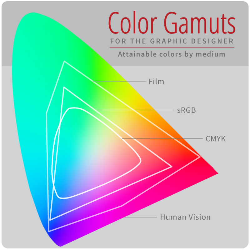
Color Gamut Overview
Below is a comparison of three popular color gamuts. You can see why film photographers were initially reluctant to switch to digital photography. You can also see that an RGB photo will lose a lot of color range when printed in CMYK.
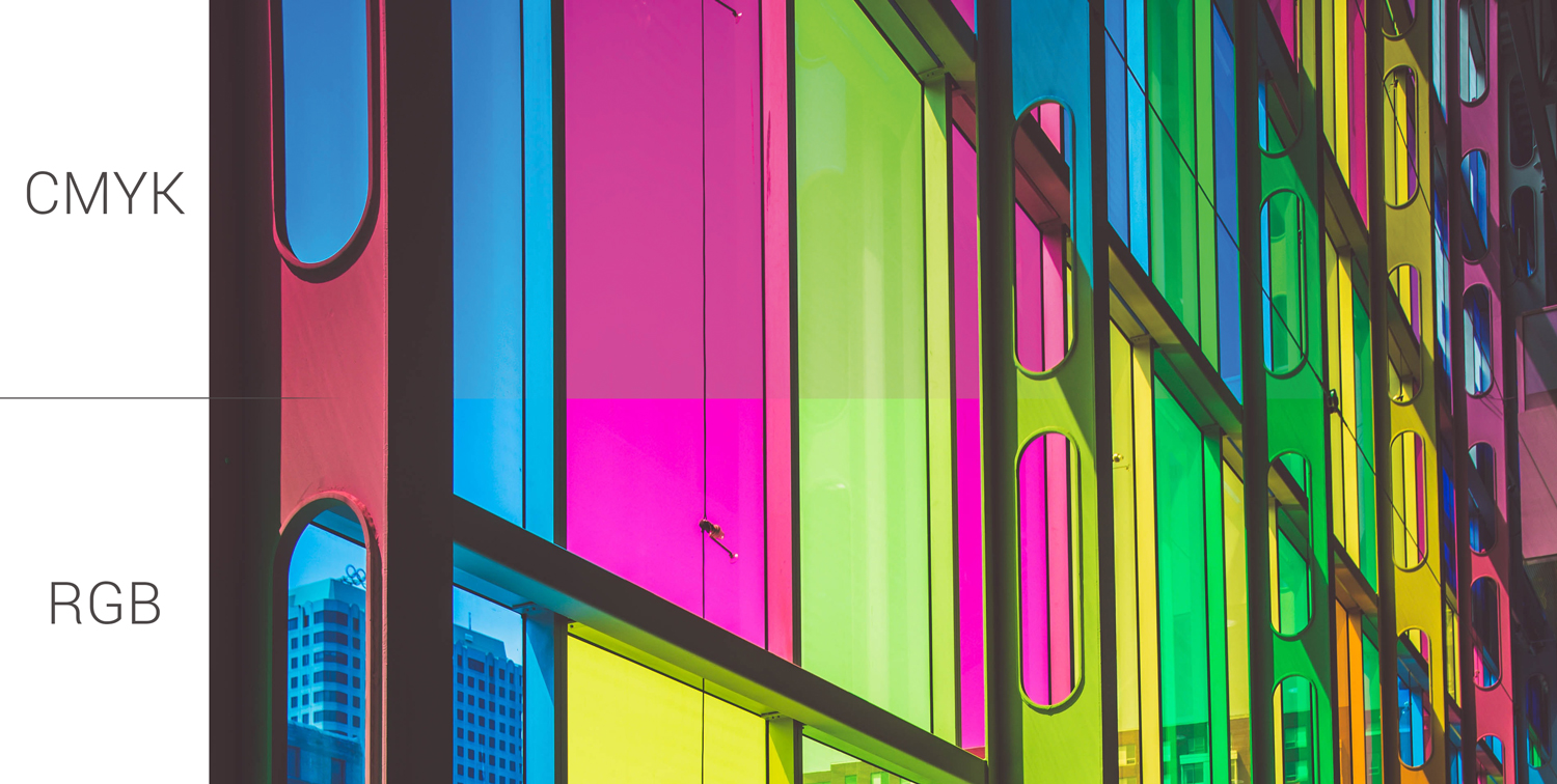
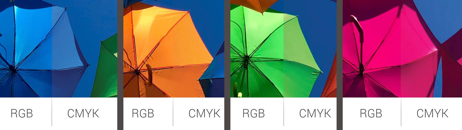
Color Shift by Color Gamut
Certain colors look different in RGB (screens) versus CMYK (paper/printed on a surface). Here’s a look at two photos and how the colors change when viewed in a specific gamut.
Gamut is called Color Mode or Color Space in software apps like Illustrator, Photoshop, and InDesign.
Some of the differences are very subtle, but they are there. Since the RGB gamut can reproduce more colors, we see brighter colors. The CMYK gamut produces fewer colors (that the human eye can see), so some colors look duller.
So . . . Does it matter if they change?
Good question. It does. For example, let’s say you design a printed brochure on the computer and use RGB. You’ll have a very nice-looking design with bright, vibrant colors. Next, you send a PDF proof of that brochure file to your client to approve. They love it and say, “Print it!” The problem arises when your client receives their printed brochures, and the colors are duller than the proof you sent them. They call you and ask, “What happened? The brochures were printed wrong.”
Just make sure you are designing in the gamut/mode/space in which your final marketing material will be reproduced. That will eliminate any surprises for your client.
You’re probably thinking, “What if I’m designing several pieces of marketing material?” Some are RGB, some are CMYK, some are foil-stamped, silkscreened, etc. The answer is that you should send a proof for each of these designs in the proper final gamut. Some gamuts and printing processes are too difficult to show to a client with a digital (PDF) proof. Most designers and manufacturers require proof of the final product. So the client would receive 1–5 actual final products to approve BEFORE the entire 1000+ products are made.
I work with some printers who will not print your stuff unless you approve a proof printed on the actual substrate your final product will be on. They don’t accept approval of digital proofs because they fear you’ll reject a final printed product that doesn’t look like your digital proof.