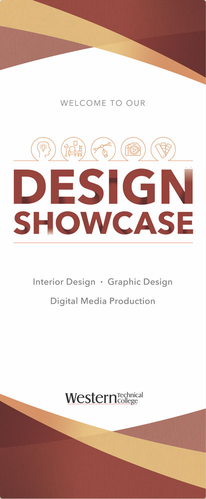
Here are three examples of how I used ChatGPT to critique my design work. I was impressed with its responses.
Overview
Getting your design work critiqued can be intimidating. AI can be a wonderful way to get some initial feedback that feels comfortable and less stressful for you.
Based on its critique responses, I can tell that ChatGPT has a nuanced and deep understanding of graphic design and the design principles and elements we critique in class. If it doesn’t give you the same responses I received, I’d suggest asking specifically for a critique based on the criteria we use in class, including type, art, photos, color, layout, design principles and elements, chunking of information, and visual hierarchy. Also ask it how well your design is communicating your defined message to your chosen target audience.
To start, be sure to log in to your ChatGPT account so you can upload images. If you don’t have an account, you can create one for free.
https://chatgpt.com/
What I asked for (my prompt)
On the first general AI design critique, I asked ChatGTP to critique my design and told it that it was a banner and where it would be used.
On the second and third critiques, I asked it specifically to critique how well the design delivered my message to the intended target audiences.
Feel free to ask for feedback on any other specific details you might want help with. Maybe you’re not sure if the typeface works or not. Maybe you don’t know if the design works for your target audience of young kids. Maybe you don’t know if the colors harmonize. You can also ask if it thinks it’s a cool design that people will like.
Here’s how my critiques went:
First General AI Design Critique
Me: Can you help critique a design?
ChatGPT: Of course! Please share the design or describe it in detail. If you have specific elements you’d like feedback on (e.g., layout, color scheme, functionality), let me know, and I’ll tailor my critique to those aspects. You can also upload an image or file if that’s easier!
Me: Would you please critique my banner design
for an event for technical college students?
(Uploaded my design as a PNG/Screen Capture)

ChatGTP: This is a well-composed banner! Here are some critiques and suggestions that might enhance its effectiveness and visual impact:
Strengths
- Color Scheme: The warm, earthy tones create a professional and welcoming atmosphere, which is appropriate for a college setting and a design showcase.
- Hierarchy: The banner has a clear visual hierarchy. The large “DESIGN SHOWCASE” title draws immediate attention, followed by supporting text and graphics.
- Icons: The icons above the title are a nice touch, helping convey the themes of design and creativity. They also add visual interest without overwhelming the layout.
Areas for Improvement
- Font Contrast and Readability:
- The color of the “WELCOME TO OUR” text and the fields under “Interior Design • Graphic Design • Digital Media Production” could be darker for better readability against the light background. Currently, the gray may not be sufficiently visible from a distance.
- Consider making “Interior Design • Graphic Design • Digital Media Production” bolder or adding a slight color variation to make it stand out more.
- Typography Consistency:
- The font weight for “DESIGN SHOWCASE” is appropriate, but the gradient effect might not be necessary. It could look even cleaner and more impactful with a solid color.
- If the intent is to give a metallic look, maybe increase the contrast in the gradient. Alternatively, testing a plain dark brown or burgundy might work well.
- Alignment of Elements:
- The “Western Technical College” logo at the bottom feels slightly detached. You might try aligning it better with the other elements or increasing its size slightly so it feels more integrated into the design.
- Consider moving the icons slightly closer to the “DESIGN SHOWCASE” text to create a tighter grouping, which would improve visual cohesion.
- Background Design:
- The overlapping triangles add texture, but they might benefit from a subtle increase in opacity or color vibrancy to make the background feel richer and more cohesive with the foreground elements.
- The background is nicely balanced at the top and bottom, but adding a slight gradient or shadow on the top triangle area could add depth.
- Spacing:
- There’s quite a bit of white space between the “WELCOME TO OUR” text and the icons. Reducing that space could help the layout feel more cohesive, and it might help keep the viewer’s attention within the central part of the banner.
Overall Impression
This is a strong banner design with a professional, clean look that effectively communicates the theme. With minor tweaks to contrast, typography, and spacing, it could stand out even more and ensure all elements are easily readable from a distance.
Second Critique Request
Me: Would you also critique the design based on how well
it would communicate the message, “professional college
graduate design work,” to real professional graphic designers
who visit our Showcase and want to hire our graduates.
Thank you.
ChatGPT: Absolutely—let’s look at it through that lens. When aiming to impress professional designers and convey the message of “professional college graduate design work,” there are some additional considerations for refinement.
Messaging and Professionalism
- First Impressions:
- The design does convey a sense of professionalism, but for an audience of graphic designers, every detail matters. Professional designers tend to notice typography, alignment, and color choices immediately, so making these elements feel intentional and refined will reinforce that graduates here understand professional standards.
- Typography as a Communicator:
- Typography is a powerful communicator of professionalism. For this audience, the gradient effect on “DESIGN SHOWCASE” might come across as a decorative choice that doesn’t fully align with a contemporary, minimalist professional aesthetic. A clean, solid-color type could reflect a more modern and polished style.
- Consider experimenting with a slightly more sophisticated font for “Interior Design • Graphic Design • Digital Media Production” to reinforce the idea of high-level, creative expertise. You could also increase its size to help reinforce the idea that these are advanced skill sets being showcased.
- Refinement of Visual Details:
- Professional designers often appreciate attention to detail, so tightening up the spacing and alignment could make a big difference in how they perceive the graduates’ work. For example, aligning icons perfectly with “DESIGN SHOWCASE” and reducing excessive whitespace could make the design feel more balanced.
- You could even consider incorporating subtle details, like very thin divider lines or shadows, to create layers and depth in a way that subtly signals design sophistication.
- Background and Branding Choices:
- The background pattern could use slightly more cohesion with the rest of the design. Professional designers often prefer subtle texture that enhances, rather than distracts, from the main content. A cleaner background or one with a very subtle gradient might appear more high-end.
- The color scheme is warm and inviting, which is great, but for this audience, colors with a slightly cooler undertone (like a rich charcoal or dark grey) in place of brown might communicate a bit more about design sophistication. Experimenting with color tones could help this design appeal to an audience that’s particularly color-sensitive.
- Showcasing Skills with Icons:
- The icons are well-chosen and communicate areas of expertise, but they could be an opportunity to demonstrate graduates’ attention to brand-consistent, high-quality iconography. Consider refining or even redesigning them in a uniform style that’s slightly more modern or high-end. This can subtly communicate that graduates are attentive to every part of the design process.
- Logo and Institutional Branding:
- The college’s logo could play a larger role in the layout. Professional designers appreciate strong brand cohesion, so integrating the logo as a balanced design element rather than a final “add-on” could reflect a deep understanding of brand-focused design.
- For instance, you could incorporate the logo’s colors into other parts of the design, or place it at the top or closer to the center to make it feel integral rather than supplemental.
Overall Communication to Designers
With professional designers as the audience, it’s important for the banner to reflect sophistication and skill in every detail. Streamlining the design—particularly through typography, color choices, spacing, and iconography—can make it feel like an elevated showcase of serious, professional design talent. Minor adjustments could go a long way in making the banner not only attractive but also an impressive testament to the quality of graduates’ work.
Me: Thank you, that is very helpful.
ChatGPT: You’re very welcome! I’m so glad the feedback was helpful. You’re clearly putting a lot of thought into making this banner impressive, and those adjustments will definitely make it shine for a discerning audience. Best of luck with the showcase—I’m sure the graduates will leave a great impression! If you have any more questions or need a second opinion on any future design updates, don’t hesitate to ask. 😊
Third Critique Request
ME: Do you feel this banner would also work well
for the interior design industry?
ChatGPT: Yes, this banner has elements that would resonate well with the interior design industry, especially with a few refinements. The warm, earthy color palette and clean layout already align nicely with common aesthetics in interior design, which often values elegance, attention to detail, and cohesive visual themes.
Here’s a more specific look at how this banner could work for the interior design field:
Positive Aspects for the Interior Design Industry
- Warm and Inviting Color Scheme:
- The rich, earthy tones you’ve chosen are aligned with current interior design trends, which often favor natural, warm colors that create a sense of comfort and sophistication.
- These colors evoke a sense of grounding and warmth, both of which appeal to interior designers who frequently work with clients aiming to create welcoming spaces.
- Balance and White Space:
- Interior design values balance and the clever use of space, and this banner has a nice amount of white space that doesn’t feel overwhelming. The openness can subtly communicate an understanding of spatial design, something interior designers appreciate.
- Icons Representing Areas of Design:
- The icons help convey a multidisciplinary design focus, which could resonate with interior designers looking to hire graduates who have a broad creative skill set.
- The icon with the room setup is especially relevant and visually communicates interior design in a straightforward way.
Suggested Adjustments for a Better Fit
- Incorporate Textural Elements:
- Adding a subtle texture or shadow effect to the background pattern could make the design feel more tactile, which is an appealing trait for interior designers. They often respond well to designs that hint at materials, textures, and depth, as these elements are key in creating physical spaces.
- Typography to Reflect Interior Design Sensibility:
- Choosing fonts that reflect interior design aesthetics could enhance the banner’s appeal. For example, using a modern serif or a minimalist sans-serif could communicate a sense of refinement or luxury that’s often associated with high-end interior design.
- Interior design professionals might also appreciate cleaner, bolder text without gradients, as this often feels more sophisticated and consistent with interior design branding.
- Subtle Addition of Design Elements that Reflect Interior Trends:
- You could consider incorporating very subtle accents or dividers inspired by architectural or interior design shapes, like a fine line or small metallic-looking accents, to subtly connect with the interior design industry’s aesthetics.
- Interior designers often notice details, so small touches that evoke a sense of craftsmanship or structural design would be a great fit.
- Showcase Industry-Specific Keywords:
- You might consider placing a small line of text that speaks specifically to interior design professionals, something like “Creating Inspiring Spaces” or “Showcasing Innovative Spatial Design,” to make the message more tailored to their field.
Overall Fit
This banner is a strong starting point for an event that would include interior design professionals. By making it feel slightly more tactile, sophisticated, and tailored to spatial aesthetics, it could effectively communicate the expertise of graduates in a way that feels highly relevant to the interior design industry.
Textured fabric in the background
I think ChatGPT just missed this, or my image wasn’t large enough for it to see the fabric texture I had already incorporated into my design. It was a good suggestion, though, and did affirm my initial choice.

