Overview
Companies use web ads to reach customers directly with product announcements, sales, specials, educational information, seasonal promotions, how to use a product, and new uses for a product.
For this project, you’ll design three web ads for one product/client. These web ads will go together like they are part of the same marketing campaign.
Grading checklist
- You will design three web ads for one product/client
- Use my templates and fictitious clients below and start designing immediately
- Or choose another client from my Client List
- Or, choose your own client and find your own design assets
- Focus on your product and the benefits it provides to the people who use it
- Have one large, emphasized image to draw the viewer in
- Use consistent brand guidelines across all three ads (logos, colors, typefaces, design elements, photos/art)
- Be sure to have a call-to-action button/ text link
- Size: Choose one:
- (1) Three differently-sized web ads:
- Leaderboard
728 x 90px at 72ppi, RGB - Medium (Inline) Rectangle
300 x 250px at 72ppi, RGB - Wide Skyscraper
160 x 600px at 72ppi, RGB
- Leaderboard
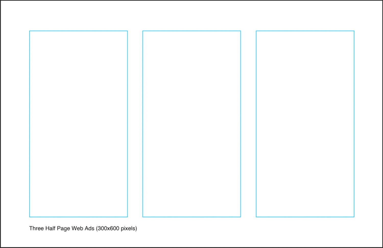
- (2) Three half page web ads
- Half Page
300 x 600px at 72ppi, RGB
- Half Page
- (1) Three differently-sized web ads:
- Use Illustrator or Photoshop to design your ads (download the template below)
(1) Template for Three Differently-Sized Web Ads
Download and use this project folder to design your three web ads. It contains the main template and all the support files (design assets) you see below.
You may choose either the Photoshop or Illustrator template below to design with.
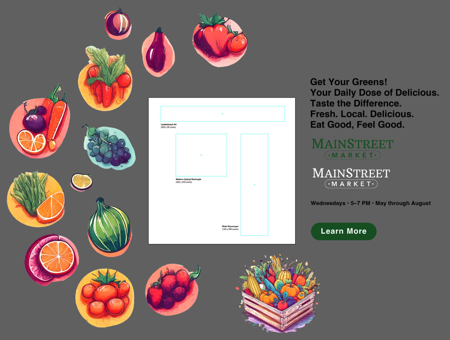
Download the Project folder here: Mainstreet Market Project Folder- Web Ads.zip
Download the Project folder here: Mainstreet Market Project Folder- Web Ads.zip
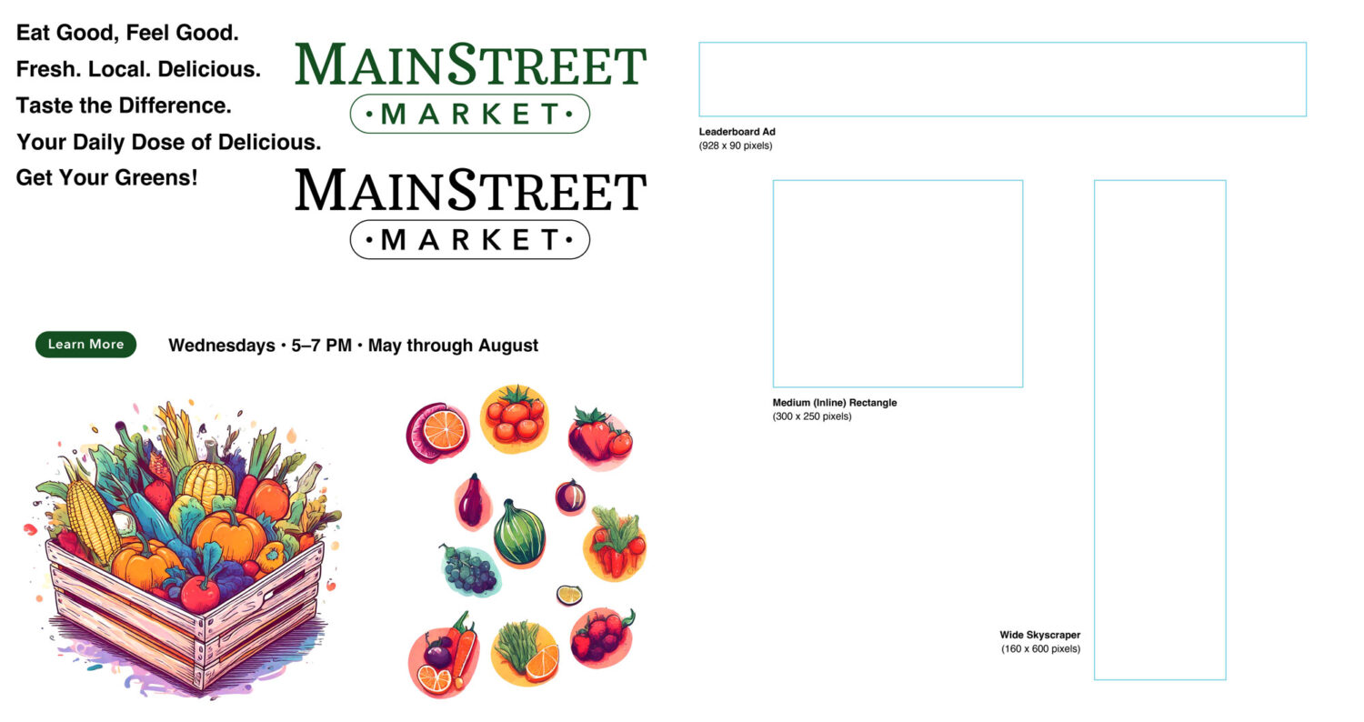
(2) Template for Three Half Page Digital Ads
Download and use this project folder to design your three web ads. It contains the main template and all the support files (design assets) you see below.
You may choose either the Photoshop or Illustrator template below to design with.
Illustrator Template
Download the project folder here: Web Ads 3 Half-Page – Template and Project Folder.zip
Photoshop Template
(To use this, download the Illustrator template that includes the logos, photos, and text and bring them into this Photoshop template.
Web Ad Best Practices


Web Ad Placement on a Website
Here are three common and popular web ad sizes and where they are usually placed on a website.
I suggest keeping the medium rectangle away from the text as much as possible. It reduces readability and slows your reader. It also makes your website look like you put ad revenue over content delivery.
Google also offers an in-text ad that displays between paragraphs. I find these completely annoying as they greatly reduce the delivery of content.

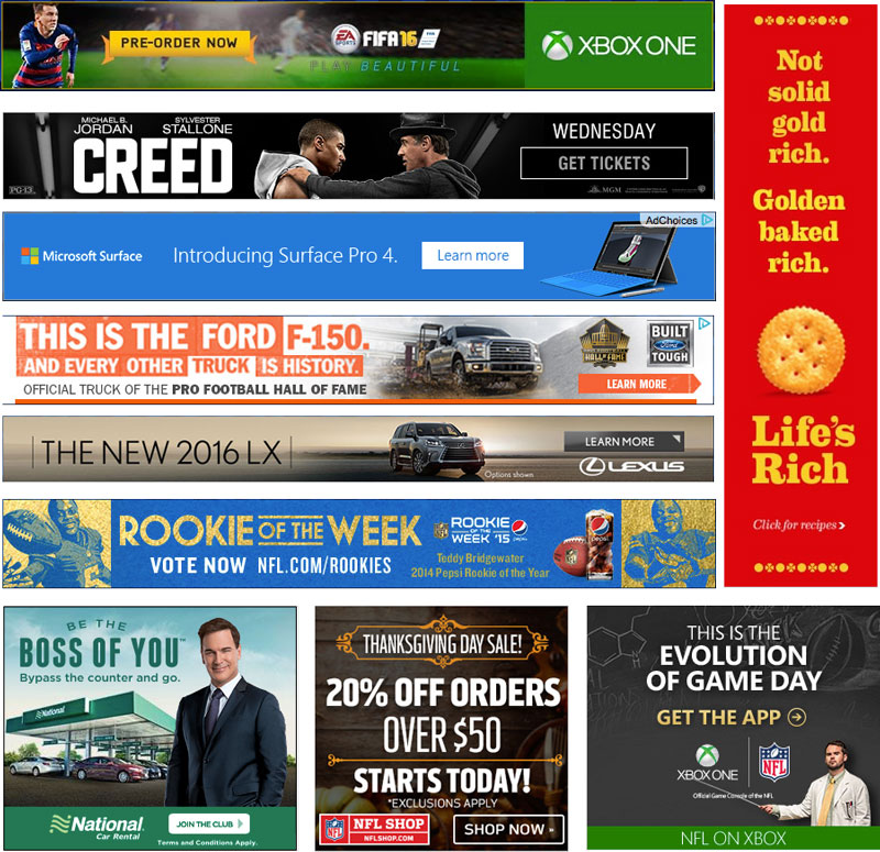
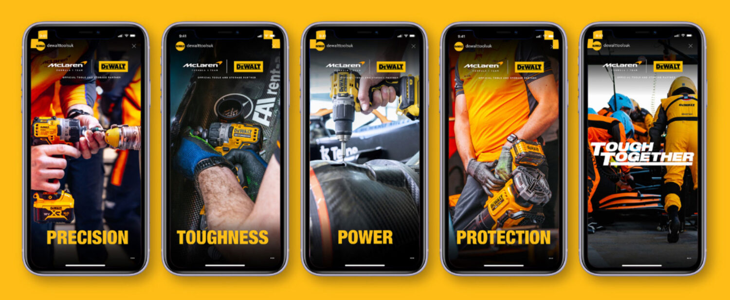
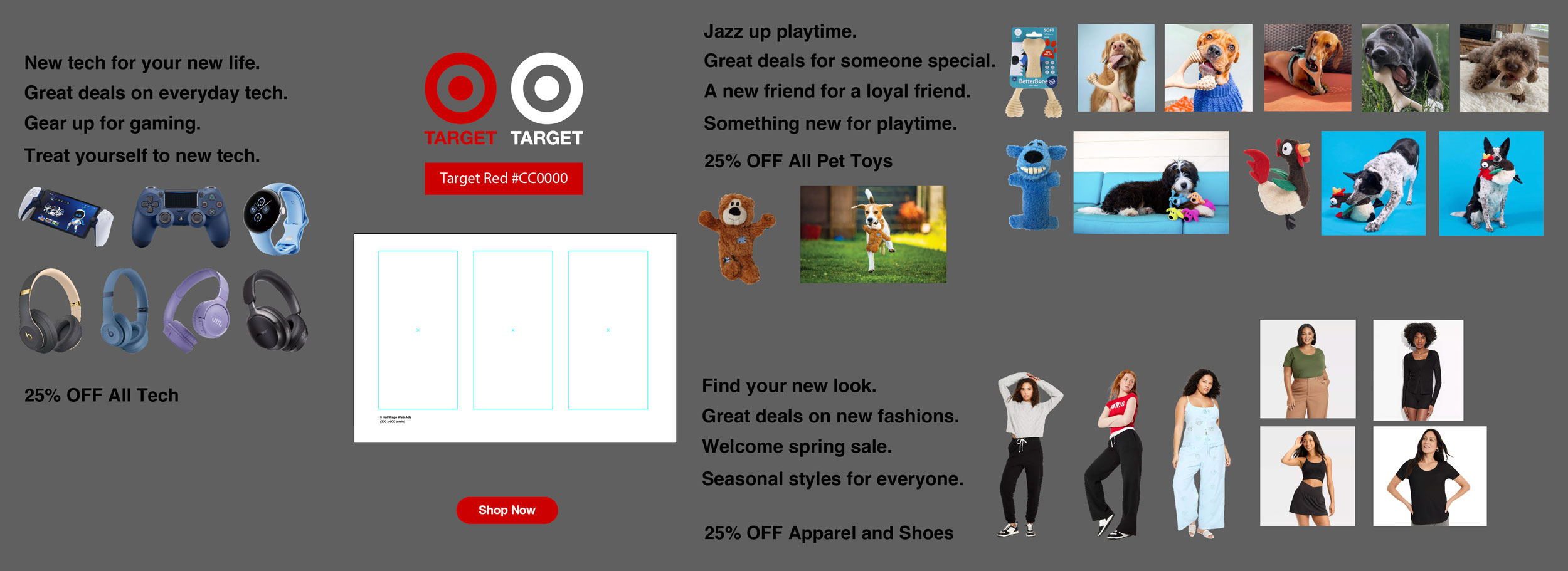
Student Web Ad Examples


Industry Web Ad Examples
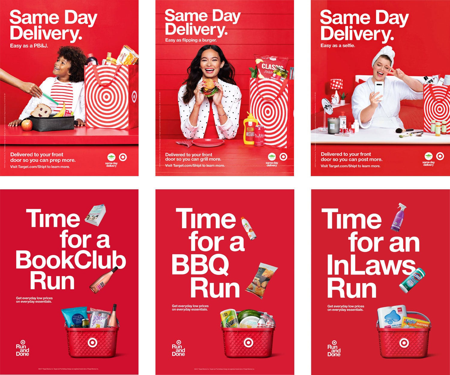
Only 7 Brand Assets were used to create these ads
The process is fairly simple. Designers create, choose, or are given photos, words (copy), design elements (borders), colors, and typefaces. They arrange these brand assets to create the web ads shown below.
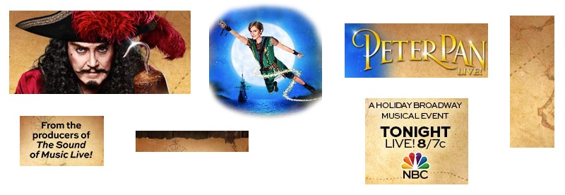
Were used to create these web ads
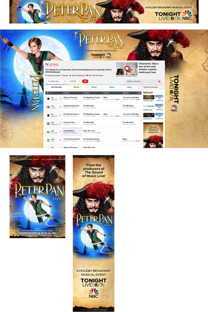
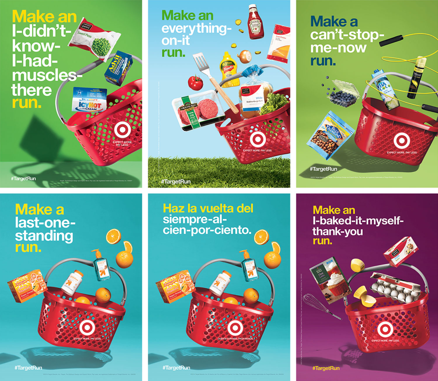
More examples


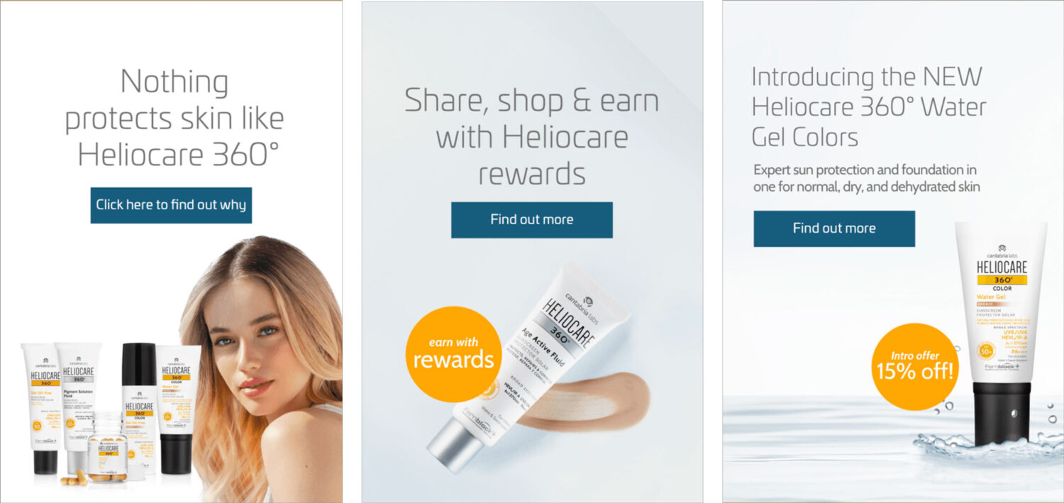
Call-to-Action Buttons/links Examples