These seven elements of design are tools to use to achieve the four principles of design. Each element can be altered to achieve different results. You will begin to use them to help clearly deliver the client’s message to the target market.
Here are several good examples of graphic design work that use each element effectively.
Line
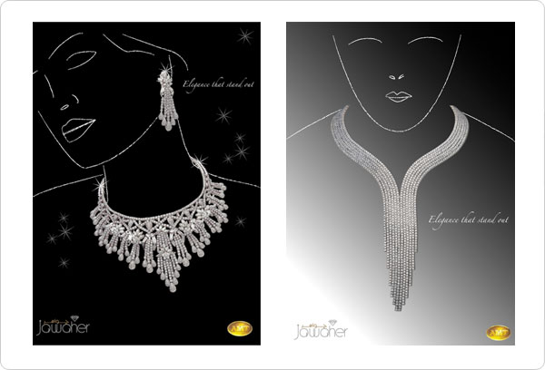
The use of a simple line to create the women in these ads helps keep the focus on the powerful jewelry.
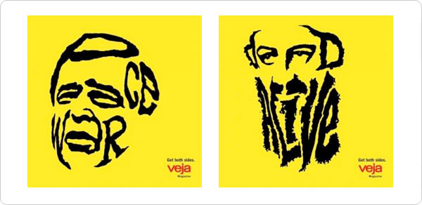
Creative use of hand-drawn lines (type) to create a portrait, and deliver a strong message.
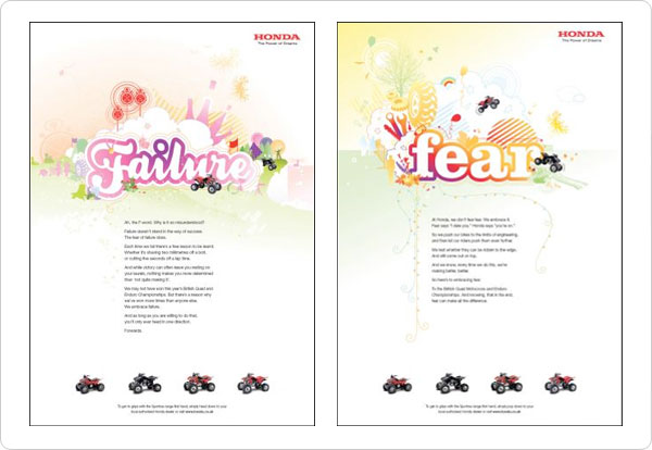
Fun, whimsical line drawings grab our attention and lead us to the headlines of these ads first.
Shape
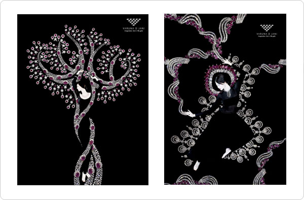
The beauty and free-flowing shapes and forms created in these jewelry ads reinforce the feminine, delicate qualities of the finely crafted jewelry.
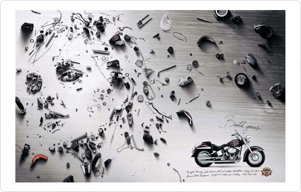
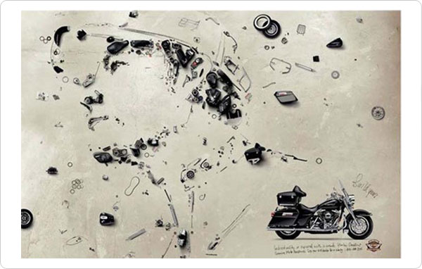
These Harley-Davidson ads reflect the style of artist Vic Muniz (www.vikmuniz.net). faces are made using Harley motorcycle parts and photographed from above.
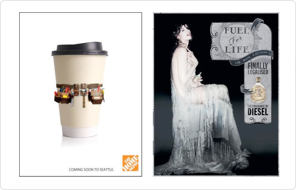
The shape adds interest and immediate recognition to the retail coffee cup. As we look further, we see the tool belt and then the link to Seattle. In the second ad, the shape of the woman sitting is mirrored by the designer and cleverly used to house the ad’s copy and product information.
The silhouetted shape of the unique POM Wonderful drink bottle and the hangman’s noose help add a “cold” feel to this ad.

Texture
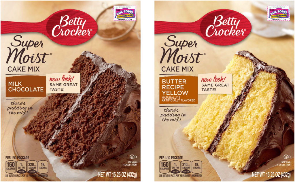
Notice how the designer used the wood countertop and cutting board to add a homemade feel and texture to this cake box design. The ripped edge of the parchment/waxed paper adds a homemade feel as well.
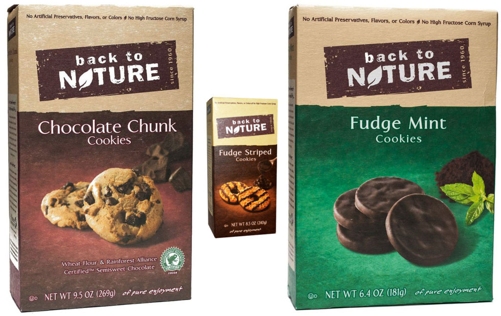
These cookie boxes allow the natural paperboard texture of the box to show through the printed colors to deliver the message of natural and simple ingredients. The rough texture of the logo and logotype add to this feeling as well.
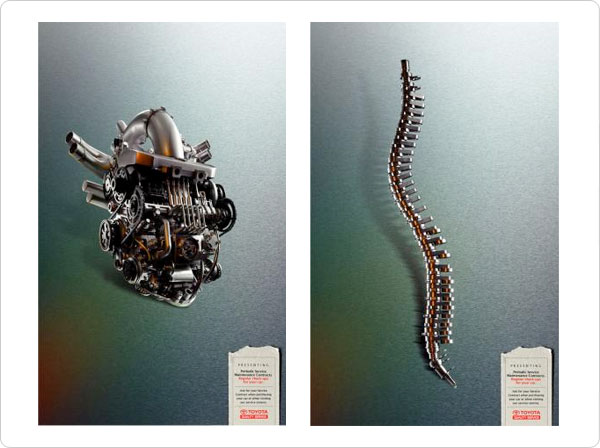
The steely and industrial texture surprises the viewer and grabs their attention. We think of these body parts as smooth and organic, not machines made of hard, cold metal.
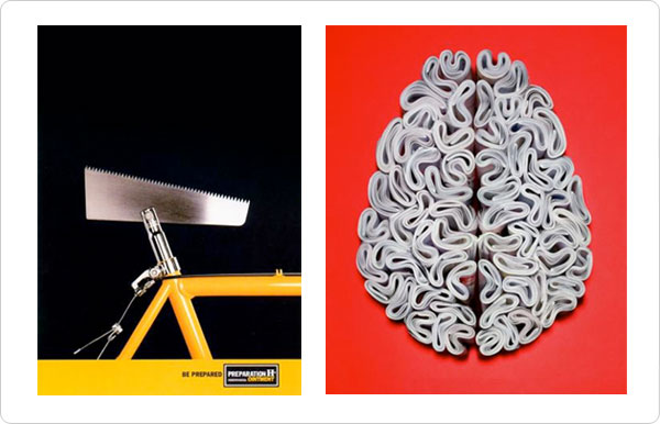
Pattern and texture are used effectively here to first remind us what the ointment relieves, and second to create the positive “intellectual” image of a brain out of rolled-up Economist magazines.
Texture and pattern are cleverly used to show how this Sony music player can put a thick foam sound-proof cover over the troublesome big-city noise.
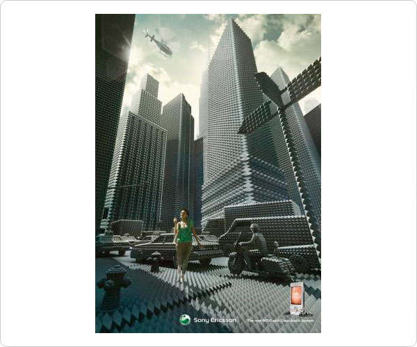
Tromp l’oeil (tromp loy) is a French phrase meaning “to fool the eye.” Enough said.
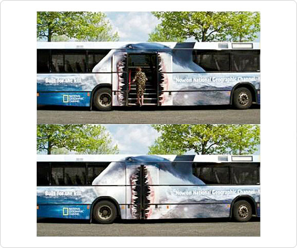
Space
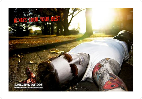
These two examples utilize foreshortening to exaggerate depth and space. This is effective because we are drawn to the tattoo work.

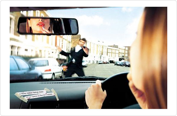
Depth is effectively used in the car window and the rear-view mirror to emphasis the man and driver, and to quickly and cleverly tell the story in this ad. (Lipstick ad)
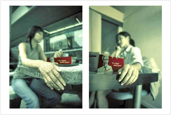
This KFC ad uses foreshortening to emphasize its “finger lickn’ good” slogan.
Motion
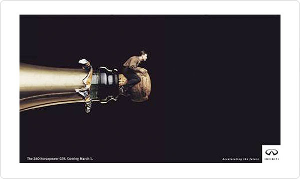
The implied motion in this Infinity car ad speaks for itself. Notice the choice of champagne (instead of carbonated beer or soda) to appeal to their more affluent target market.
This is also a good example of scale exaggeration and emphasis by isolation.
These ads create motion and some chaos in the background. It is a nice contrast to the serene and still man standing in the front. Our eyes zoom in on the man as we follow a single point perspective.
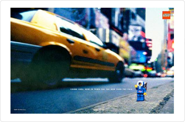
This ad for Legos appearing at a toy show in New York blurs the background to create a busy street scene and to emphasize the Lego toy. It also uses strong diagonal lines and perspective to create implied motion down the street to the toy show (hopefully setting the viewer in action).
Value
Value contrast and shape are used cleverly in this jewelry ad to trick the eye. A soft glowing contour of a feminine figure uniquely creates a ring and a necklace.
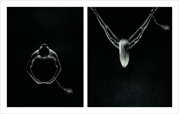
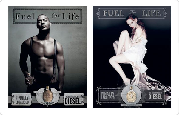
These ads rely on high-value contrast to emphasize their main element, and to deliver their cologne’s sexy, edgy and youthful brand message.
Color
Color is the seventh element. It is so important that is has it’s own page. See the main design fundamentals menu above.
